Data visualization is definitely my favorite part of research. I am not a designer and have not received formal training in data visualization, but it’s something I deeply enjoy and it is one of the tasks that I do when I want to feel productive but I don’t feel like writing or responding to emails.
The images I’ve collected in this post are some of my favorites from different papers. Some are meant to explain a complicated finding. Others try to capture a messy idea or illustrate the full analytical pipeline.
The first figure is a classic in my research, which is using sequence analysis to illustrate longitudinal trajectories of categorical variables. This one specifically is from a recent paper in Computers in Human Behaviour (López-Pernas and Saqr 2024). I use the TraMineR package for this. For the transitions, I use tna, our own package for Transition Network Analysis, based on qgraph. I love this figure not only because I think it is very aesthetically pleasing but because it allows you to see the whole picture immediately. I have used many of such figures in my research using the VaSStra method, to which I devoted another post.

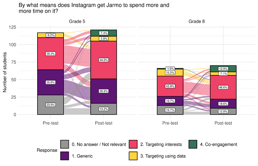
Another type of figure that my colleagues really like is the alluvial plot. I have shared a tutorial on how to create it with ggalluvial in a previous post. The example below is meant to illustrate transitions between (categorical) answers to a pre-test and post-test about AI in social media (Vartiainen et al. 2024).

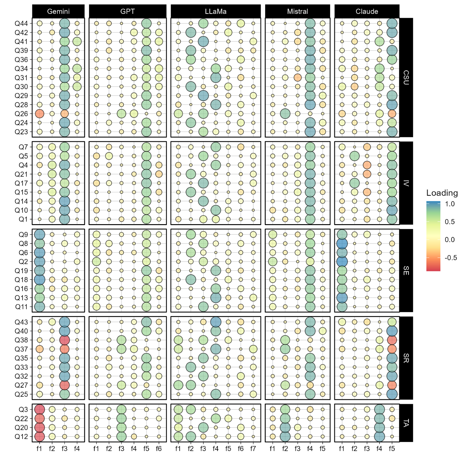
One of my latest favorites is this image from our recent study on LLM-generated responses to the MSLQ questionnaire (Vogelsmeier et al. 2025). For this one, I used my go-to package ggplot2. The code will be available once the article is published. The figure represents the factor loadings from Exploratory Factor Anaysis, with columns representing extracted factors (f1 – f7 on the x-axis) and rows grouped by theoretical constructs of MSLQ.

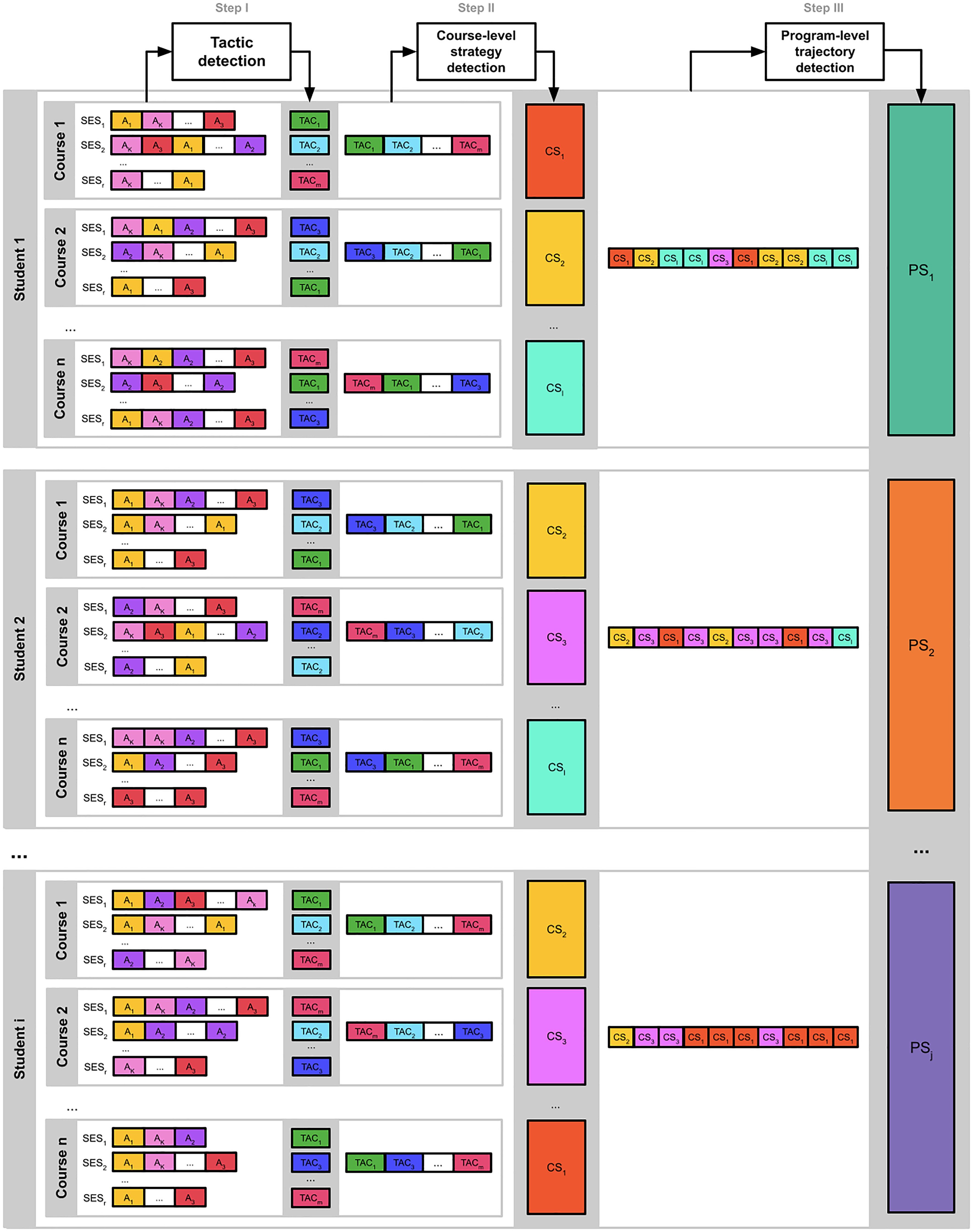
Lastly, I often create figures that summarize the analytical pipeline in my papers, so readers can understand the methods used easily. I don’t use any fancy tools, just Google Slides and a lot of patience.
For example, the following figure illustrates three levels of sequence analysis clustering, following VaSSTra, part of one of my early papers in learning analytics (Saqr et al. 2023).

For my recent book, I also created many of these figures. For example, for the chapter on eXplainable AI using LLMs (López-Pernas et al. 2025).

Shoutout to the Free Pople Icons for Diverse & Inclusive Designs for making their icons available freely. I use them all the time.
References
Citation
@misc{lópez-pernas2025,
  author = {López-Pernas, Sonsoles},
  title = {Data Visualization for Research},
  date = {2025-07-30},
  url = {https://sonsoleslp.github.io/posts/visualization/},
  langid = {en}
}