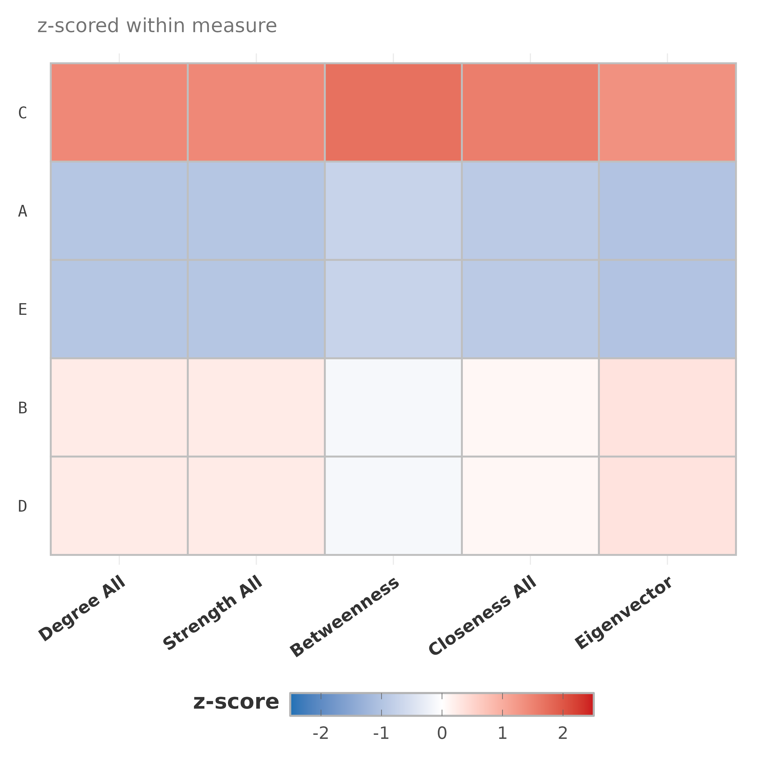
Heatmap of nodes (rows) by centrality measures (columns), z-standardized within measure so the diverging palette is meaningful. Optional row clustering groups nodes with similar centrality profiles.
Usage
plot_centrality_heatmap(
  x,
  measures = NULL,
  cluster_rows = TRUE,
  order_by = NULL,
  show_values = FALSE,
  value_digits = 1L,
  low = "#2171B5",
  mid = "white",
  high = "#CB181D",
  limits = c(-2.5, 2.5),
  title = NULL,
  subtitle = "z-scored within measure",
  ...
)
Arguments
- x
Centrality data frame (from
centrality) or a network input.- measures
Character vector of measure names.
- cluster_rows
Logical. Hierarchically cluster rows so nodes with similar profiles are adjacent. Default TRUE.
- order_by
If
cluster_rows = FALSE, optionally the name of a measure to sort rows by (descending). Default: first measure.- show_values
Logical. Print z-scores in cells. Default FALSE.
- value_digits
Decimal places for cell values. Default 1.
- low, mid, high
Color stops for the diverging scale. Defaults to blue -> white -> red.
- limits
Numeric c(min, max) z-score range. Values outside are squished to the endpoints. Default c(-2.5, 2.5).
- title, subtitle
Plot title and subtitle.
- ...
Passed to
centralitywhenxis a network.