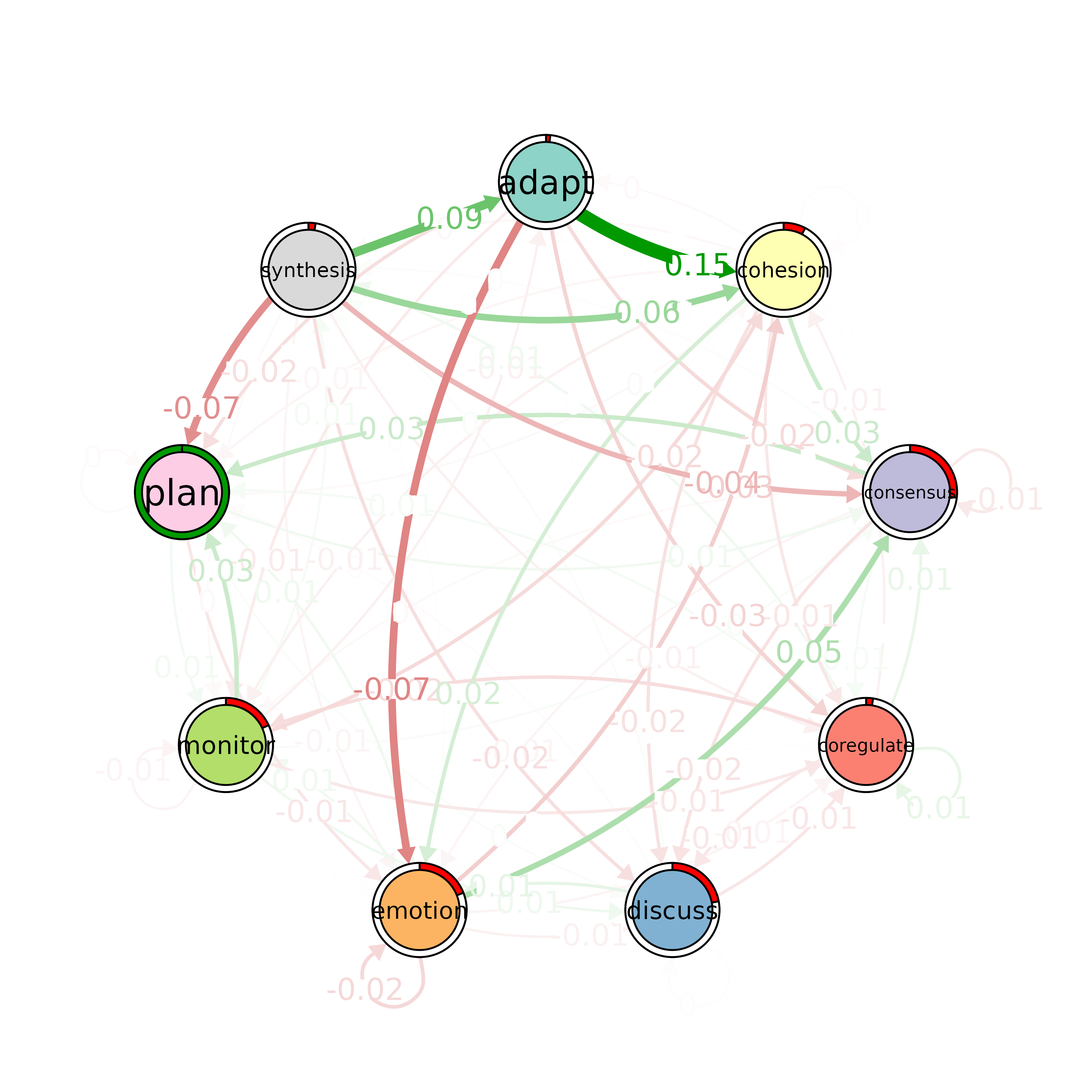
Plots the difference network between model x and model y. The edges are
computed from subtracting the two models. The pie chart is the difference in
initial probabilities between model x and model y. Green color indicates
that xis greater than yand red indicates otherwise.
Usage
plot_compare(x, ...)

# S3 method for class 'tna'
plot_compare(x, y, posCol = "#009900", negCol = "red", ...)
Arguments
- x
A
tnaobject. This is the the principal model.- ...
Additional arguments passed to
cograph::splot().- y
A
tnaobject. This is the model subtracted from the principal model.- posCol
Color for plotting edges and pie when the first group has a higher value. See
cograph::splot().- negCol
Color for plotting edges and pie when the second group has a higher value. See
cograph::splot().