This is a visual gallery of every VaSSTra plot, run on the
longitudinal engagement data from Chapter
11 of Learning Analytics Methods and Tutorials. It follows
the method’s own order: the state views, the sequence views, the
trajectory views, and the combined per-trajectory grid (all base
graphics, no ggplot2 dependency), then the
evaluate() selection panels, and last the
cograph-rendered flow and transition networks. Every view
shares one state palette and one state order, both of which can be
pinned on the fit with state_colors and
state_order.
It focuses only on the plots. For the workflow around them (running
vasstra(), comparing counts, reading fit indices,
relabeling groups, and extracting tidy tables), see
vignette("get-started") and
vignette("vasstra-tutorial"), and
vignette("clustering-algorithms") for the estimation
methods.
The fit
Every figure below is drawn from one fit, and to keep the gallery
about the plots rather than the tuning, that fit is the fully automatic
default: vasstra(engagement) detects the roles, selects the
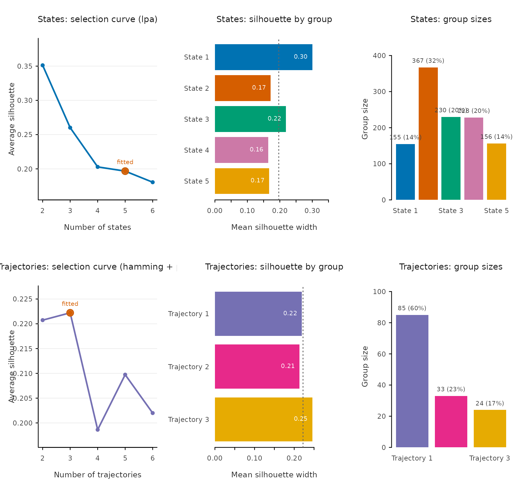
number of states and trajectories, and fits them. It settles on five
states and three trajectories here, drawn in their discovery order on
the default palette. Naming, reordering, and recolouring are shown in
Palette and state order below; they change how a plot reads,
not which plot each call draws.
library(VaSSTra)
data("engagement", package = "VaSSTra")

fit <- vasstra(engagement)
#> Selected n_states = 5 (lpa, bic = 19008.964); see `diagnostics$selection`.
#> Registered S3 method overwritten by 'Nestimate':
#>   method     from
#>   print.mcml cograph
#> Selected n_trajectories = 3 (hamming + pam, silhouette = 0.222); see `diagnostics$selection`.
State overview: profile + bars + heatmap + sizes
type = "all" draws the four state views together on the
shared palette; the profile heatmap reads with the first state as its
top row, matching the bars, sizes, and legends.
plot(fit, which = "states", type = "all")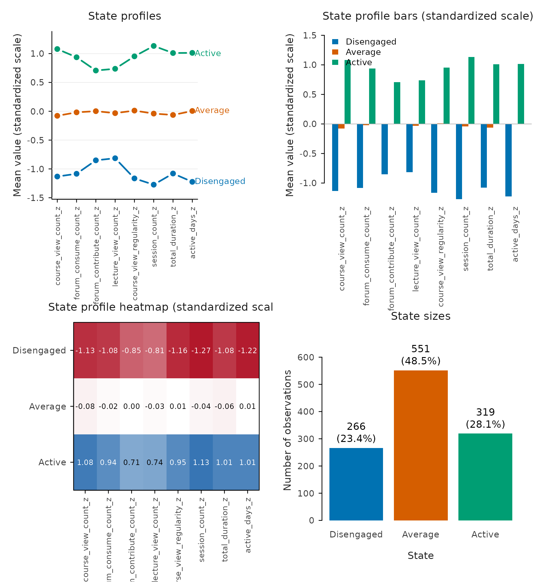
Each view is also available alone:
plot(fit, which = "states", type = "profile")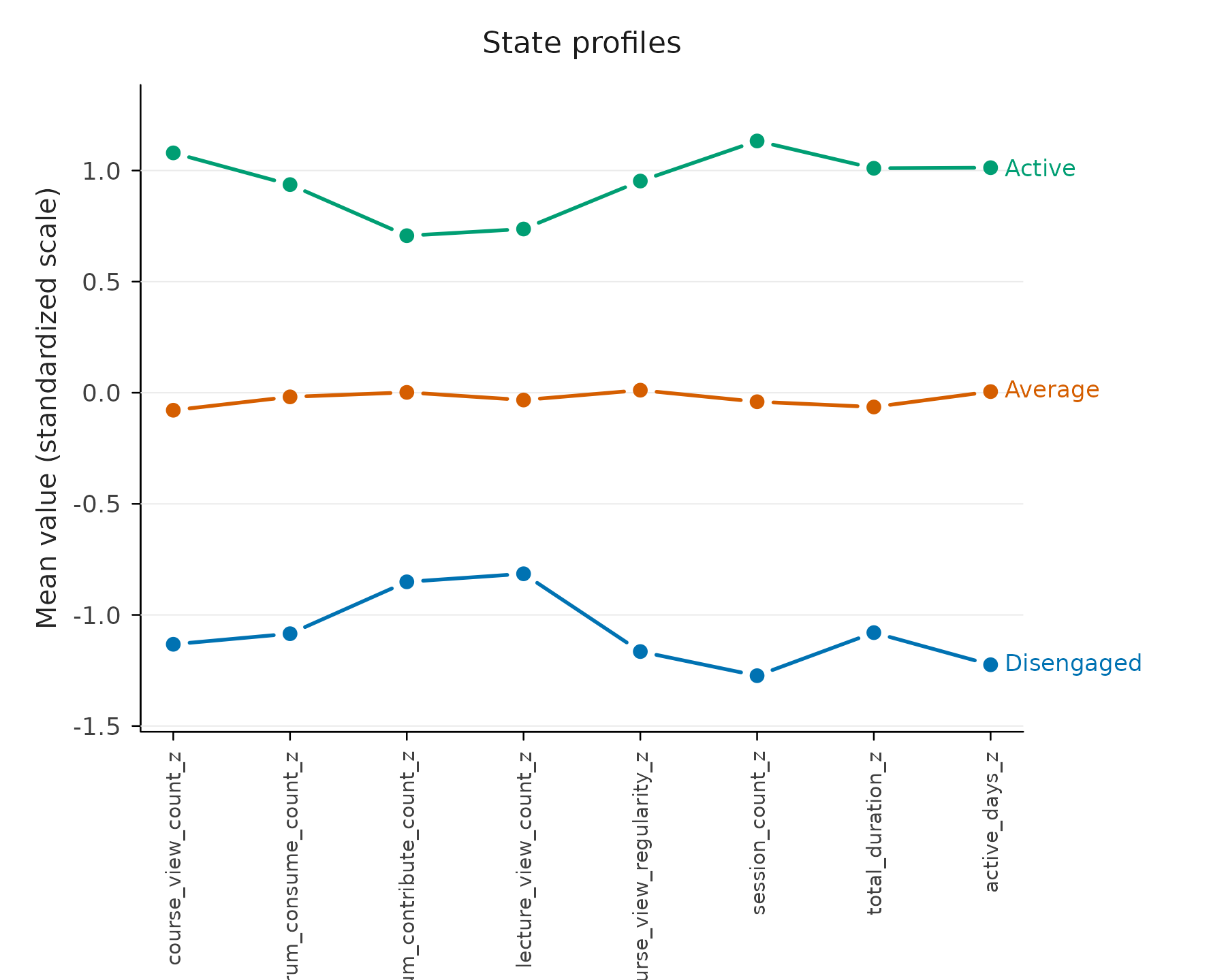
plot(fit, which = "states", type = "bars")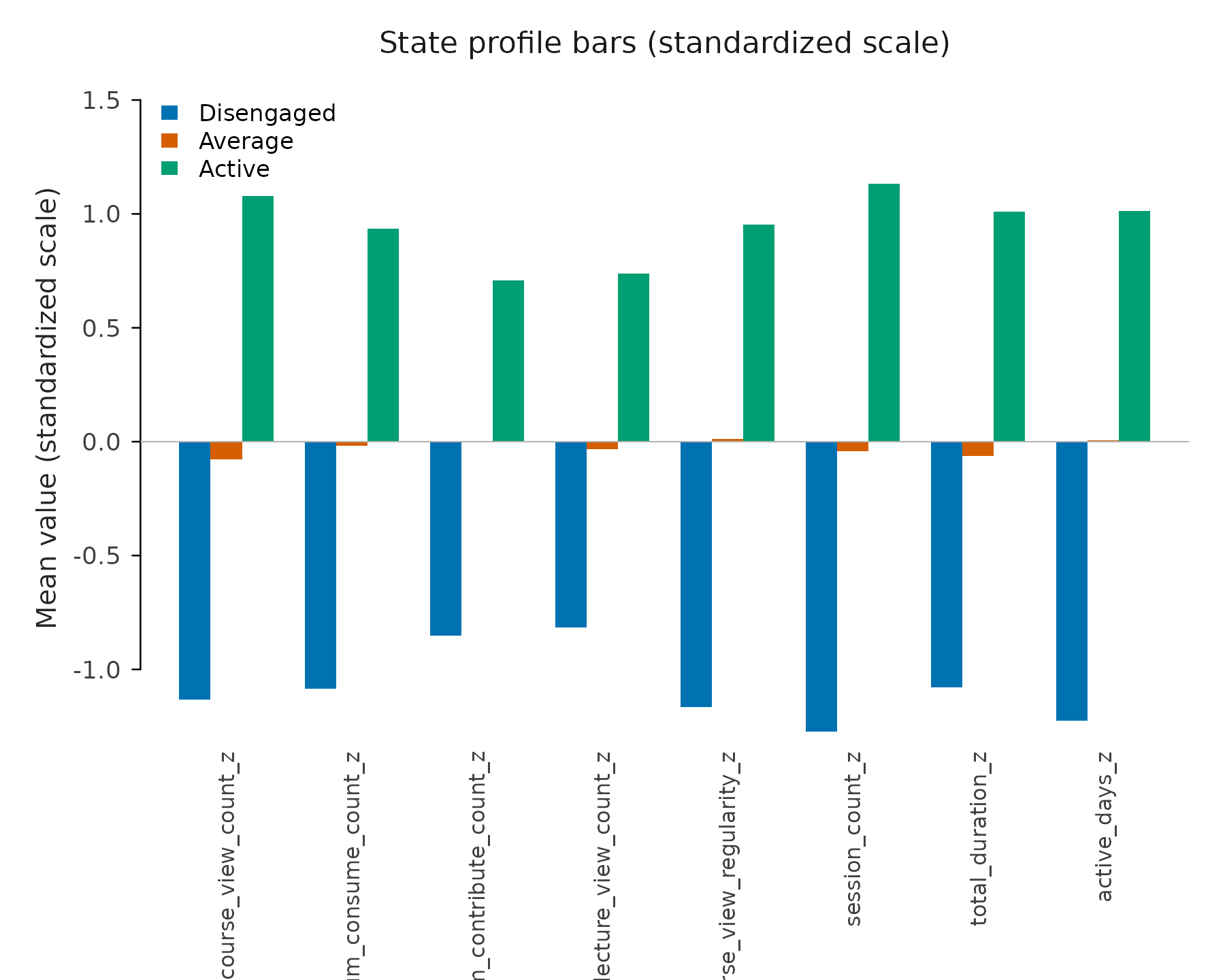
plot(fit, which = "states", type = "heatmap")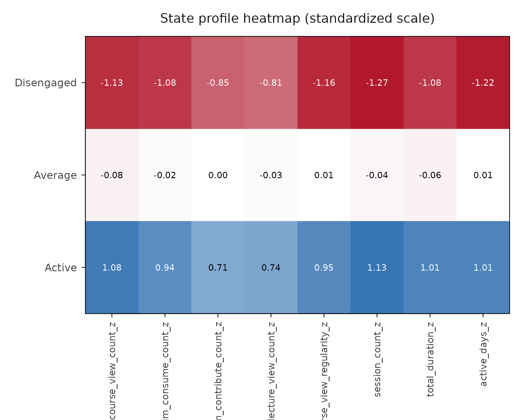
plot(fit, which = "states", type = "sizes")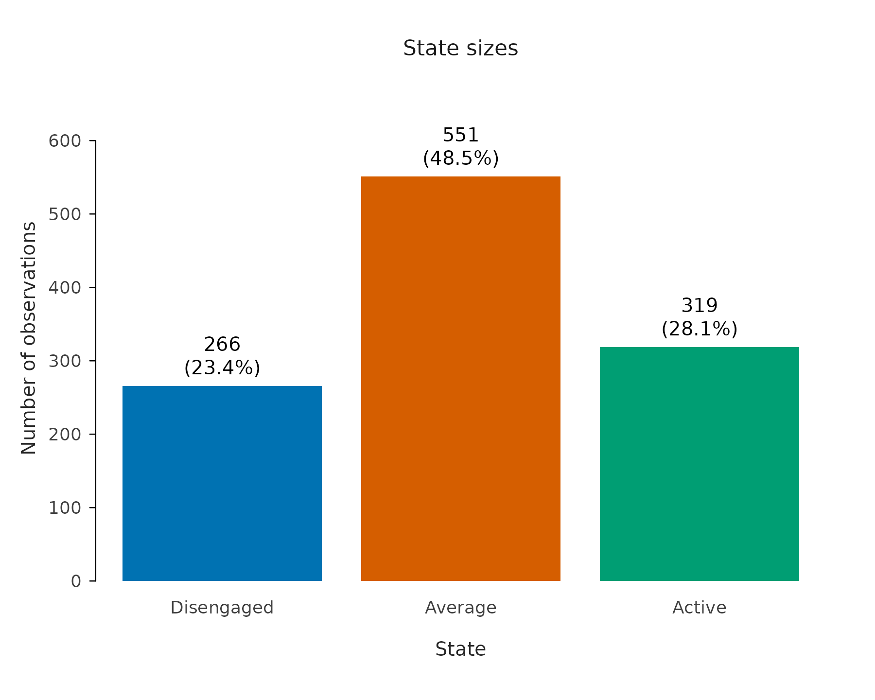
Indicators by state
type = "variables" takes the profile apart along time.
It draws one panel per time point and, within each, a grouped boxplot of
every clustering indicator split by state, so the aggregated profile
above becomes a question you can check at each moment: does each
indicator keep separating the states throughout, or only on average? The
indicators stay on the scale the states were clustered on, so the shared
y-axis is comparable across panels, and the call returns the tidy
time-by-variable-by-state medians behind the boxes.
plot(fit, which = "states", type = "variables")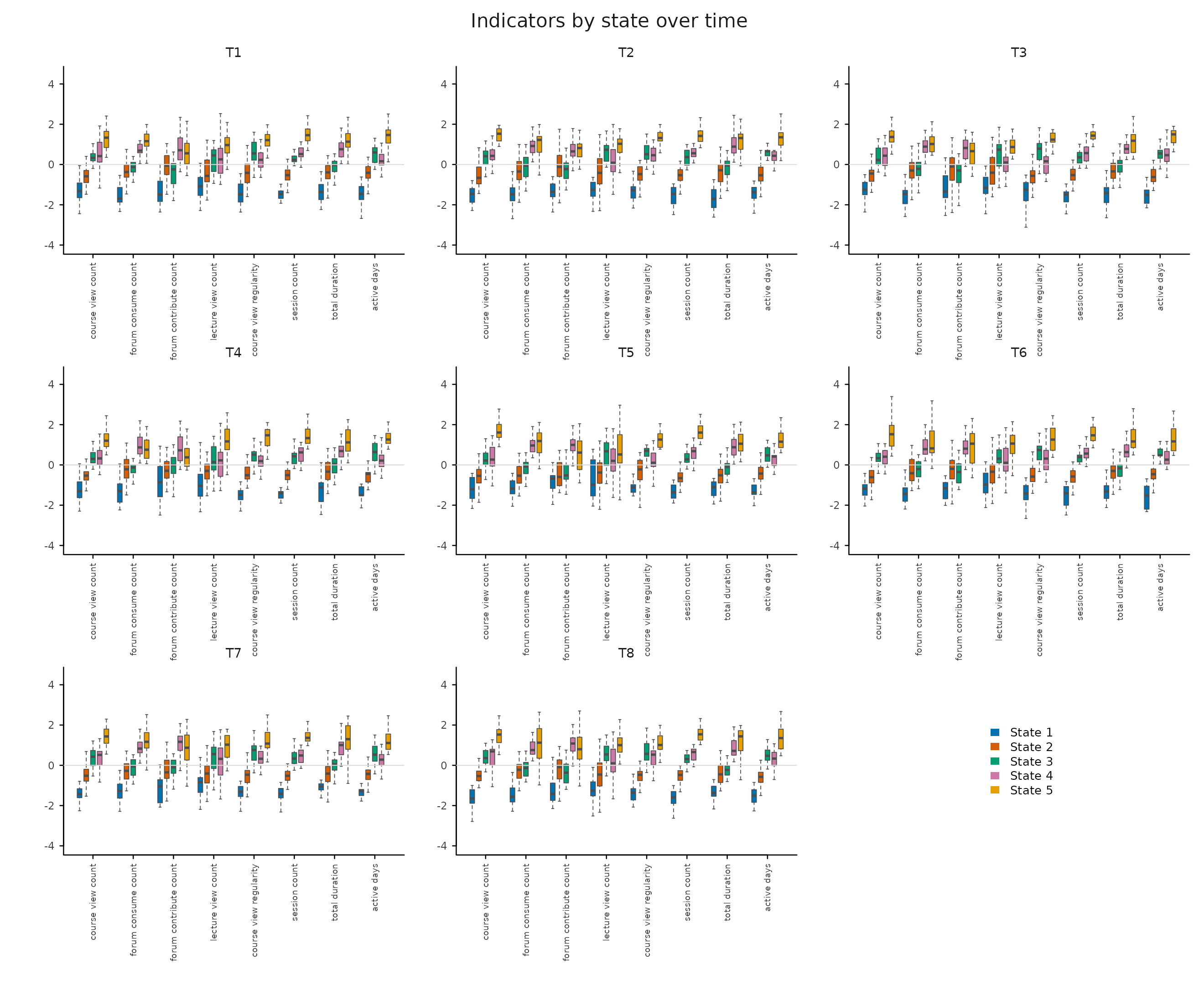
by_time = FALSE pools the time points into a single
panel, the boxplot counterpart of the profile plot: one box per
indicator and state, over all observations.
plot(fit, which = "states", type = "variables", by_time = FALSE)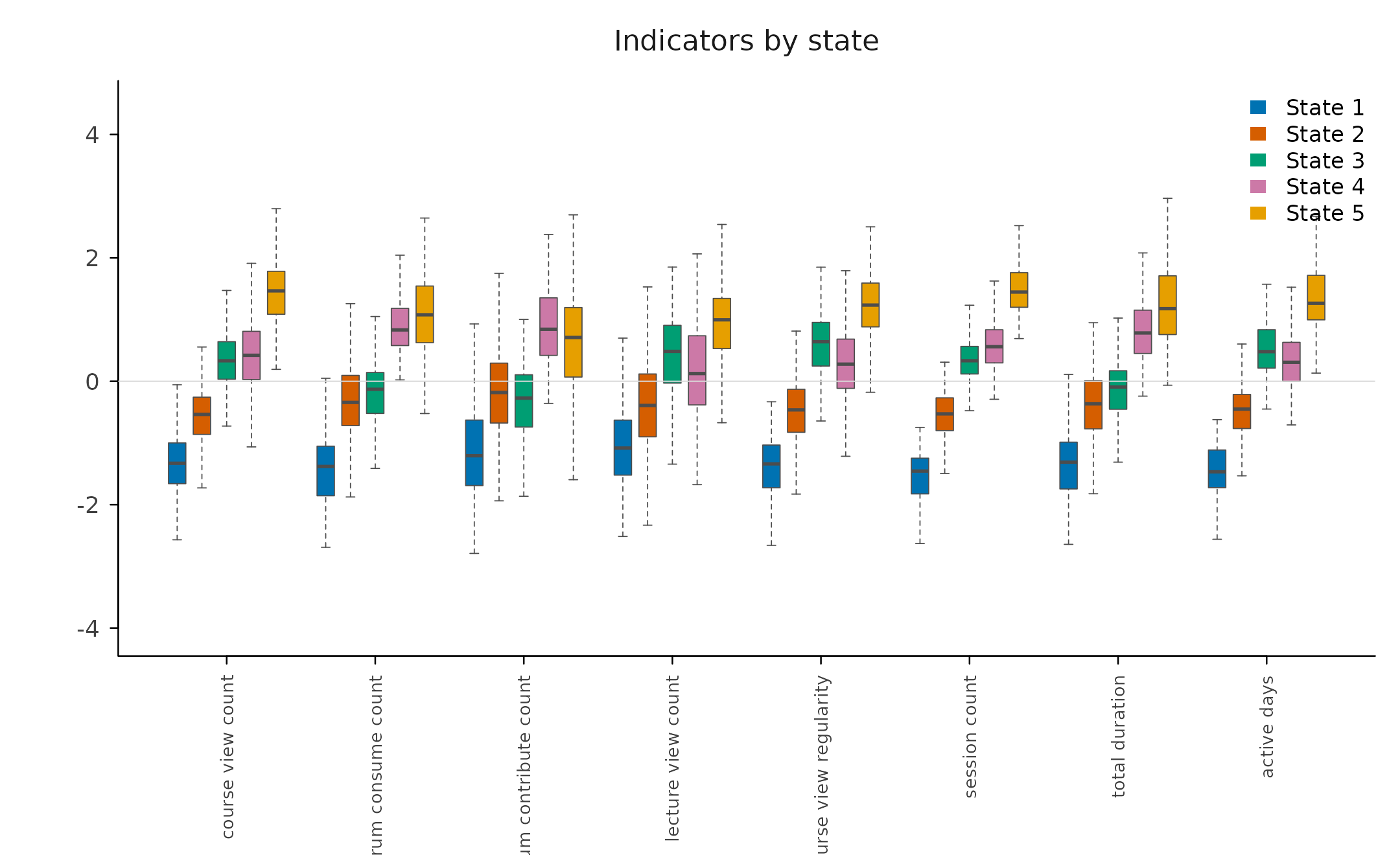
state_descriptives() is the numeric companion: one row
per state and indicator with the count, mean, standard deviation,
median, and range. scale = "original" reports the raw
indicators instead of the clustered (standardized) ones.
head(state_descriptives(fit))
#>     state                 variable   n mean   sd median  min   max
#> 1 State 1      course_view_count_z 155 -1.3 0.57   -1.3 -2.8  0.57
#> 2 State 1    forum_consume_count_z 155 -1.4 0.58   -1.4 -2.7  0.29
#> 3 State 1 forum_contribute_count_z 155 -1.1 0.76   -1.2 -2.8  1.52
#> 4 State 1     lecture_view_count_z 155 -1.0 0.79   -1.1 -2.5  1.58
#> 5 State 1 course_view_regularity_z 155 -1.4 0.58   -1.3 -3.7 -0.33
#> 6 State 1          session_count_z 155 -1.5 0.43   -1.5 -2.9 -0.75
by_time = TRUE matches the faceted plot: it adds a
time column and reports the same statistics per state,
indicator, and time point.
head(state_descriptives(fit, by_time = TRUE))
#>     state            variable time  n mean   sd median  min    max
#> 1 State 1 course_view_count_z    1 25 -1.3 0.58   -1.3 -2.4 -0.057
#> 2 State 1 course_view_count_z    2 16 -1.4 0.56   -1.5 -2.3  0.022
#> 3 State 1 course_view_count_z    3 23 -1.4 0.60   -1.3 -2.6 -0.504
#> 4 State 1 course_view_count_z    4 18 -1.2 0.75   -1.3 -2.3  0.568
#> 5 State 1 course_view_count_z    5 16 -1.2 0.57   -1.2 -2.2 -0.420
#> 6 State 1 course_view_count_z    6 18 -1.2 0.49   -1.2 -2.0  0.087
Palette and state order
Two arguments control how states display everywhere.
state_colors pins a palette on the fit (a named vector is
matched by state and survives reordering and set_labels()),
and state_order fixes the order the states read in every
plot (stacking, legends, transition and flow nodes), independent of the
order the clusters were discovered in. Both are stored on the fit and
reused by every plot, so the styling is set once; a colors
argument on an individual plot() call overrides them for
that call alone.
fit_styled <- vasstra(
  engagement,
  state_labels = c("Disengaged", "Average", "Active"),
  state_order  = c("Active", "Average", "Disengaged"),
  state_colors = c(Disengaged = "#D55E00", Average = "#0072B2", Active = "#009E73")
)
#> Using n_states = 3 to match the supplied labels.
#> Selected n_trajectories = 3 (hamming + pam, silhouette = 0.435); see `diagnostics$selection`.
plot(fit_styled, type = "distribution")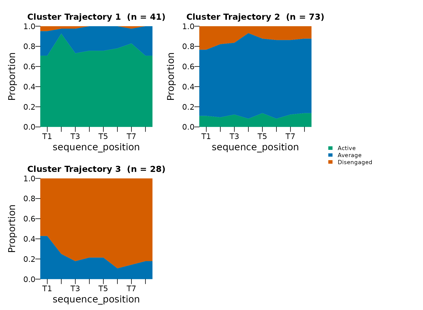
All sequences: heatmap (default), distribution, index
Every plot containing state sequences is rendered by
Nestimate::sequence_plot(). The heatmap is the default view
for the complete sequence set.
plot(fit, which = "sequences")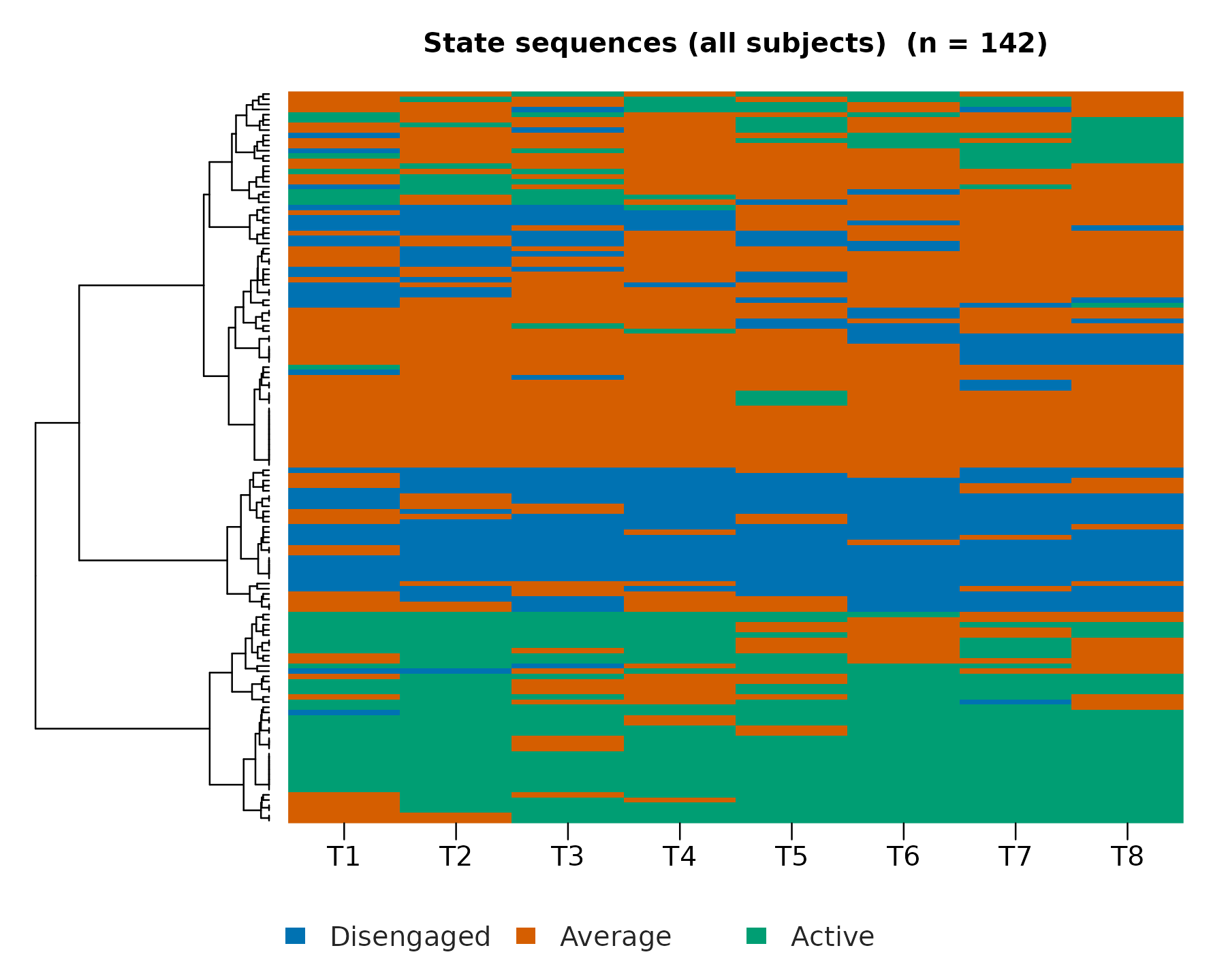
plot(fit, which = "sequences", type = "distribution")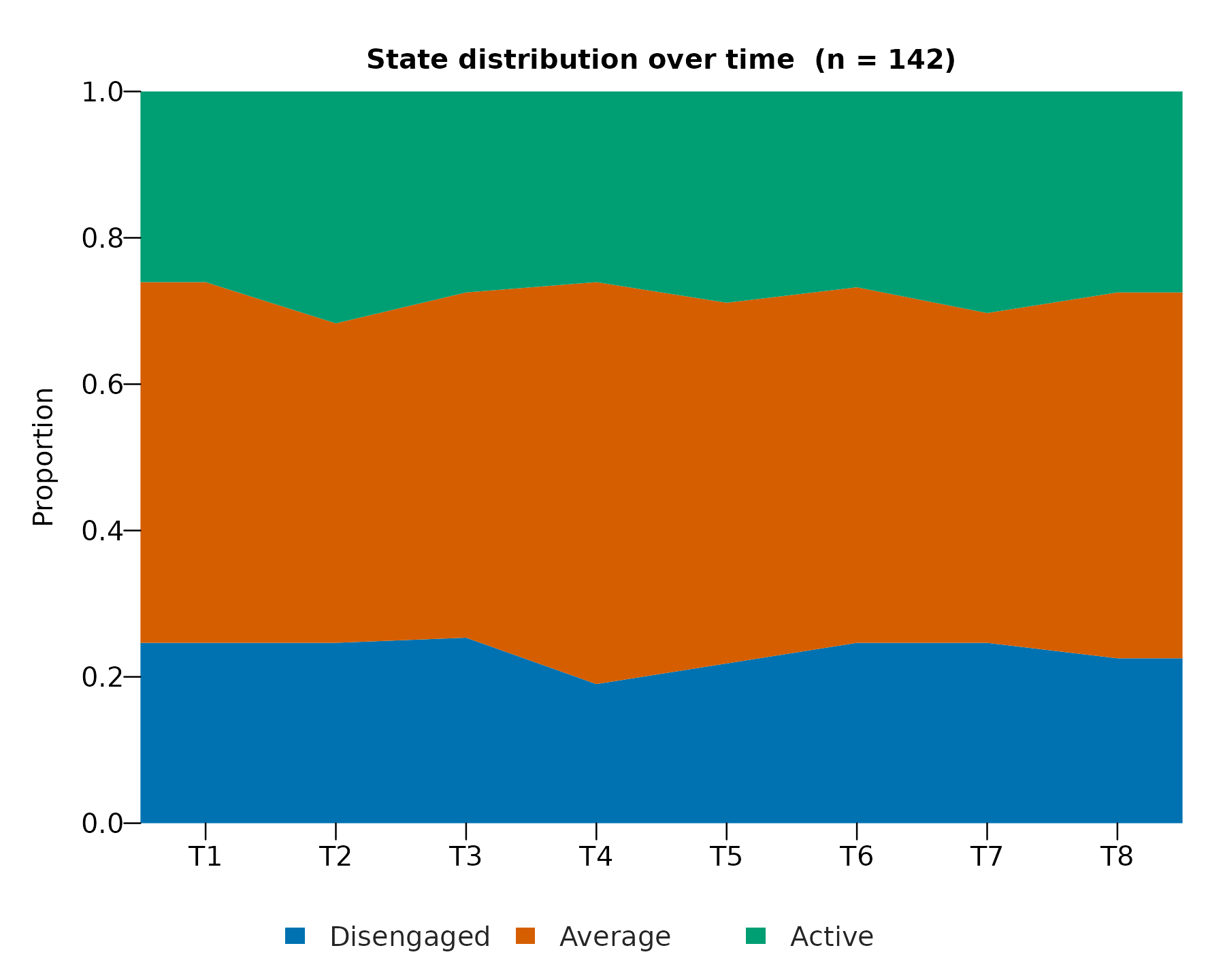
plot(fit, which = "sequences", type = "index")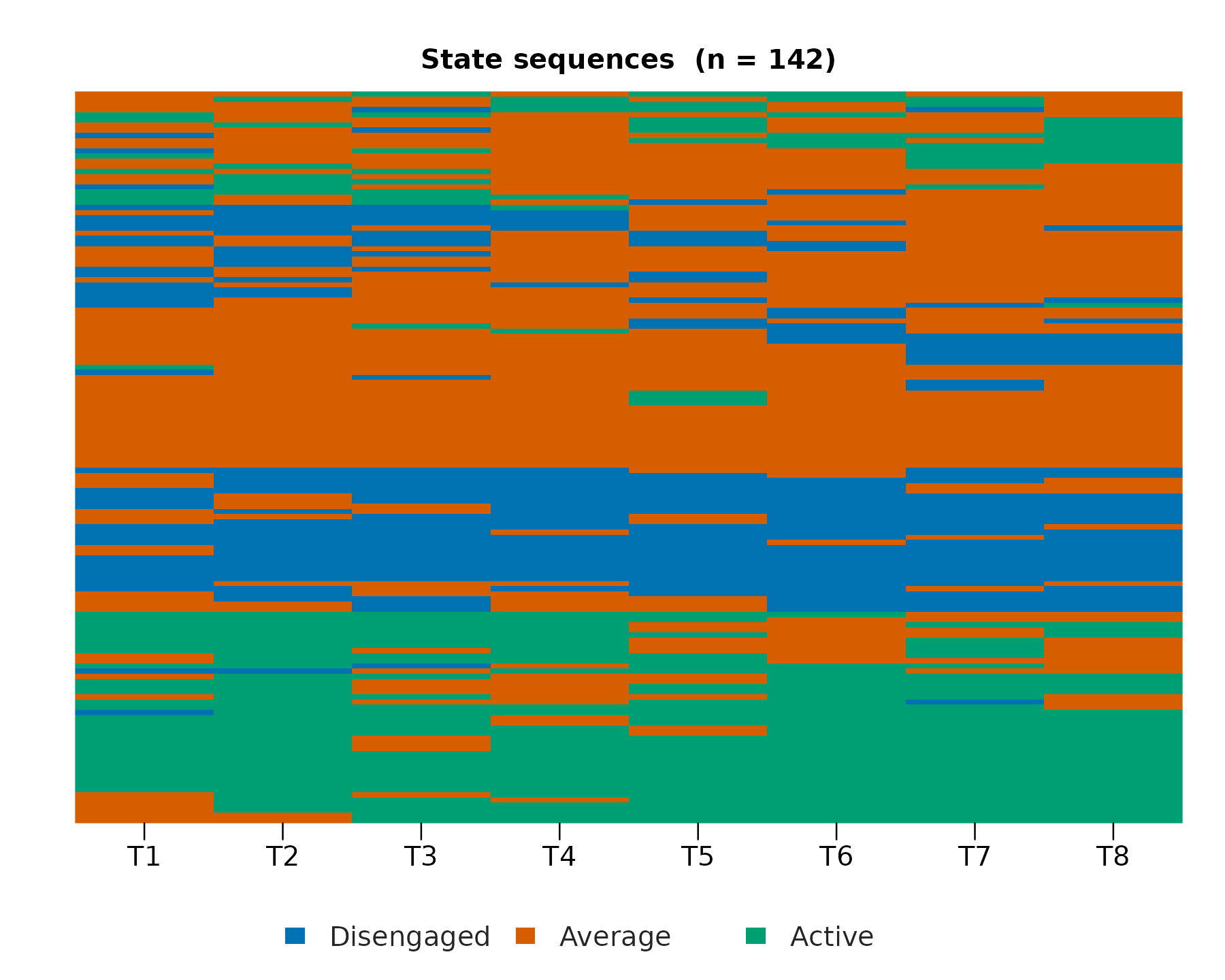
Trajectories: distribution, index, heatmap
plot(fit, type = "distribution")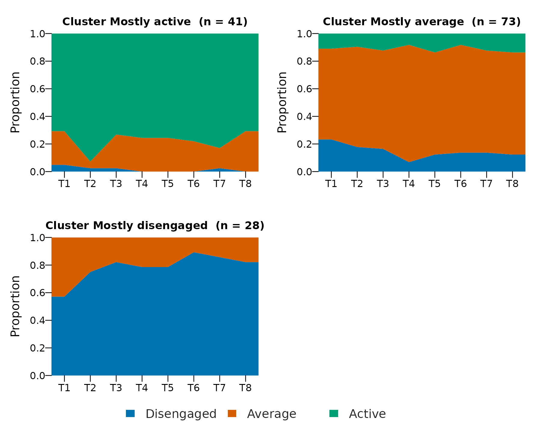
plot(fit, type = "index")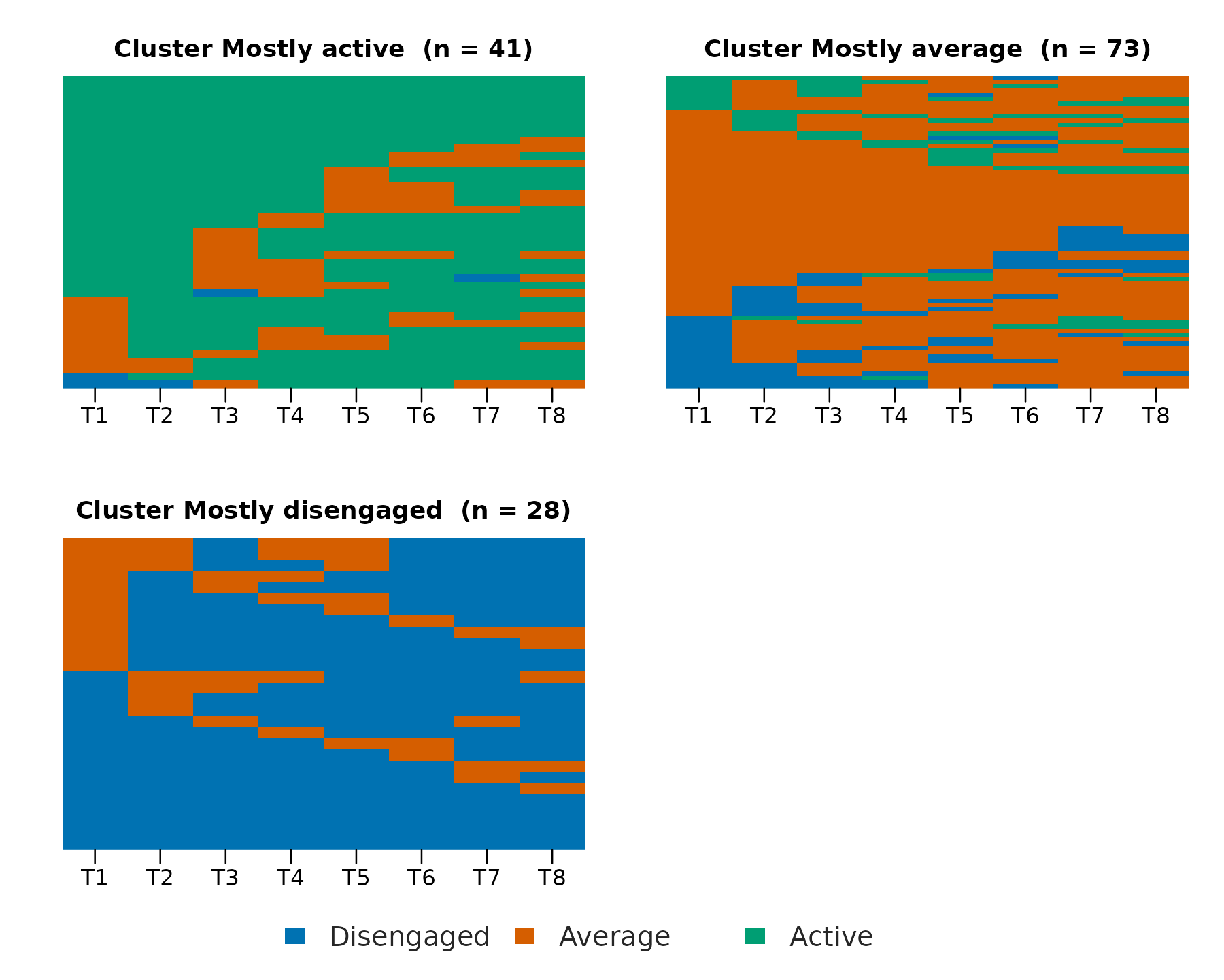
plot(fit, type = "heatmap")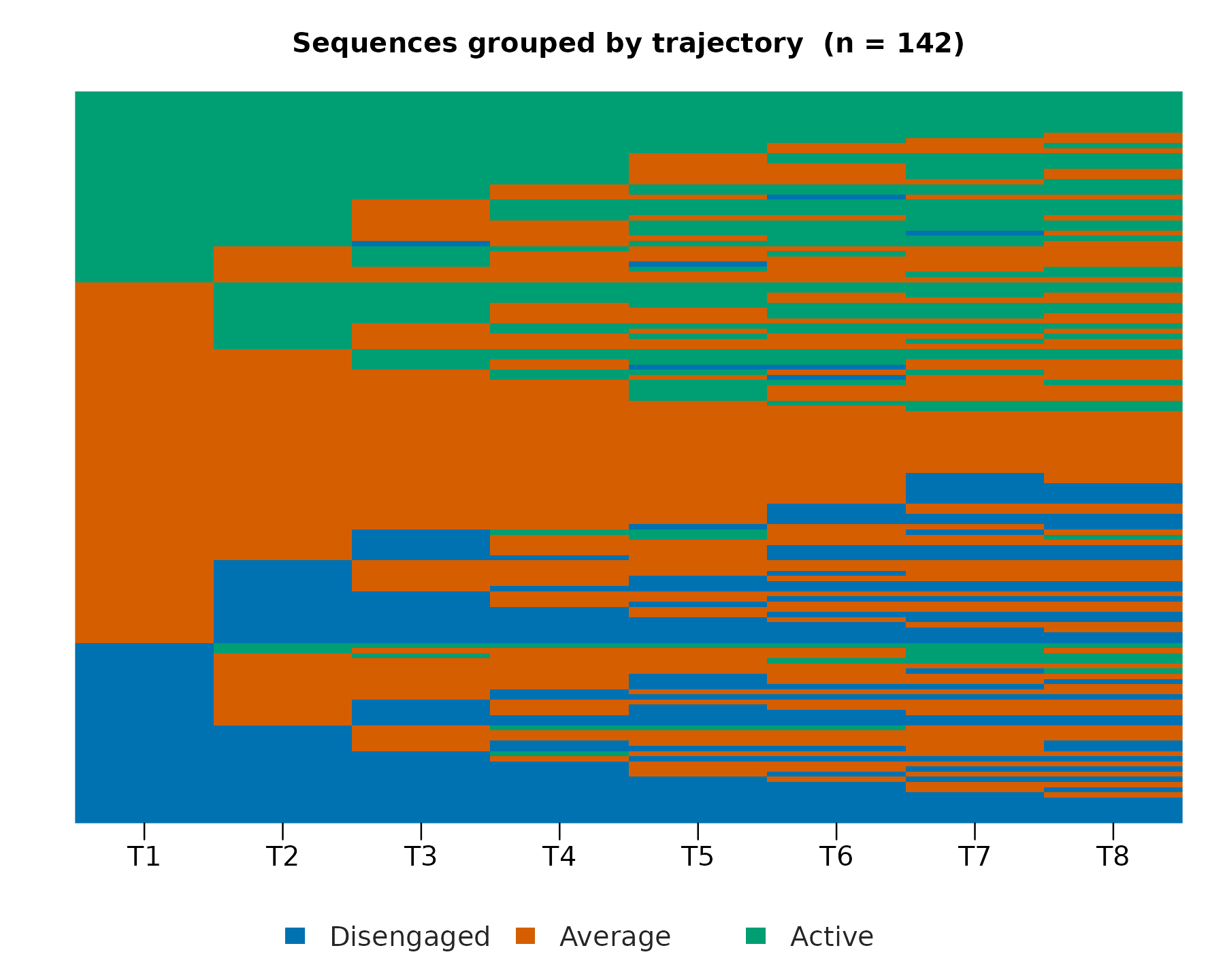
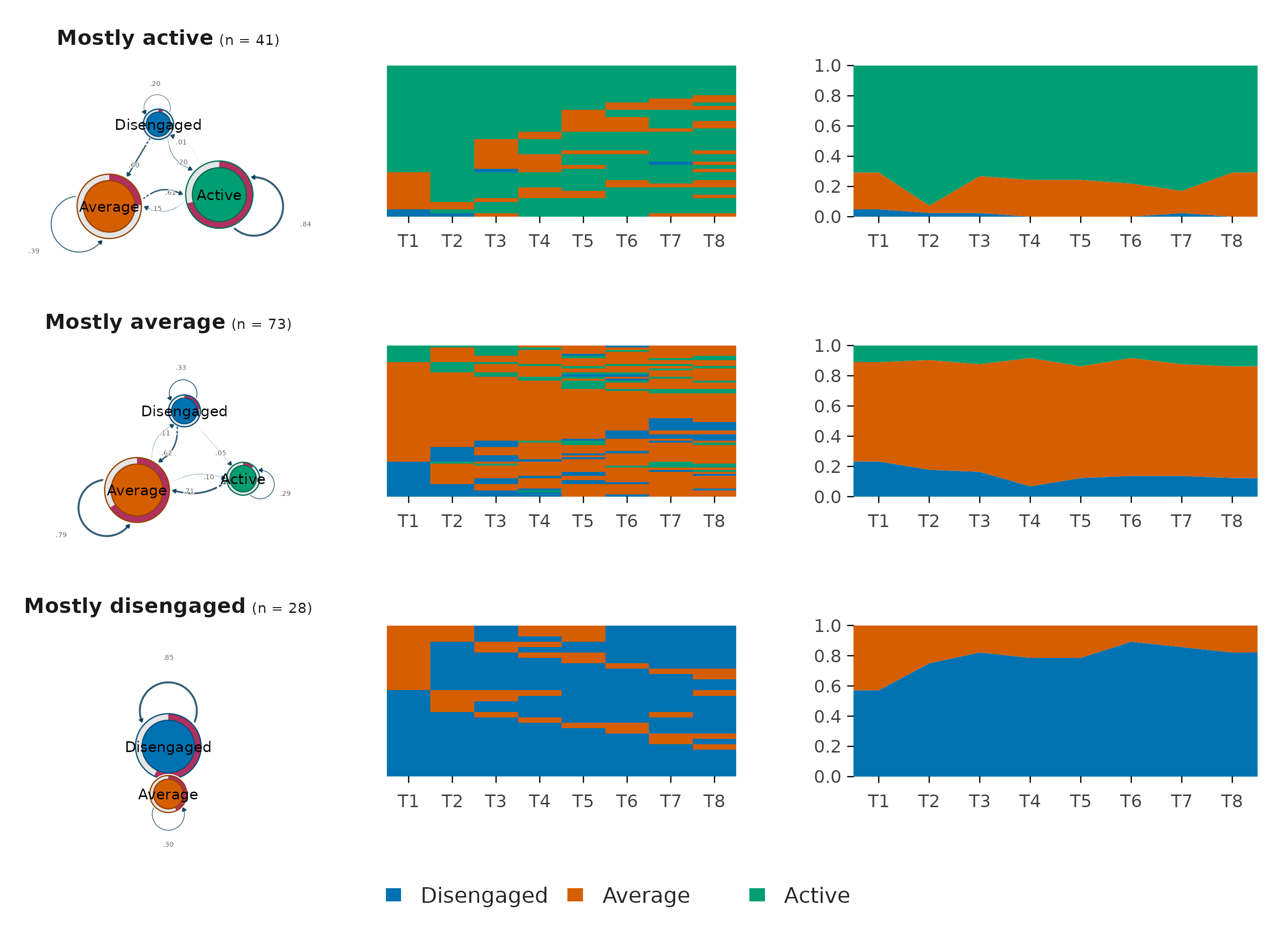
The combined per-trajectory grid
Passing several views in type composes them into one
figure with one row per trajectory and one column per
view, in the order requested. This is the standard per-cluster
VaSSTra display, drawn in one call with a shared ordered legend. The
transition column needs the suggested cograph package.
Evaluation panels
plot(evaluate(fit)) draws the selection curve,
per-cluster silhouette widths, and group sizes for both clustering
steps. The state and trajectory rows use distinct palettes, so the two
groupings are not read as corresponding.
Choice comparisons across methods
The explicit comparison draws a metric-aware plot, on the shared palette with light gridlines.
state_options <- state_choices(
  engagement,
  n_states = 2:5,
  method = c("kmeans", "pam", "ward.D2", "lpa"),
  lpa_model = "EEI",
  seed = 22294
)
plot(state_options, metric = "silhouette")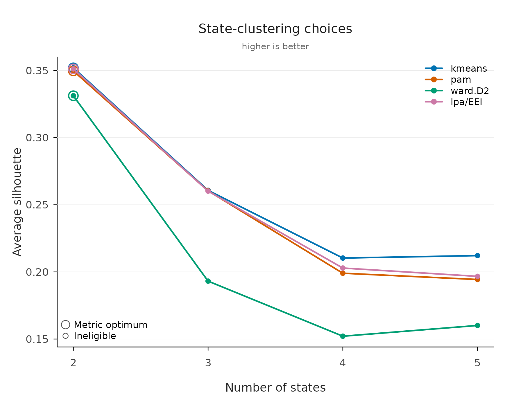
plot(state_options, metric = "bic", groups = "lpa/EEI")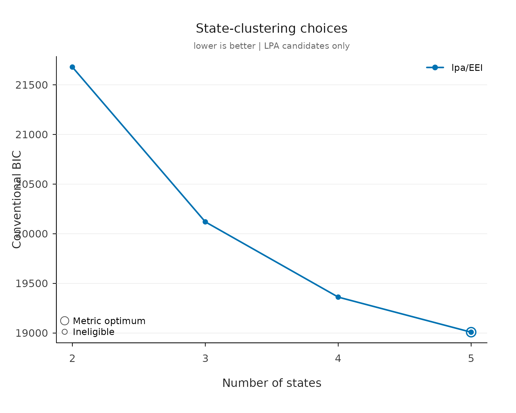
Flow plots (cograph)
flow_plot() renders state movement between consecutive
time points through cograph, on the same palette and state order as
every other plot, and returns a ggplot object rather than
drawing base graphics. Aggregated bands and individual lines are the two
views:
flow_plot(fit)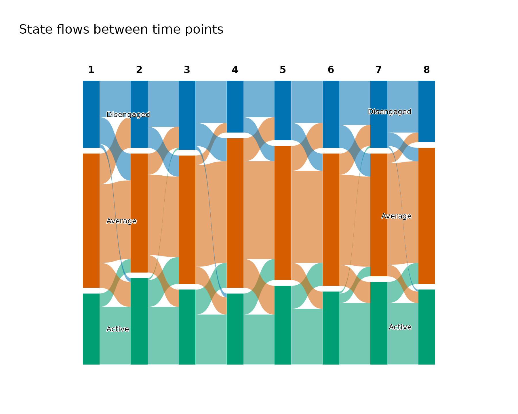
flow_plot(fit, type = "individual")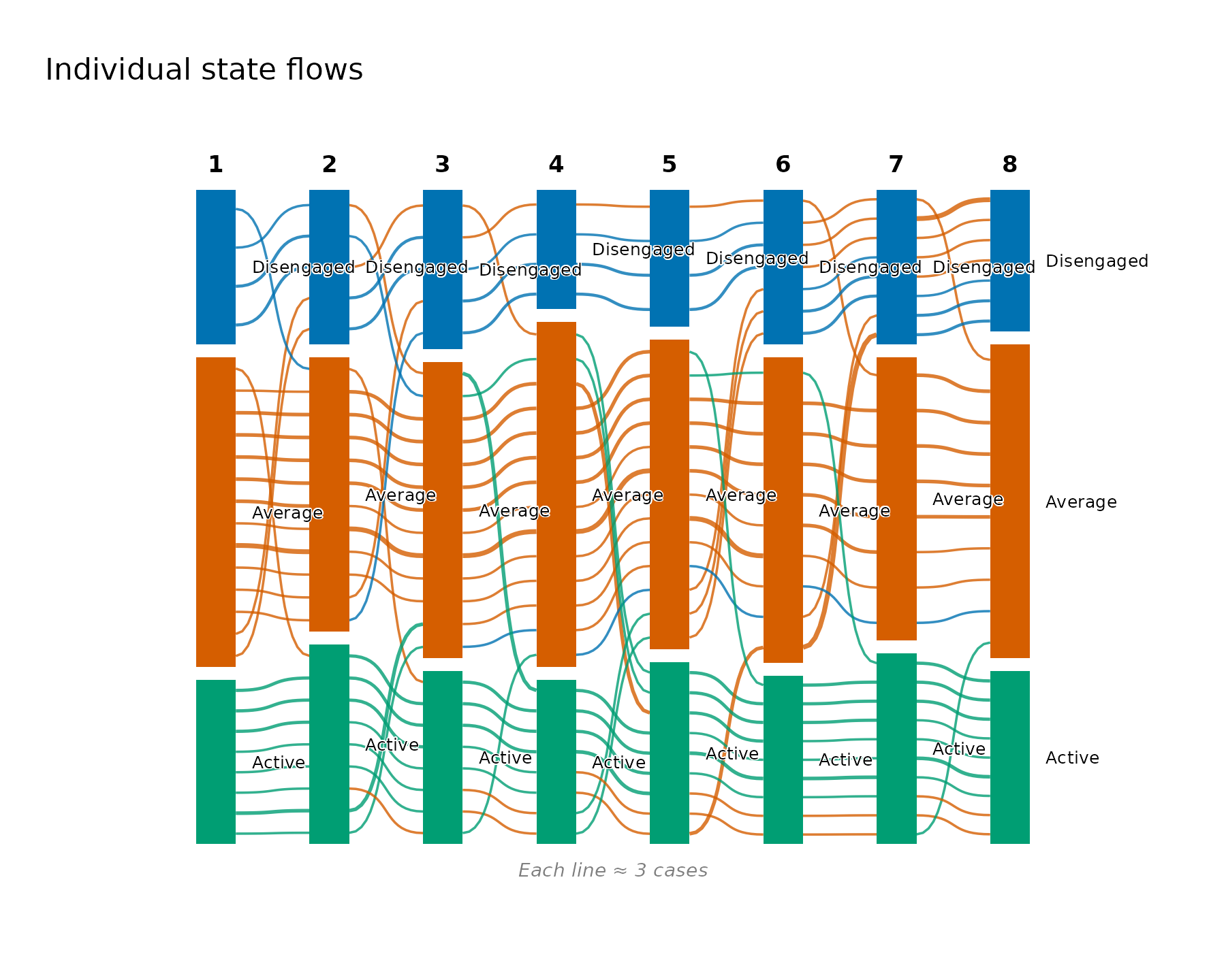
The vignette("flow-plots") article covers the rest:
colouring by destination or by first/last state, restricting to one
trajectory, line bundling, thresholding negligible flows, and tuning a
figure for a manuscript.
Transition network (Nestimate builds, cograph draws)
Node size is a transition-network centrality from
Nestimate::net_centrality(); the network comes from
Nestimate::build_tna(). Drawn by
cograph::splot(); returns the tidy node table invisibly.
The paired form places the sequences beside the network on one shared
palette.
transition_plot(fit)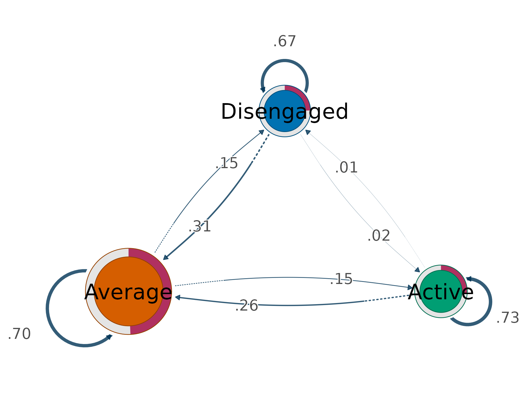
transition_plot(fit, sequences = TRUE)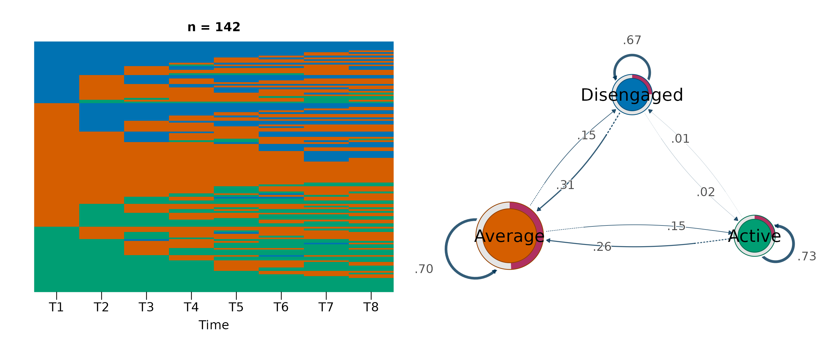
The centralities are also available as a tidy table:
transition_centrality(fit)
#>     state InStrength OutStrength
#> 1 State 1       0.20        0.46
#> 2 State 2       0.86        0.45
#> 3 State 3       0.56        0.56
#> 4 State 4       0.53        0.54
#> 5 State 5       0.26        0.40
See vignette("flow-plots") for the centrality-driven
node sizing (size, weights,
loops), the per-trajectory networks, and the other paired
views.