Visualize motif frequencies and their statistical significance.
Arguments
- x
A
cograph_motifsobject frommotif_census()- type
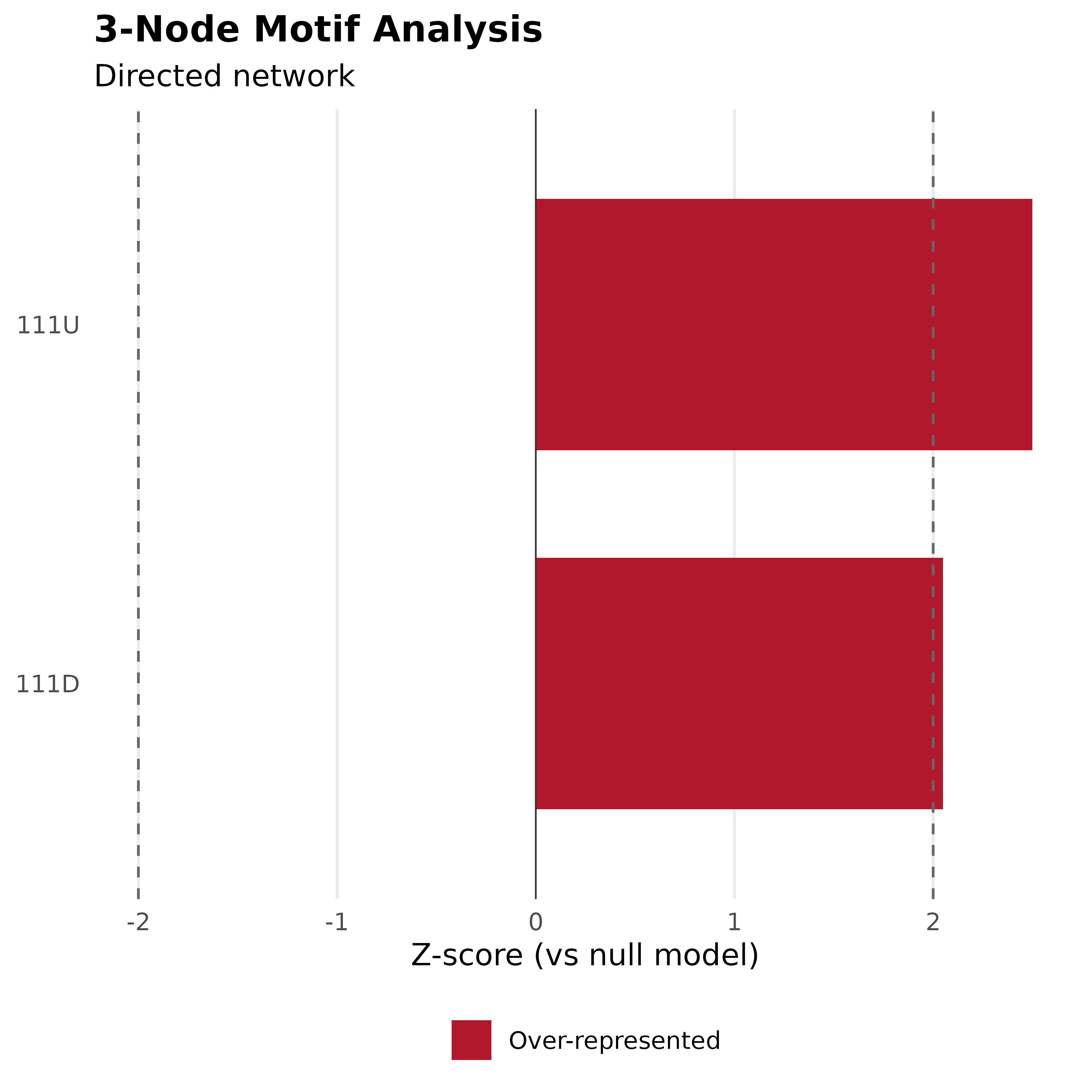
Plot type:
"bar"(default) Bar chart of motif frequencies, colored by significance direction (over/under-represented).
"heatmap"Heatmap of z-scores across motif types.
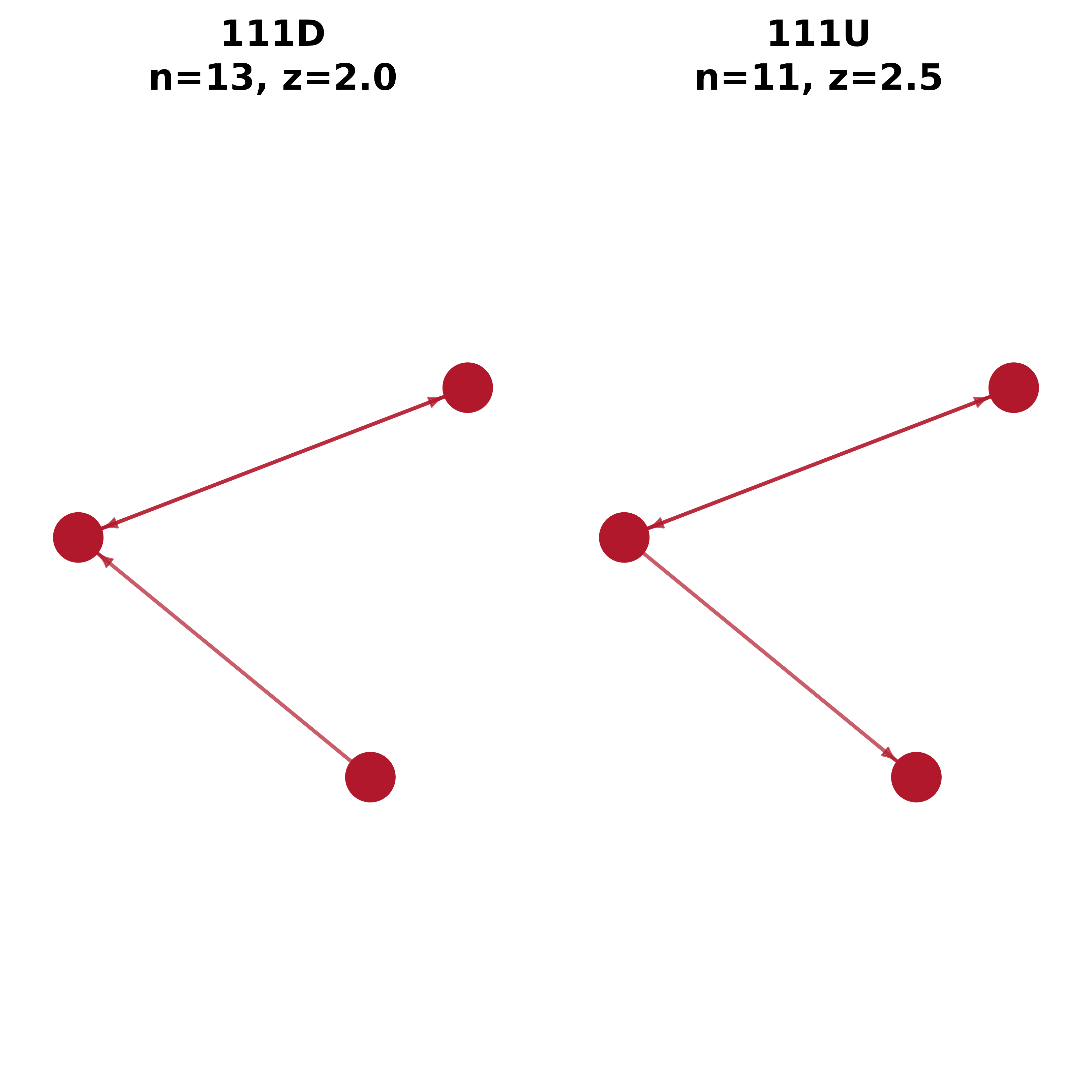
"network"Network diagrams of the top motifs by |z-score|.
- show_nonsig
Show non-significant motifs? Default FALSE.
- top_n
Show only top N motifs by |z-score|. Default NULL (all).
- colors
Three-element color vector for under-represented, neutral, and over-represented motifs. Default
c("#2166AC", "#999999", "#B2182B")(blue/gray/red).- ...
Additional arguments passed to plotting functions
See also
motif_census() for the analysis that produces this object
Other motifs:
extract_motifs(),
extract_triads(),
get_edge_list(),
motif_census(),
motifs(),
plot.cograph_motif_analysis(),
subgraphs(),
triad_census()