reviewBar() summarizes a single column as a horizontal
bar chart with frequency and percentage labels. It is the workhorse plot
of the package. This article walks through every
argument of
reviewBar(data, col, fill = "#7BB0D1", width = 0.6, sep = "\r\n",
          studlabs = FALSE, study_id = StudyID, label_space = 1.6,
          base_size = 12, na.rm = TRUE, na_label = "Not reported",
          na_in_percent = TRUE, na_last = FALSE)
Default
Pass the data frame and a column. Column names may be bare or quoted. Bars are ordered by frequency, and each is annotated with its count and percentage.
reviewBar(studies, Design)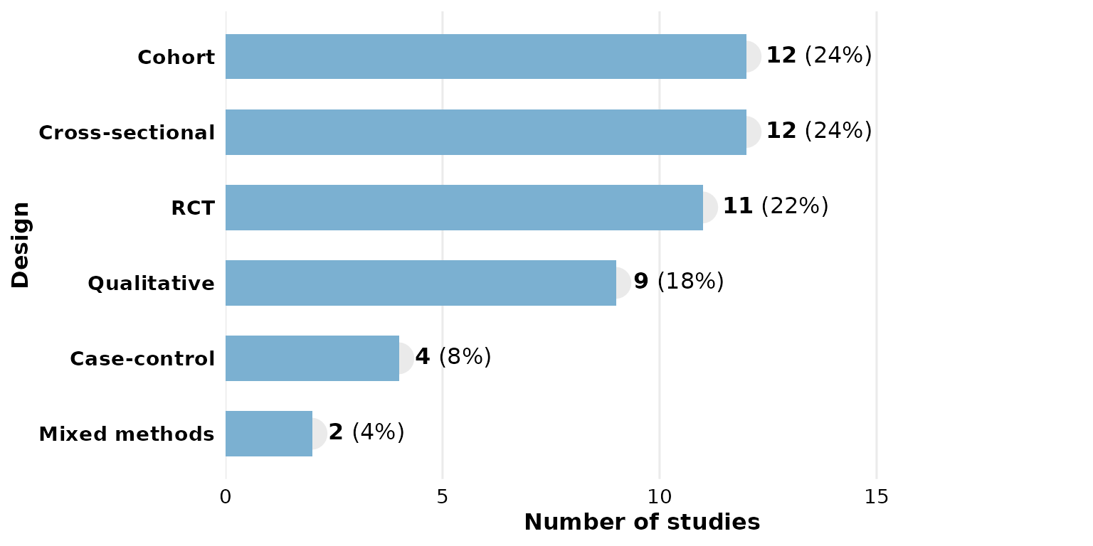
col: the column to summarize
Any categorical column works. Multi-value columns (cells holding
several values) are split first — see sep below.
reviewBar(studies, Setting)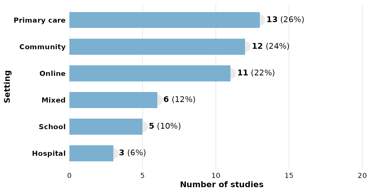
fill: bar color
A single hex color paints every bar:
reviewBar(studies, Design, fill = "#59a14f")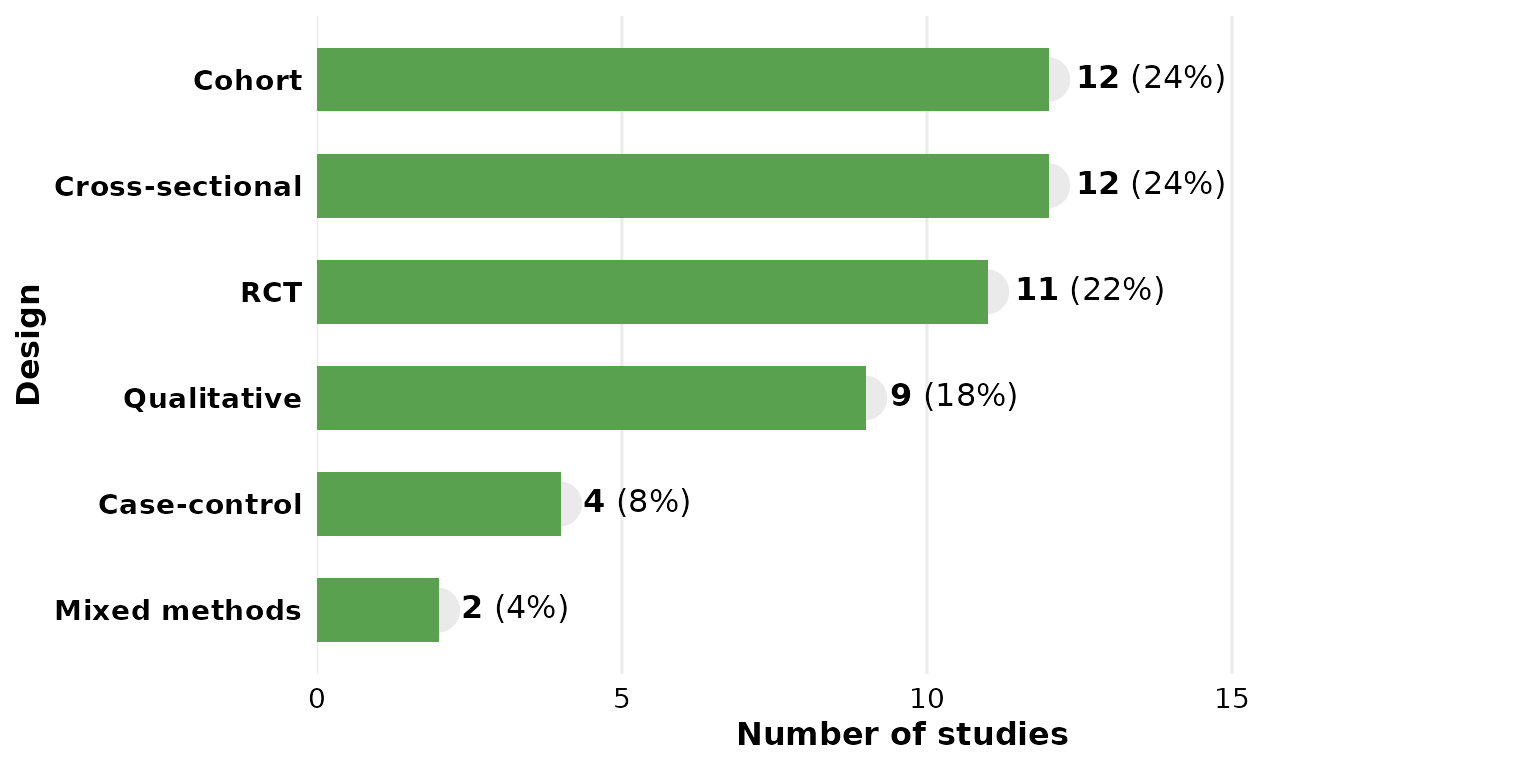
Use one of the package PALETTE colors:
reviewBar(studies, Design, fill = PALETTE[4])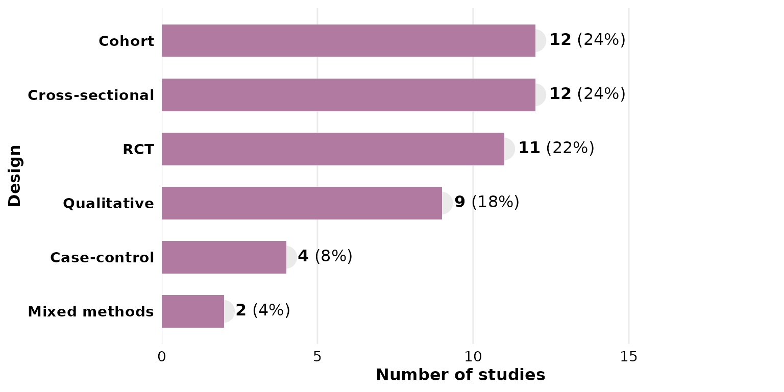
Passing a vector of colors maps one color per bar (recycled if shorter than the number of categories):
reviewBar(studies, Design, fill = PALETTE)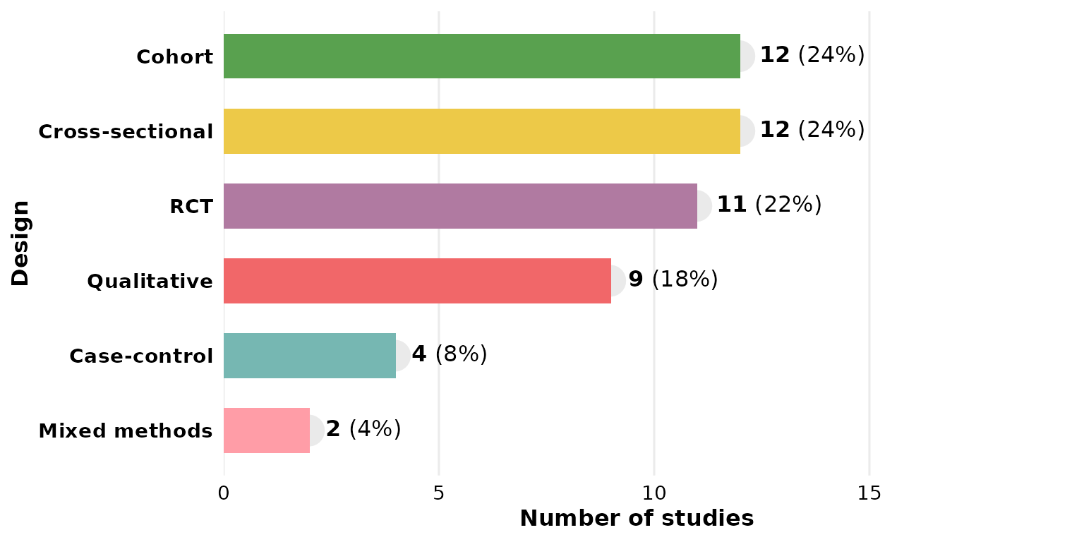
A named vector pins specific colors to specific categories:
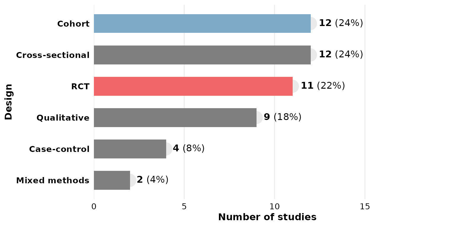
width: bar thickness
width runs from 0 to 1 (fraction of the available band).
Thin bars:
reviewBar(studies, Design, width = 0.3)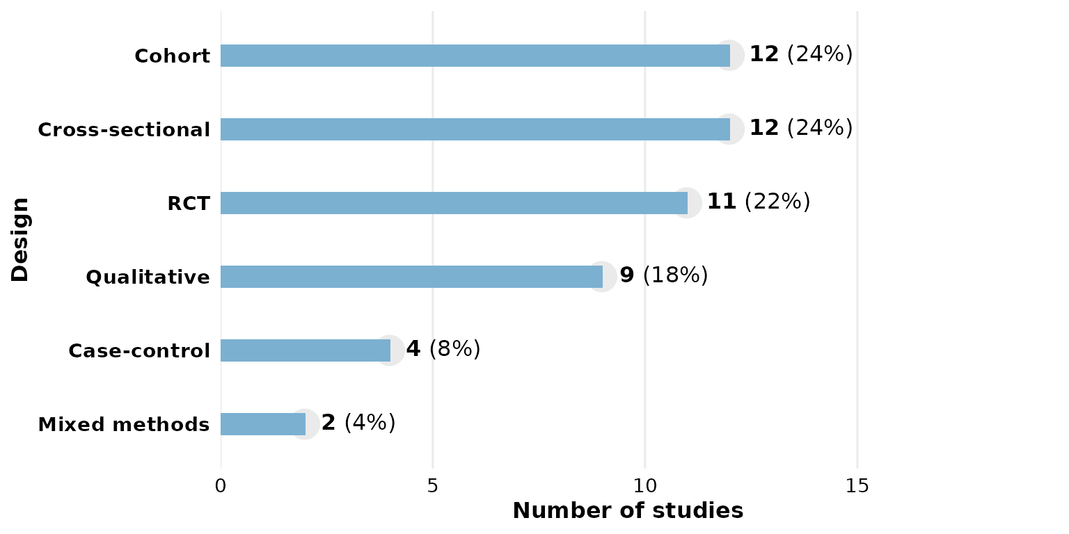
Full-width bars:
reviewBar(studies, Design, width = 1)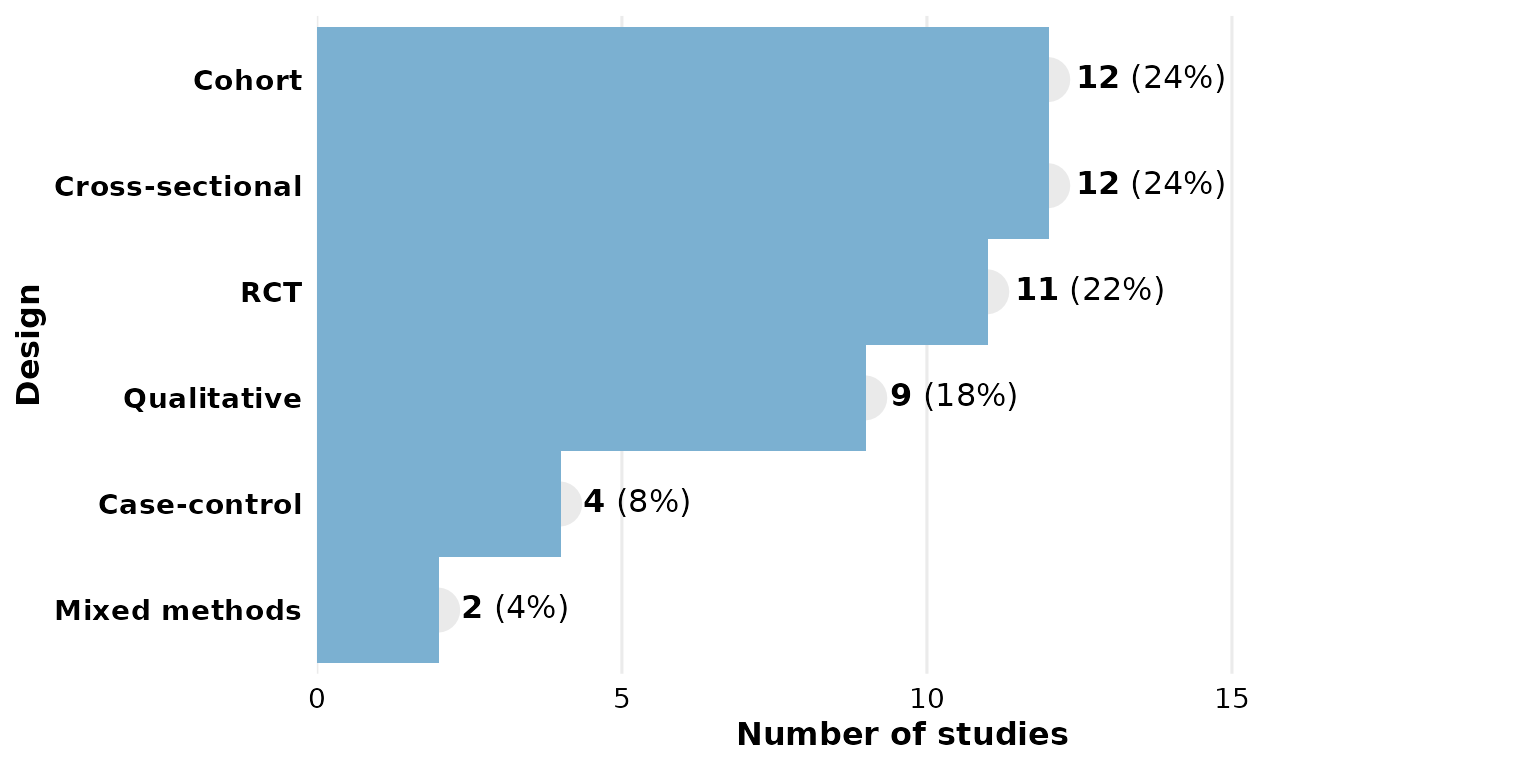
sep: multi-value separator
Some cells hold several values. In studies,
Outcome uses newline separators ("\r\n", the
default), so each value is counted independently:
reviewBar(studies, Outcome)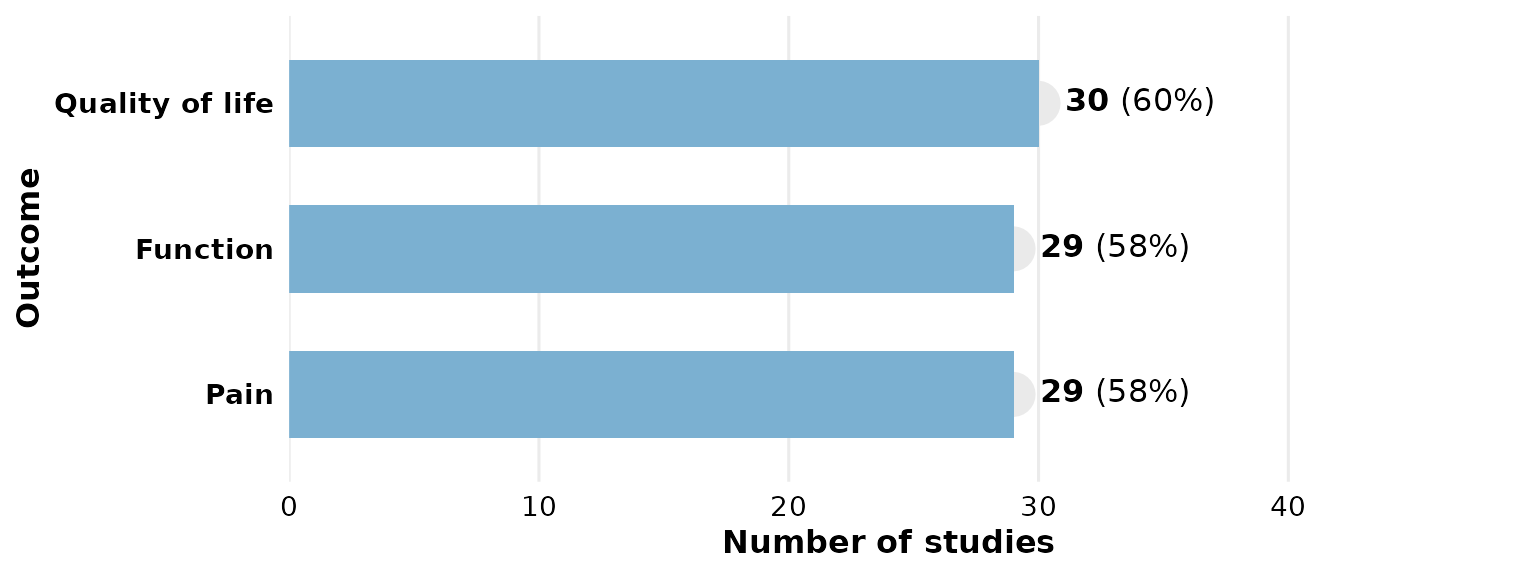
If your data uses a different delimiter, set sep. Here
we rebuild a semicolon-separated column to demonstrate:
studies_semi <- studies
studies_semi$Outcome <- gsub("\r\n", "; ", studies_semi$Outcome)
reviewBar(studies_semi, Outcome, sep = "; ")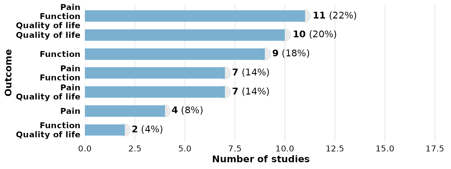
studlabs and study_id: label bars with
study IDs
Set studlabs = TRUE to overlay the contributing study
identifiers on each bar. This requires the ggfittext
package.
reviewBar(studies, Design, fill = PALETTE[2], studlabs = TRUE)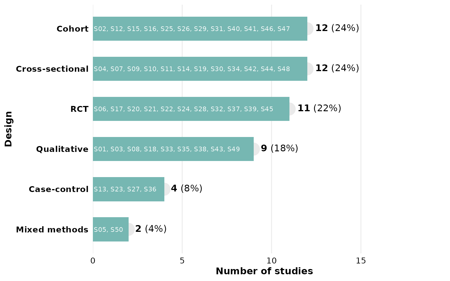
study_id selects which column supplies those identifiers
(default StudyID). Here we label with the author
instead:
reviewBar(studies, Design, studlabs = TRUE, study_id = Author)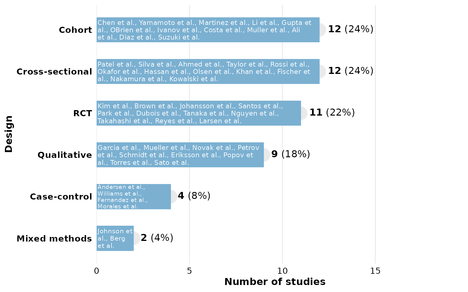
label_space: room for the count labels
The count/percentage labels sit to the right of each bar. If a long
label is clipped, increase label_space (a multiplier on the
x-axis headroom, default 1.6). Country names are long, so
give them more room:
reviewBar(studies, Country, fill = PALETTE[6], label_space = 2)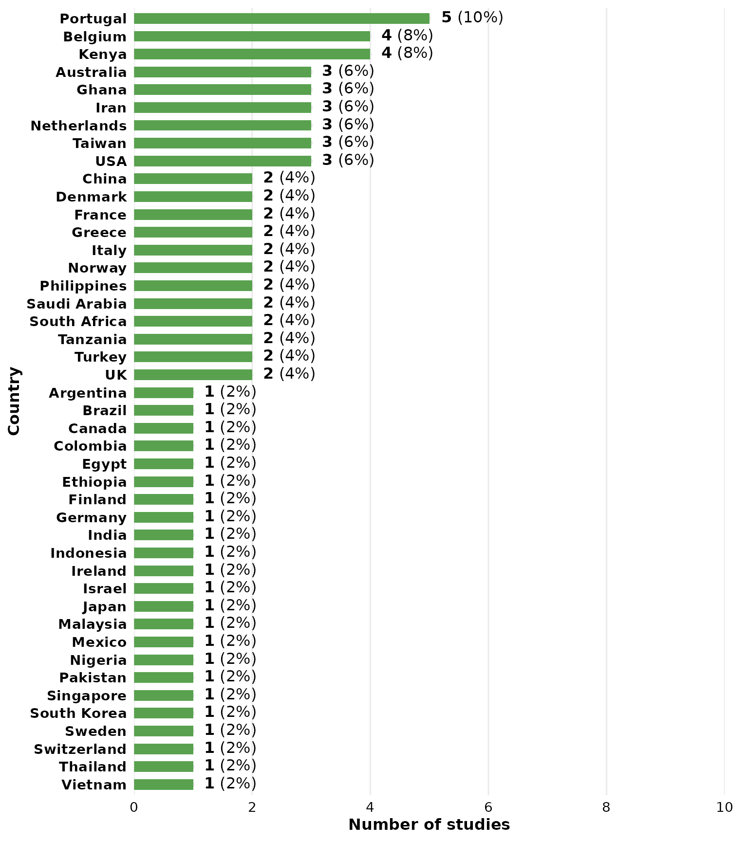
A tighter value packs the plot horizontally:
reviewBar(studies, Design, label_space = 1.2)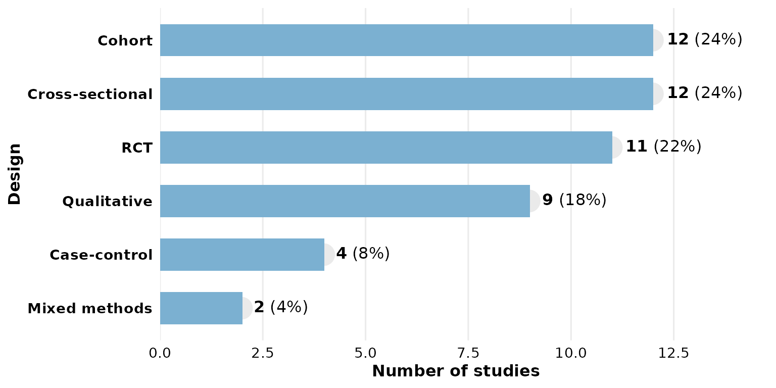
base_size: overall text and element scaling
A single knob scales all text and spacing proportionally. Smaller, for multi-panel figures:
reviewBar(studies, Design, base_size = 9)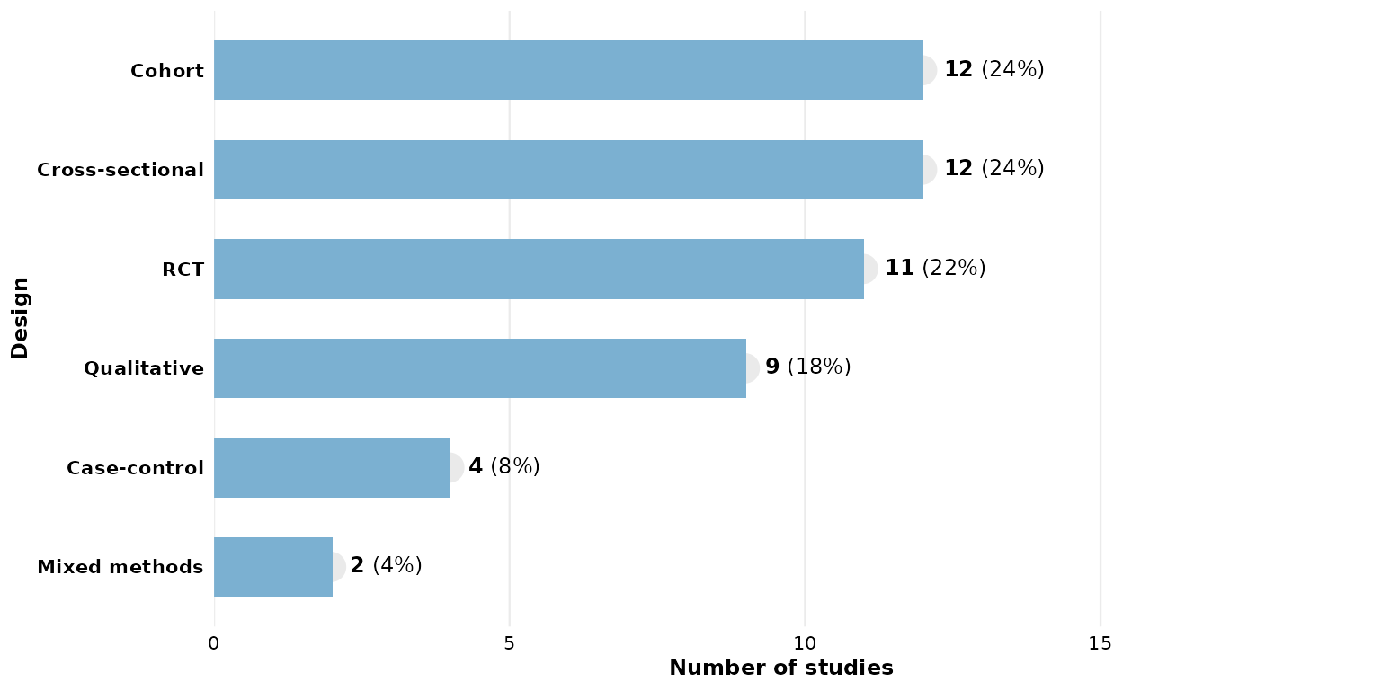
Larger, for slides or posters:
reviewBar(studies, Design, base_size = 18)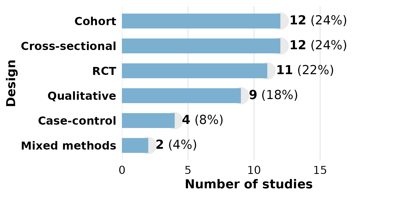
Missing data: na.rm, na_label,
na_in_percent, na_last
These four arguments control how NA (and empty) cells
are treated. We use a column that actually has missing values —
FundingSource.
By default na.rm = TRUE drops missing rows, but the
percentage denominator is still the full sample, so the shown
percentages need not sum to 100%:
reviewBar(studies, FundingSource)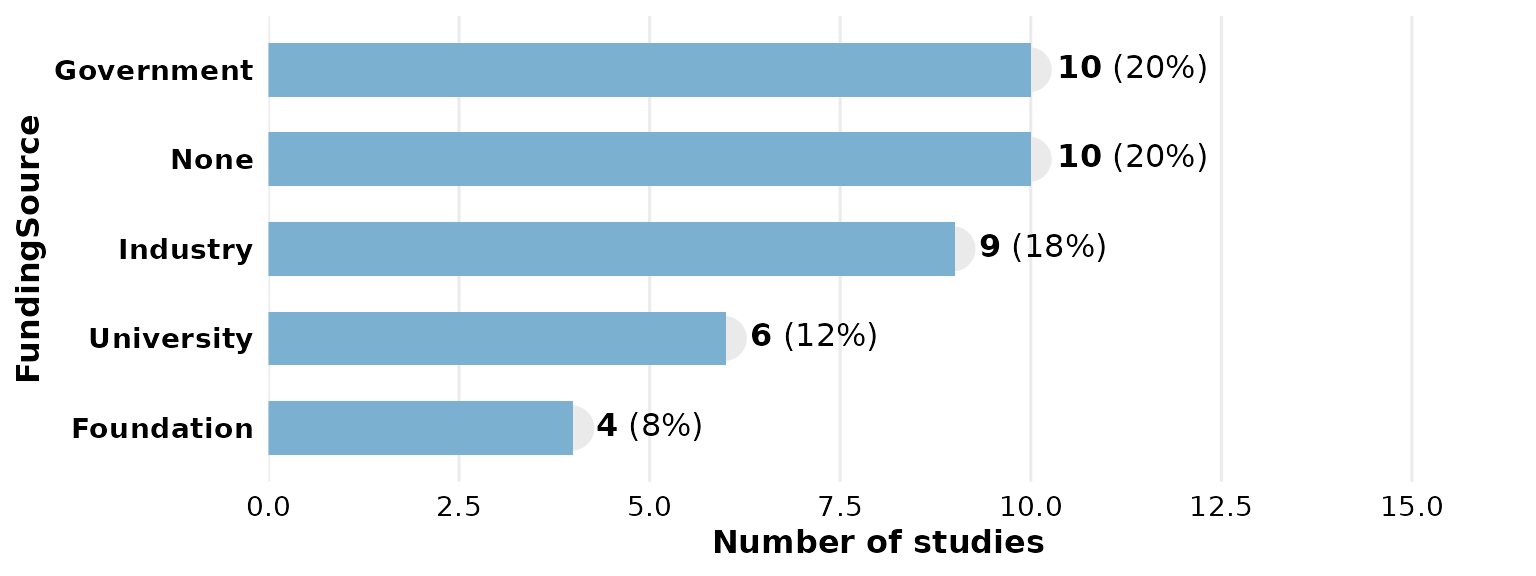
Keep the missing rows as their own category with
na.rm = FALSE; na_label sets its name:
reviewBar(studies, FundingSource, na.rm = FALSE, na_label = "Not reported")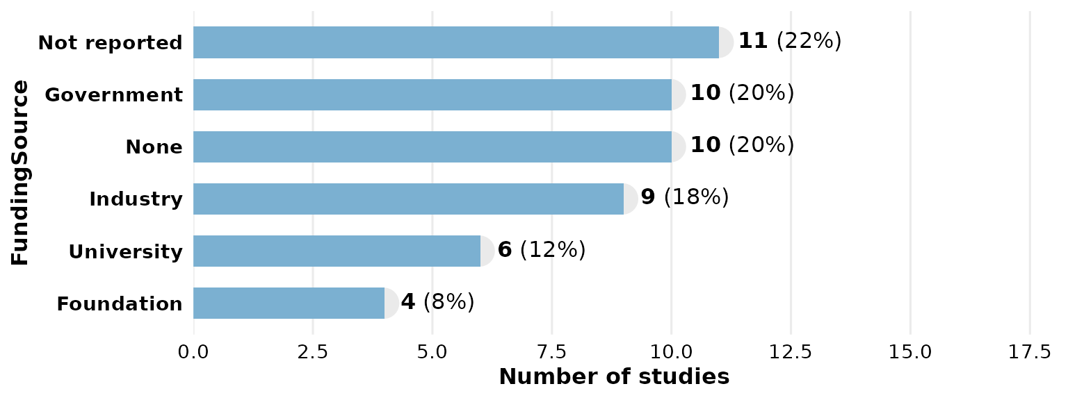
With na_in_percent = FALSE the denominator excludes
missing rows, so the reported categories sum to 100%:
reviewBar(studies, FundingSource, na.rm = FALSE, na_in_percent = FALSE)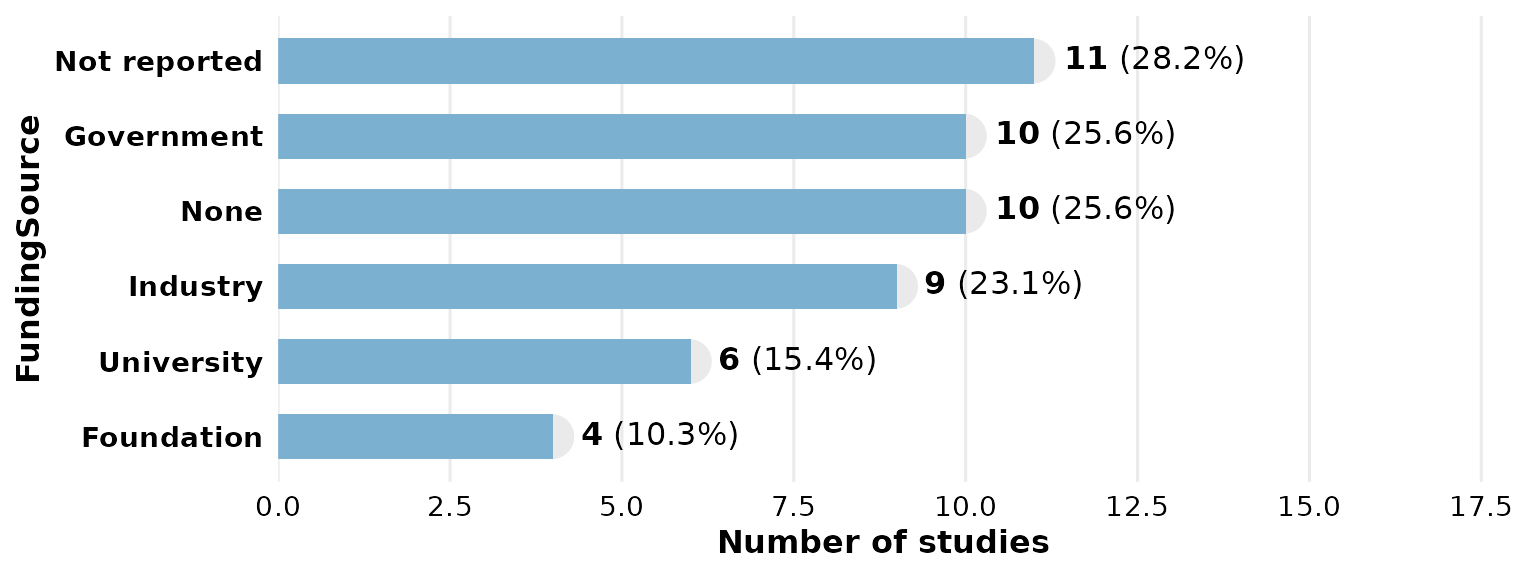
na_last = TRUE forces the missing-value bar to the end
(bottom) regardless of its frequency:
reviewBar(studies, FundingSource, na.rm = FALSE, na_last = TRUE)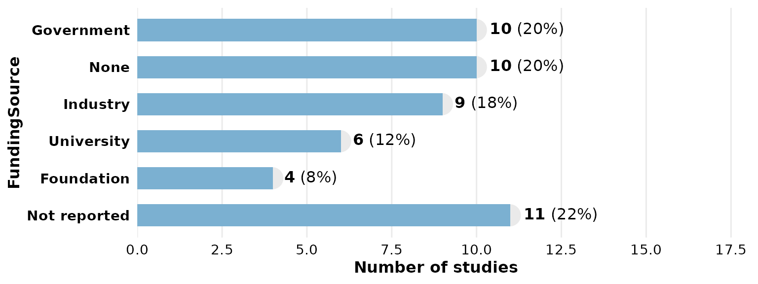
Composing with ggplot2
Every review*() function returns a plain ggplot, so you
can keep adding layers, scales, and labels with +:
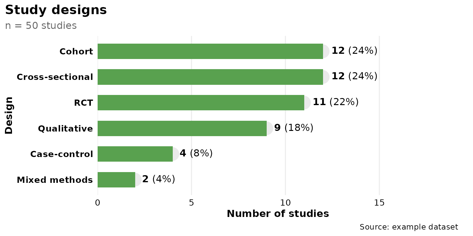
reviewBar(studies, Design, fill = "#59a14f") +
  labs(title = "Study designs", subtitle = "n = 50 studies",
       caption = "Source: example dataset") +
  theme(plot.title.position = "plot")