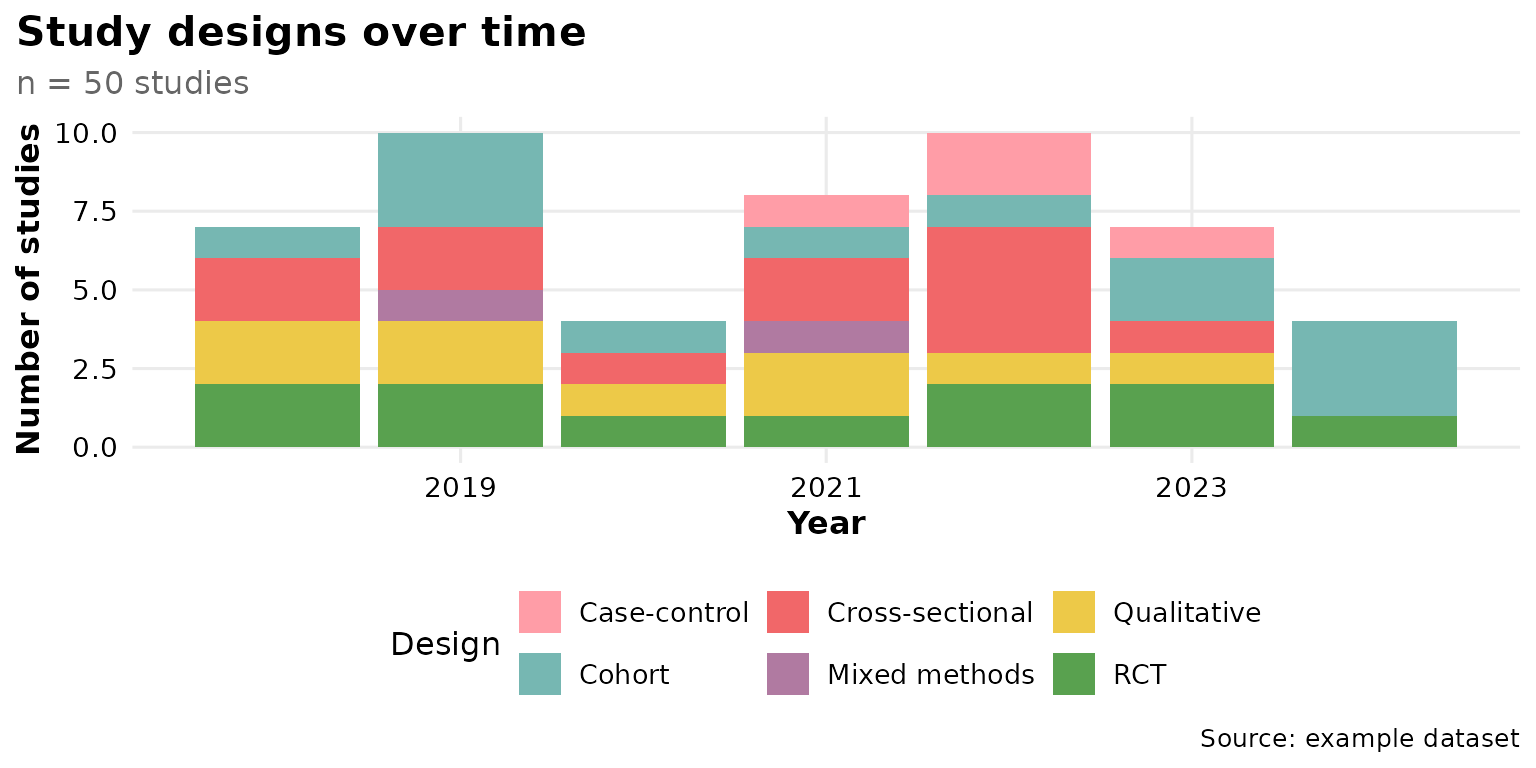
reviewTrend() shows how the values of one column
distribute across publication years, drawing one stacked bar per year.
It answers questions like “which study designs have grown over time?”.
This article walks through every argument of
reviewTrend(data, col, year_col = Year, sep = "\r\n", colors = PALETTE,
            base_size = 12, na.rm = TRUE, na_label = "Not reported",
            labels = c("none", "count", "percent", "both", "studies"),
            study_id = StudyID)
Default
Pass the data frame and a column. Column names may be bare or quoted.
Each year becomes a stacked bar whose segments are the categories of
col, and the y-axis counts studies.
reviewTrend(studies, Design)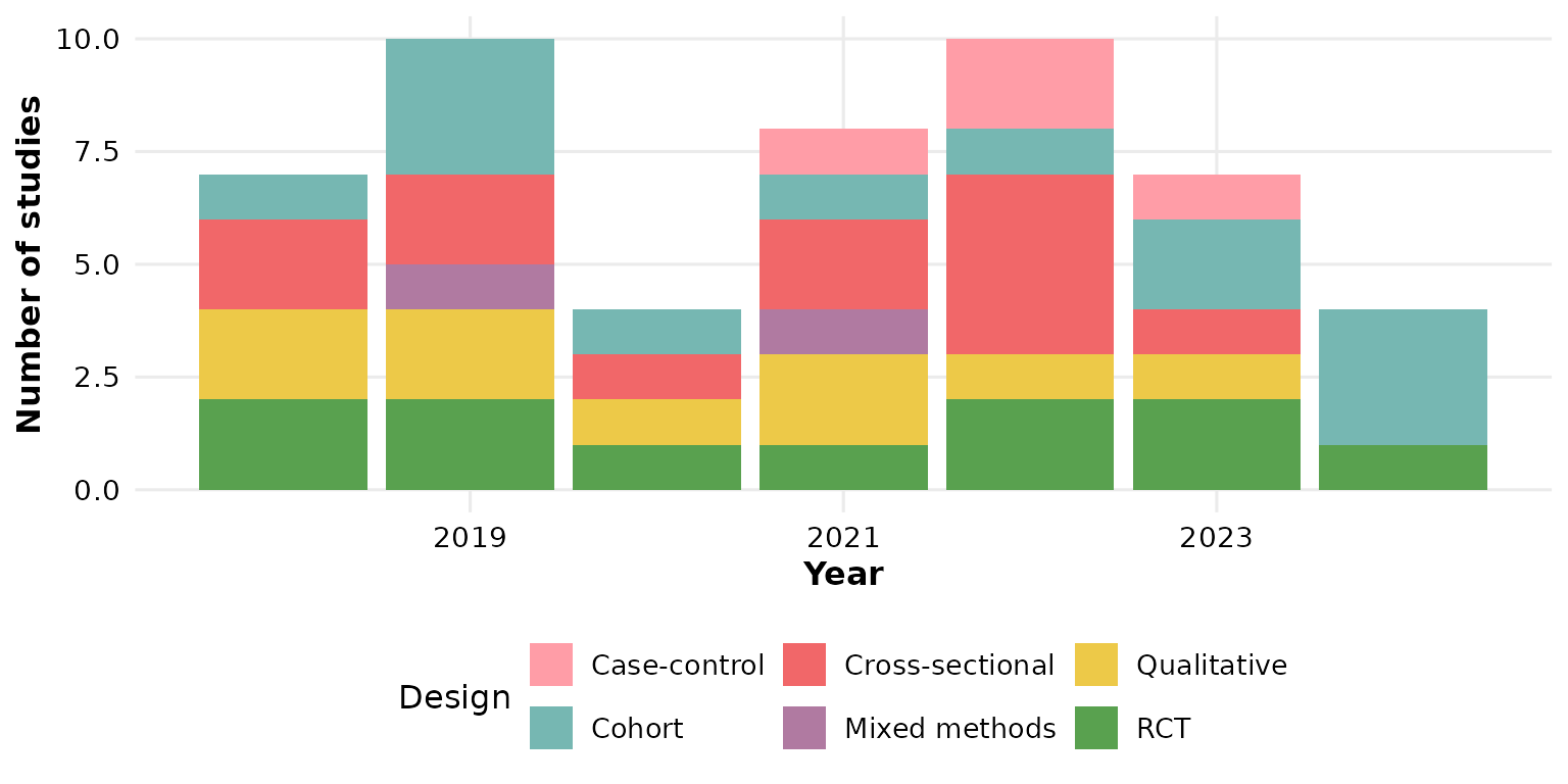
col: the column to track
Any categorical column works. Here we track the analysis setting over time:
reviewTrend(studies, Setting)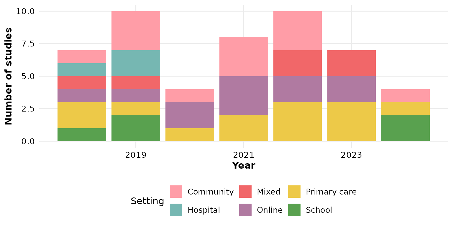
Multi-value columns (cells holding several values) are split first,
so each value is counted independently in its year — see sep below.
Outcome is such a column:
reviewTrend(studies, Outcome)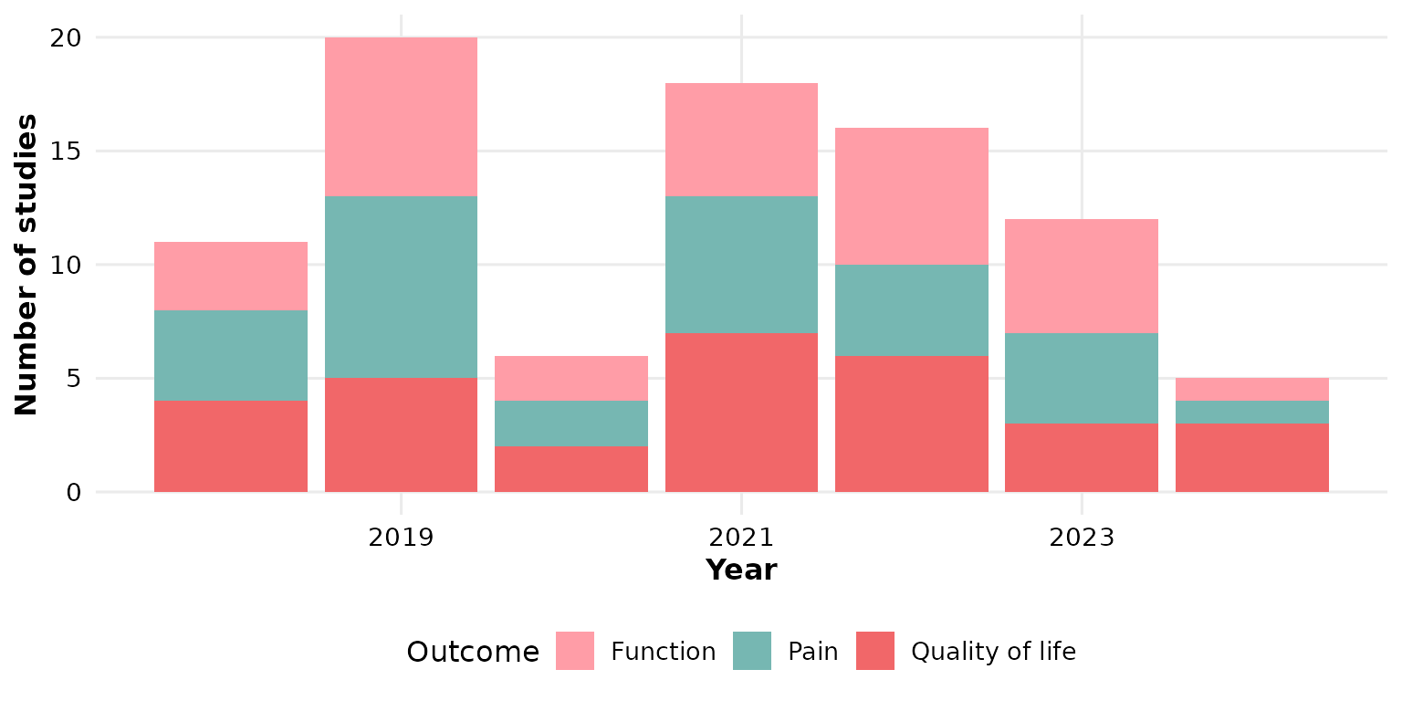
year_col: the year column
By default the years come from the Year column. If your
data names it differently, pass year_col. Below we rename
the column and point reviewTrend() at it explicitly:
studies_pubyear <- studies
studies_pubyear$PubYear <- studies_pubyear$Year
reviewTrend(studies_pubyear, Design, year_col = PubYear)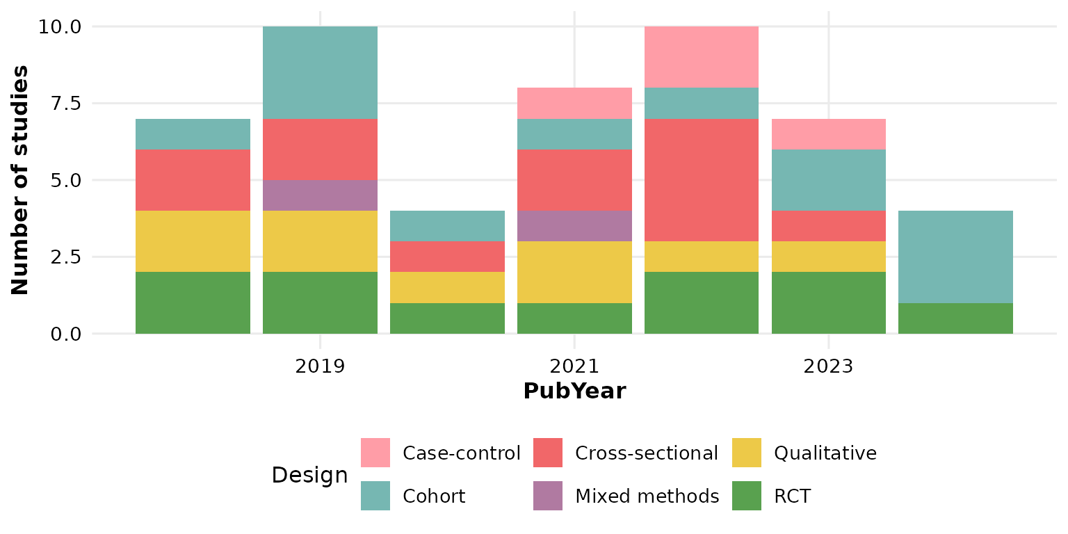
sep: multi-value separator
Cells holding several values are split on sep before
counting. In studies, Outcome uses newline
separators ("\r\n", the default). If your data uses a
different delimiter, set sep. Here we rebuild a
semicolon-separated column to demonstrate:
studies_semi <- studies
studies_semi$Outcome <- gsub("\r\n", "; ", studies_semi$Outcome)
reviewTrend(studies_semi, Outcome, sep = "; ")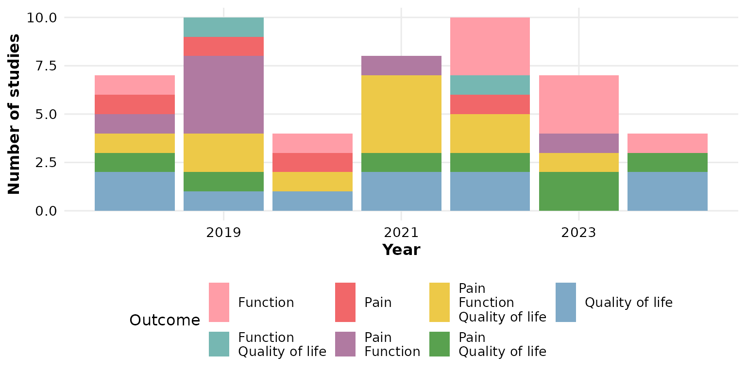
colors: the fill palette
Segments are filled by cycling through colors, which
defaults to the package PALETTE:
reviewTrend(studies, Design, colors = PALETTE)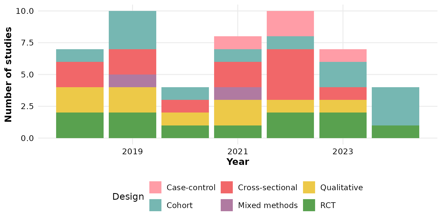
Pass a custom vector to restyle every category (recycled if shorter than the number of categories):
reviewTrend(studies, Design,
            colors = c("#264653", "#2a9d8f", "#e9c46a", "#f4a261",
                       "#e76f51", "#8ab17d"))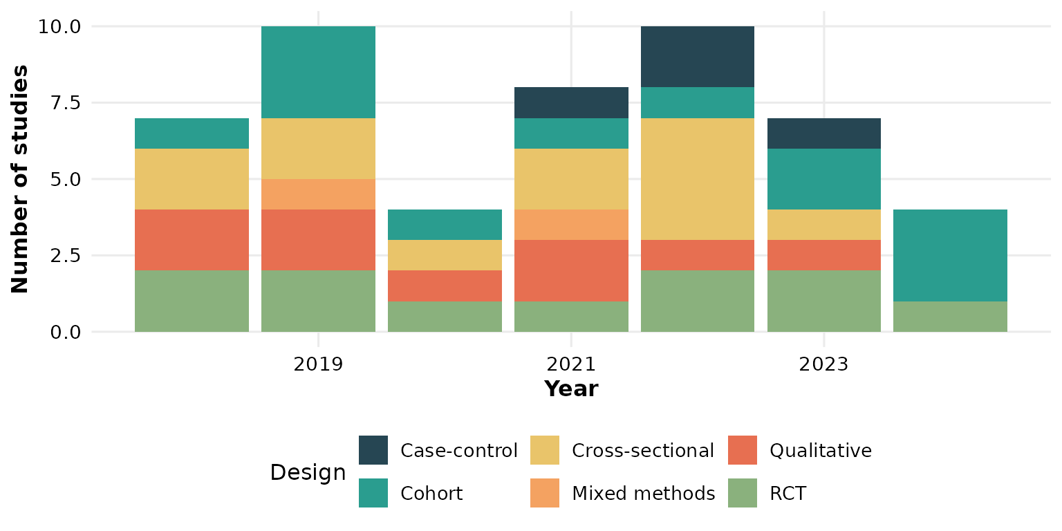
A named vector pins specific colors to specific categories:
reviewTrend(studies, Design,
            colors = c("RCT" = "#f16769", "Cohort" = "#7ea9c7",
                       "Qualitative" = "#59a14f", "Cross-sectional" = "#edc948",
                       "Mixed methods" = "#b07aa1", "Case-control" = "#76b7b2"))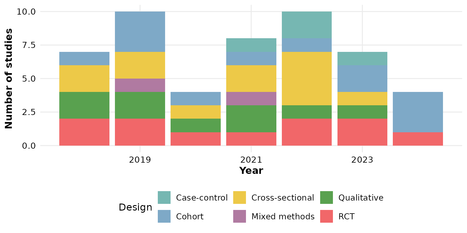
base_size: overall text and element scaling
A single knob scales all text and spacing proportionally. Smaller, for multi-panel figures:
reviewTrend(studies, Design, base_size = 9)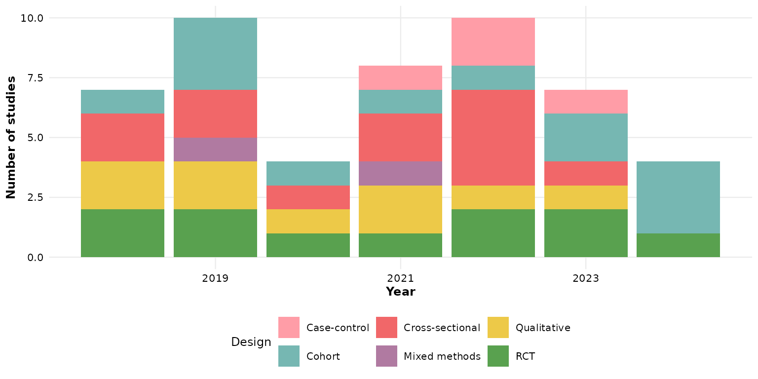
Larger, for slides or posters:
reviewTrend(studies, Design, base_size = 18)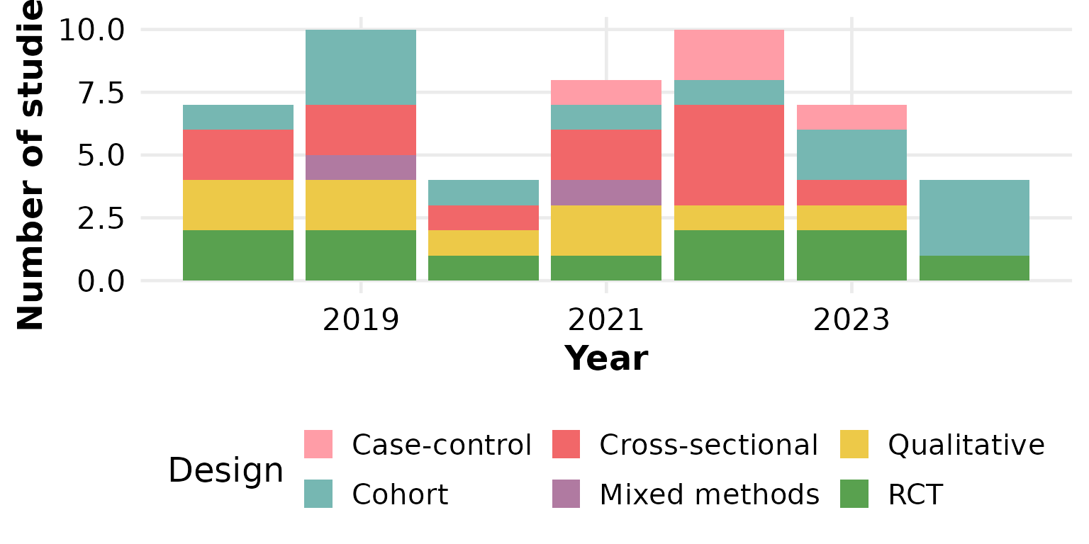
Missing data: na.rm and na_label
These two arguments control how NA (and empty) cells are
treated. We use a column that actually has missing values —
FundingSource.
By default na.rm = TRUE drops missing rows entirely:
reviewTrend(studies, FundingSource)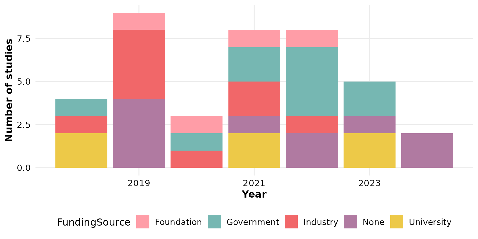
Keep the missing rows as their own category with
na.rm = FALSE; na_label sets the name of that
category:
reviewTrend(studies, FundingSource, na.rm = FALSE, na_label = "Not reported")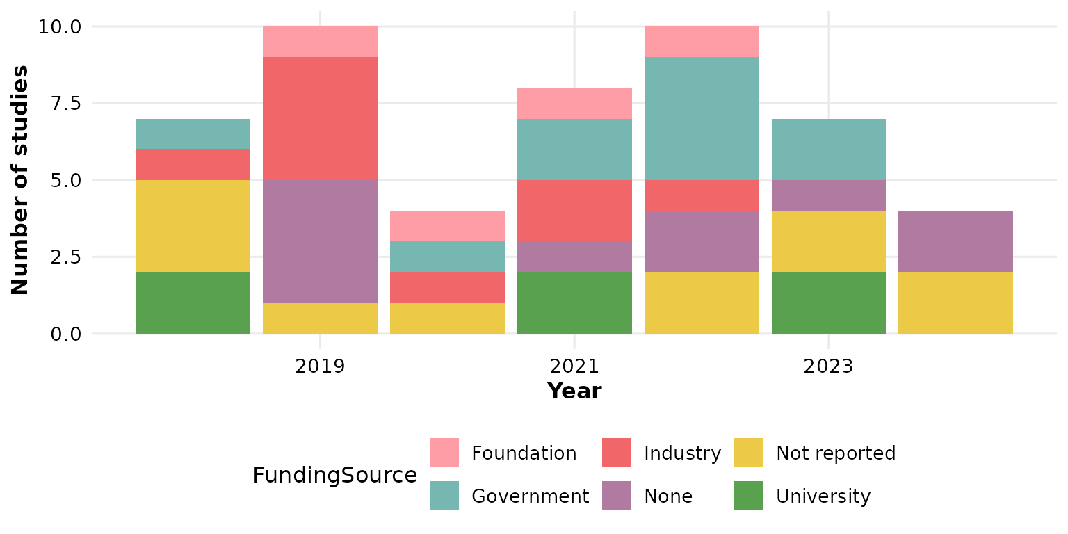
labels: what to print on each segment
labels controls the text overlaid on each stacked
segment. The default is "none" — clean bars with no
annotation:
reviewTrend(studies, Design, labels = "none")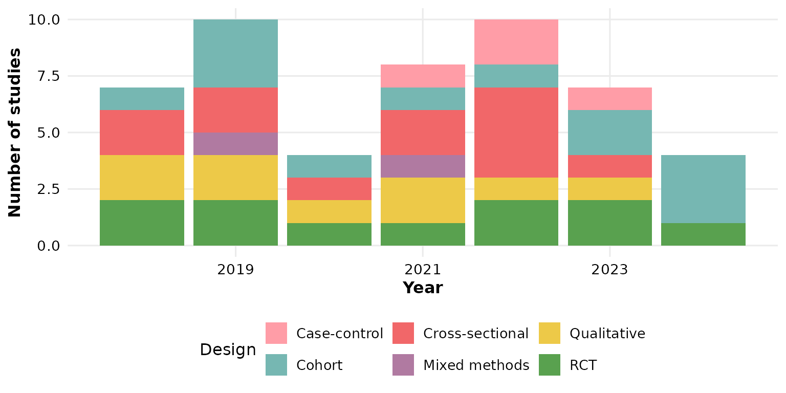
"count" prints the number of studies in each
segment:
reviewTrend(studies, Design, labels = "count")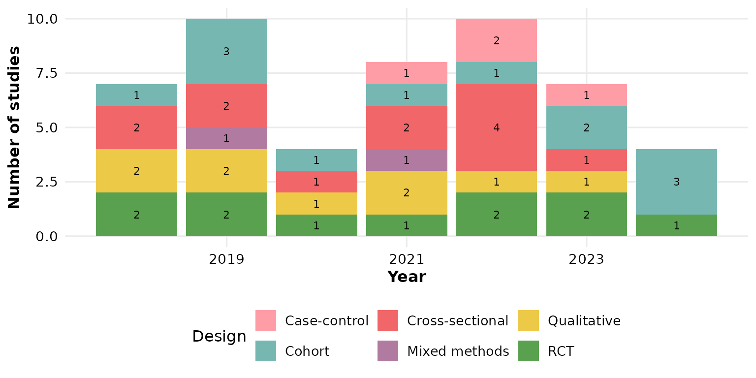
"percent" prints each segment’s share within its
year, so the segments of one bar sum to 100%:
reviewTrend(studies, Design, labels = "percent")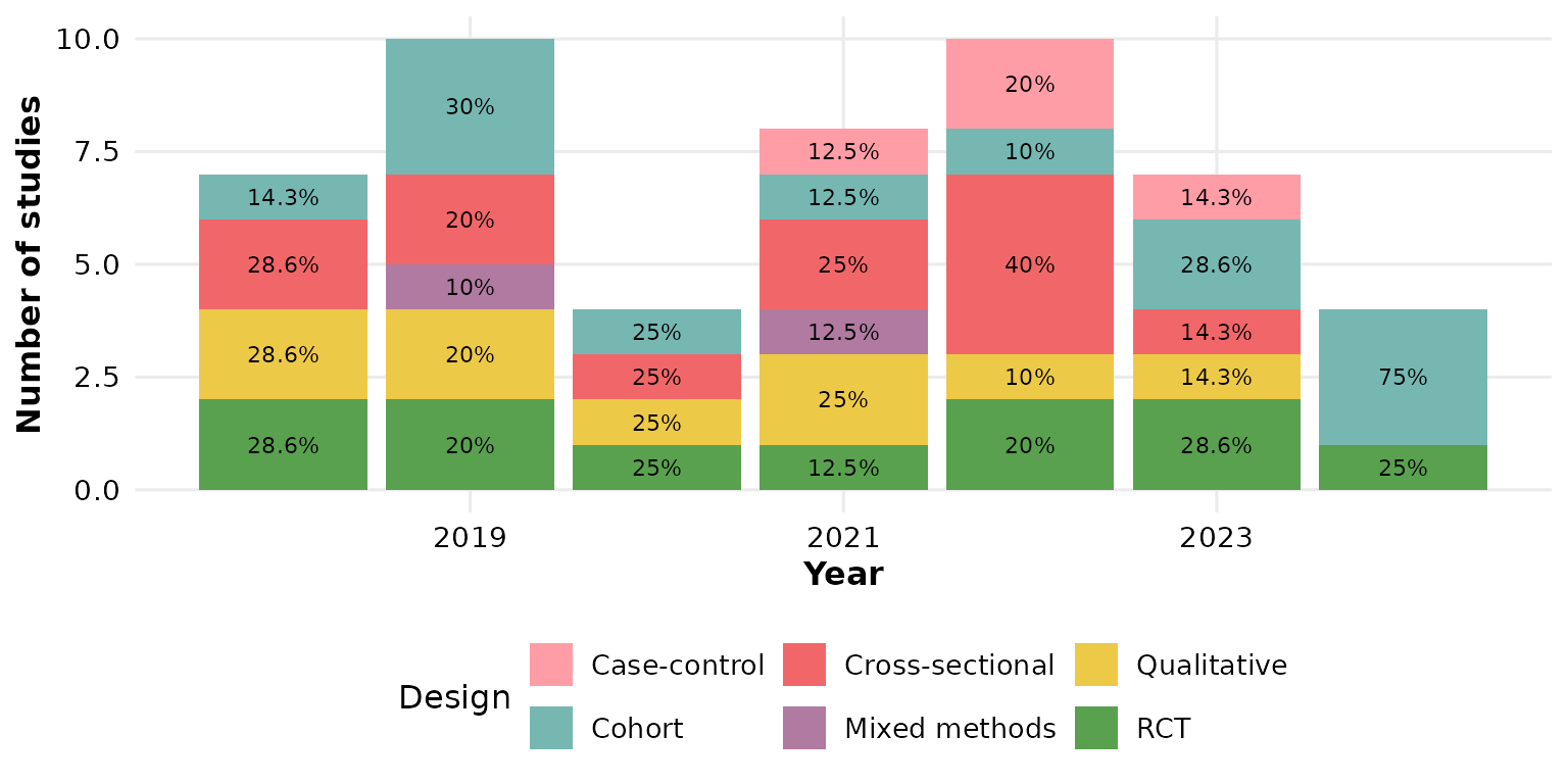
"both" combines the two, showing count and within-year
percentage:
reviewTrend(studies, Design, labels = "both")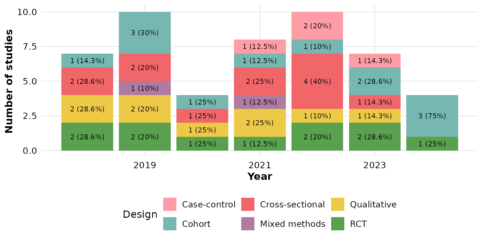
"studies" overlays the contributing study identifiers
themselves, one per line. This is most legible when categories are few,
so give the panel some height:
reviewTrend(studies, Design, labels = "studies")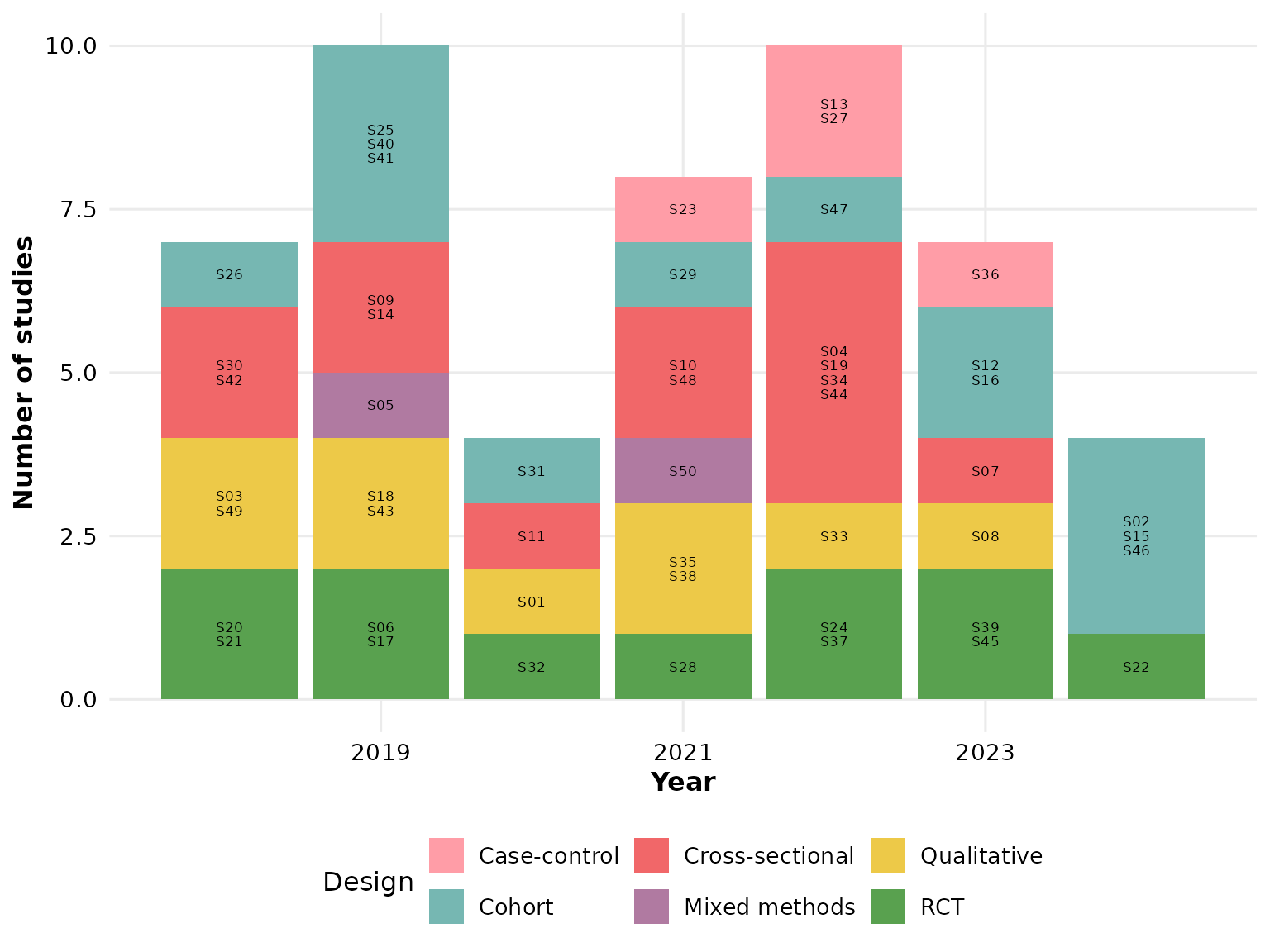
study_id: which column supplies the IDs
When labels = "studies", the study_id
column provides the identifiers (default StudyID). Point it
at any ID-like column — here we label with the author instead:
reviewTrend(studies, Design, labels = "studies", study_id = Author)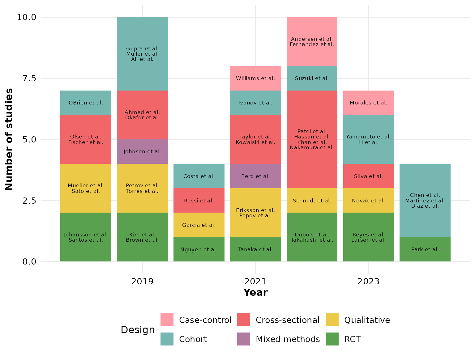
Composing with ggplot2
Every review*() function returns a plain ggplot, so you
can keep adding layers, scales, and labels with +:
reviewTrend(studies, Design, colors = PALETTE) +
  labs(title = "Study designs over time", subtitle = "n = 50 studies",
       caption = "Source: example dataset") +
  theme(plot.title.position = "plot")