
Overview
litReview helps you summarize and visualize categorical
data extracted during a literature review. Every plot function returns a
standard ggplot that you can customize with +. Column names
can be passed bare or quoted.
library(litReview)
data(studies)
head(studies)
#>   StudyID       bibKey         Author Year
#> 1     S01 author1_2018  Garcia et al. 2020
#> 2     S02 author2_2022    Chen et al. 2024
#> 3     S03 author3_2018 Mueller et al. 2018
#> 4     S04 author4_2018   Patel et al. 2022
#> 5     S05 author5_2019 Johnson et al. 2019
#> 6     S06 author6_2021     Kim et al. 2019
#>                                                        Reference
#> 1  Garcia et al. (2020). Title of study S01. Journal Name, 1-10.
#> 2    Chen et al. (2024). Title of study S02. Journal Name, 1-10.
#> 3 Mueller et al. (2018). Title of study S03. Journal Name, 1-10.
#> 4   Patel et al. (2022). Title of study S04. Journal Name, 1-10.
#> 5 Johnson et al. (2019). Title of study S05. Journal Name, 1-10.
#> 6     Kim et al. (2019). Title of study S06. Journal Name, 1-10.
#>                             Country          Design SampleSize FollowUpWeeks
#> 1                             Egypt     Qualitative         50             8
#> 2                             Italy          Cohort        300             8
#> 3                    Nigeria\nGhana     Qualitative        300             4
#> 4 Saudi Arabia\nTurkey\nSwitzerland Cross-sectional        150             8
#> 5                            Mexico   Mixed methods         75            12
#> 6         Belgium\nSingapore\nIndia             RCT       1200            NA
#>               AgeGroup      Setting     Intervention
#> 1               Adults Primary care              CBT
#> 2             Children    Community        Education
#> 3         Older adults       Online         Combined
#> 4               Adults        Mixed         Combined
#> 5               Adults        Mixed         Exercise
#> 6 Adults\nOlder adults     Hospital CBT\nMindfulness
#>                           Outcome    AnalysisApproach RiskOfBias FundingSource
#> 1                        Function   Thematic analysis        Low          <NA>
#> 2                 Quality of life               ANOVA   Moderate          None
#> 3                 Quality of life               ANOVA        Low    University
#> 4 Pain\nFunction\nQuality of life Narrative synthesis        Low    Foundation
#> 5                            Pain               ANOVA       High          None
#> 6       Function\nQuality of life       Mixed methods        Low      Industry
#>   OpenAccess InterventionType    PubType Randomization Blinding
#> 1         No       Behavioral Conference          <NA>     <NA>
#> 2        Yes      Educational    Journal          <NA>     <NA>
#> 3         No       Multimodal Conference          <NA>     <NA>
#> 4         No       Multimodal Conference          <NA>     <NA>
#> 5         No         Physical    Journal          <NA>     <NA>
#> 6         No       Behavioral Conference             P        F
#>   SampleJustification AttritionReported EthicsApproval Preregistration
#> 1                   F                 F              P            <NA>
#> 2                <NA>              <NA>              F            <NA>
#> 3                   P                 F              F            <NA>
#> 4                   P              <NA>           <NA>               P
#> 5                   M                 P           <NA>            <NA>
#> 6                   F                 M              F               P
#>   EffectSize LimitationsDiscussed
#> 1       <NA>                    P
#> 2          M                    P
#> 3          M                    F
#> 4          F                    P
#> 5          F                    P
#> 6          F                    P
Bar chart
reviewBar() produces a horizontal bar chart with
frequency and percentage labels.
reviewBar(studies, Design)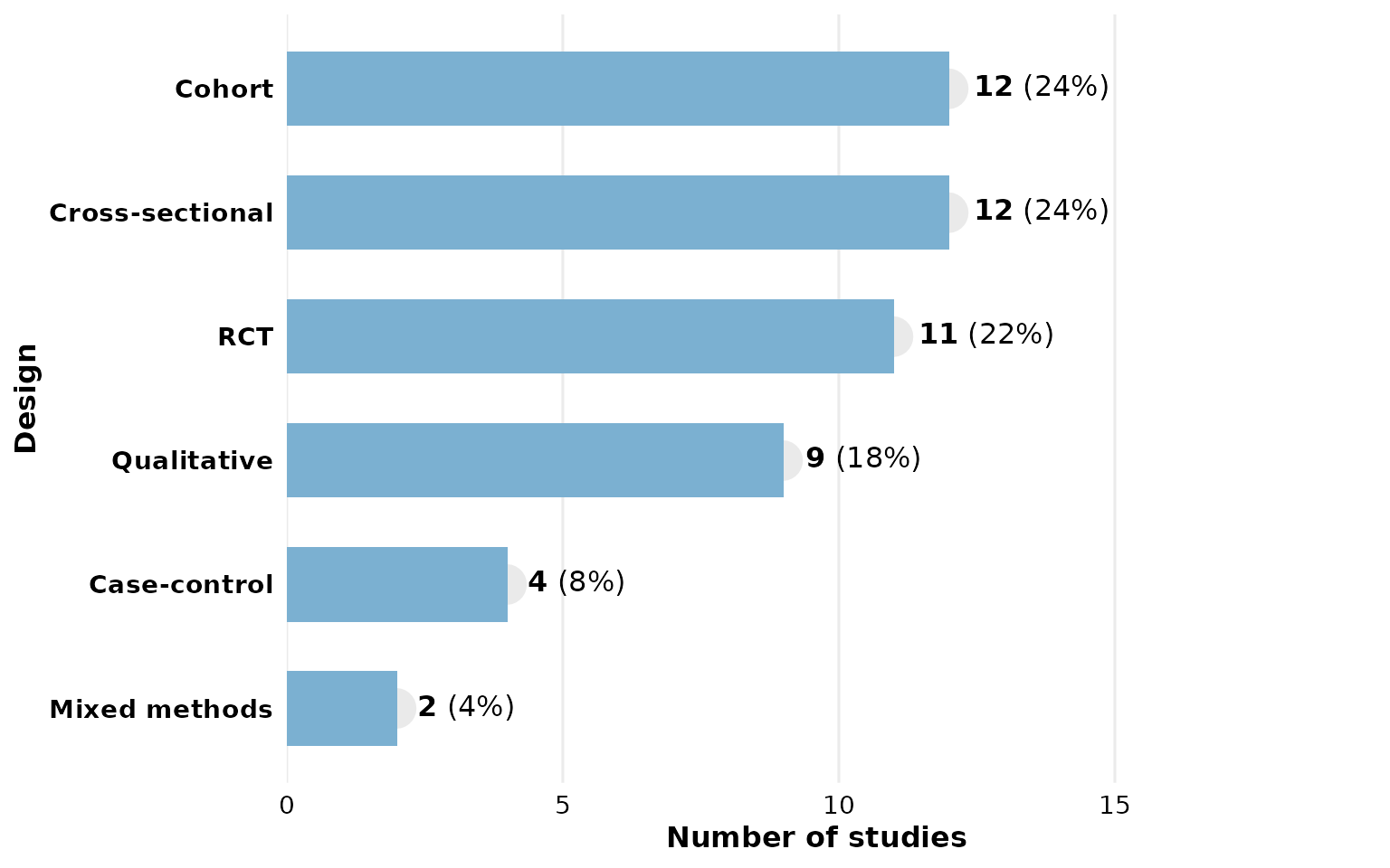
Customize with + like any ggplot:
library(ggplot2)
reviewBar(studies, Design, fill = "#59a14f") +
  labs(title = "Study Designs", subtitle = "n = 12 studies")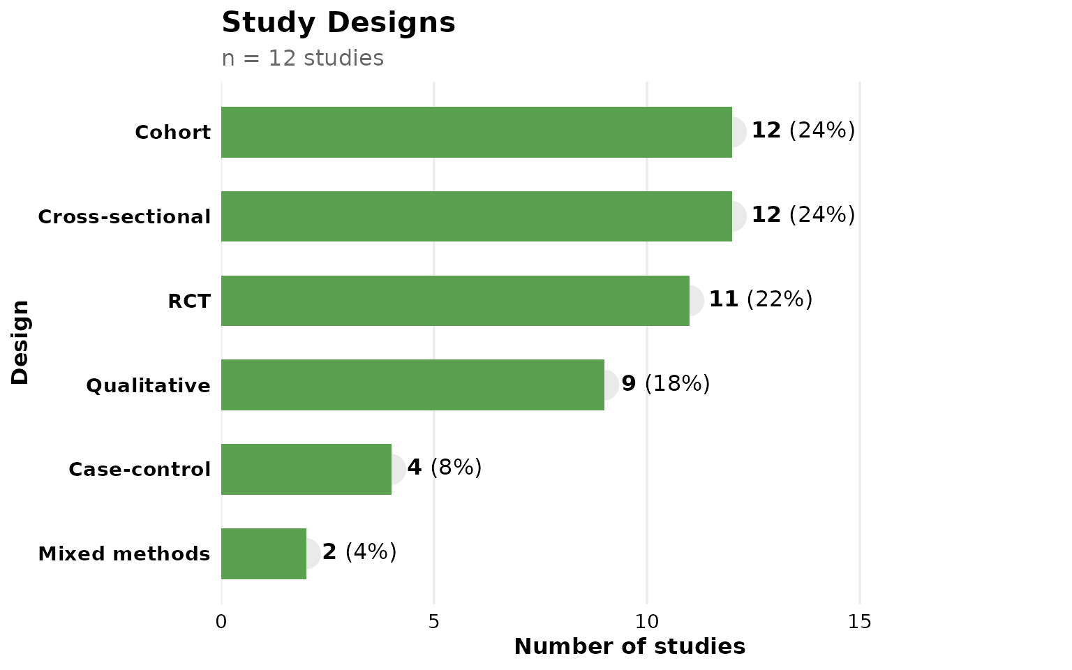
Study labels on bars
Set studlabs = TRUE to overlay the contributing study
IDs on each bar:
reviewBar(studies, Design, fill = PALETTE[2], studlabs = TRUE)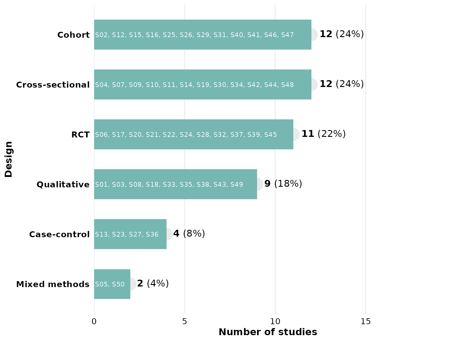
Multi-value columns
The Outcome column contains multiple values per cell
separated by "\r\n":
reviewBar(studies, Outcome, fill = PALETTE[4], width = 0.6)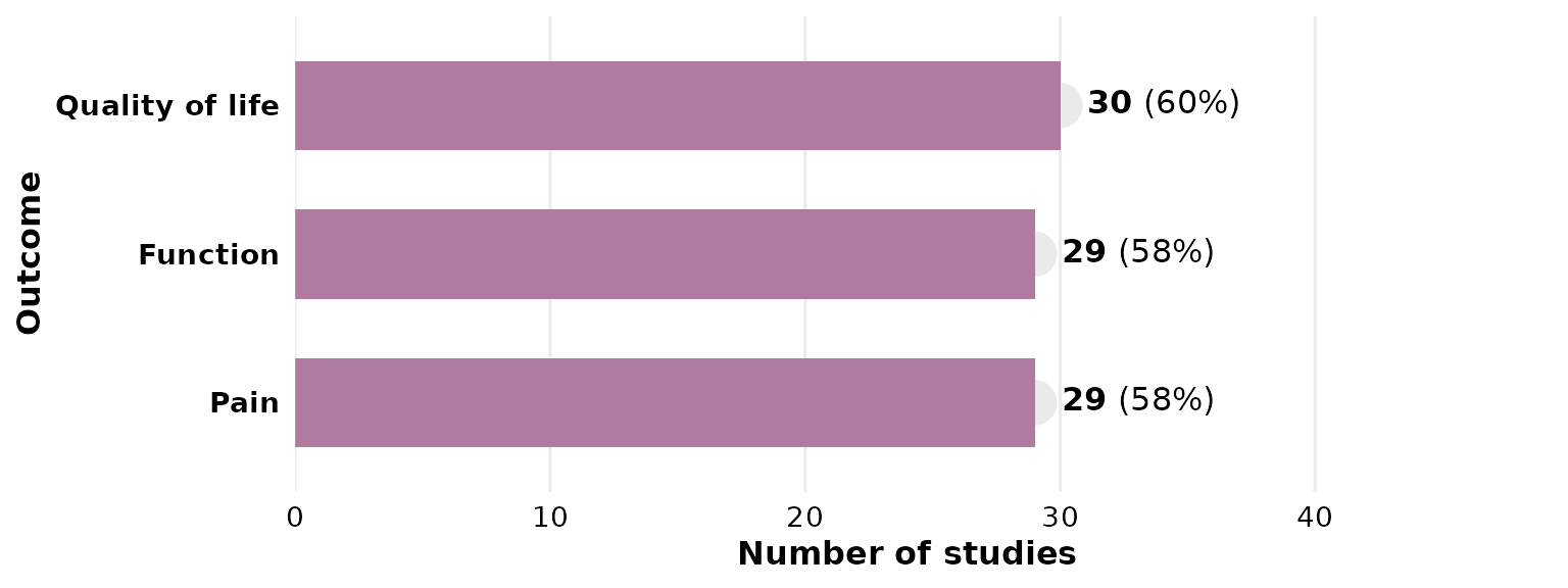
Adjusting label space
If labels are clipped, increase label_space (default
1.6):
reviewBar(studies, Country, fill = PALETTE[6], label_space = 2)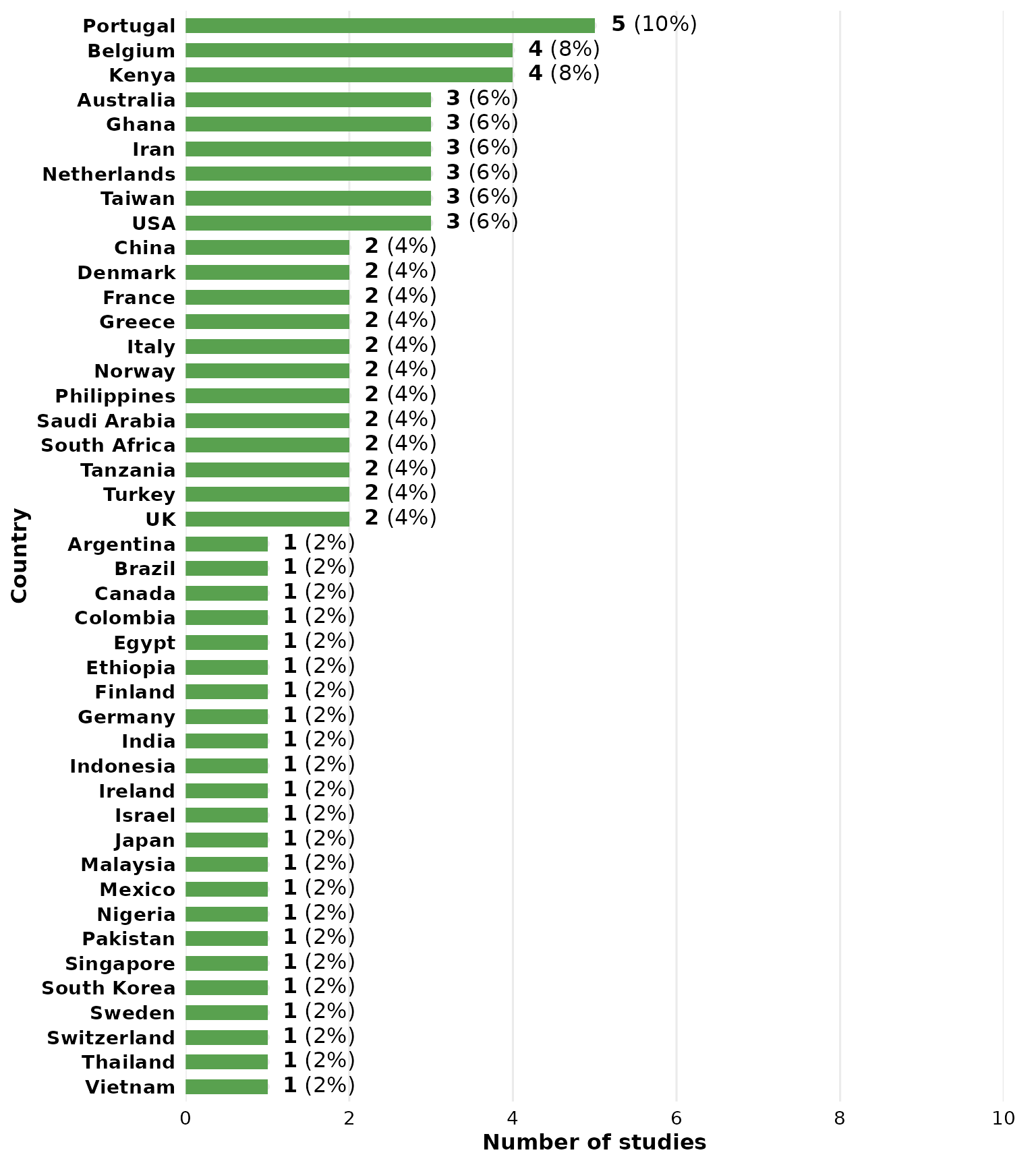
Stacked / grouped bar chart
reviewStackedBar() cross-tabulates a primary category
against a second grouping variable, drawing one horizontal bar per
category split by group. By default (position = "fill")
each bar is scaled to 100%, so you can compare composition across
categories:
reviewStackedBar(studies, Design, RiskOfBias)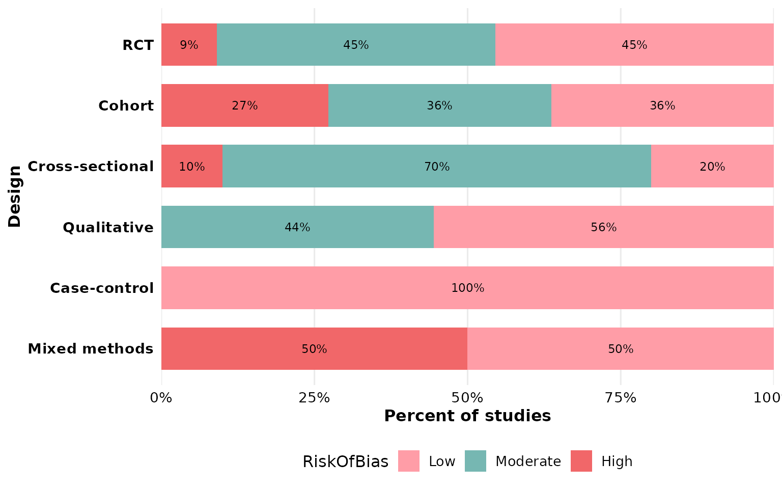
Use position = "stack" to show raw counts instead:
reviewStackedBar(studies, Design, RiskOfBias, position = "stack")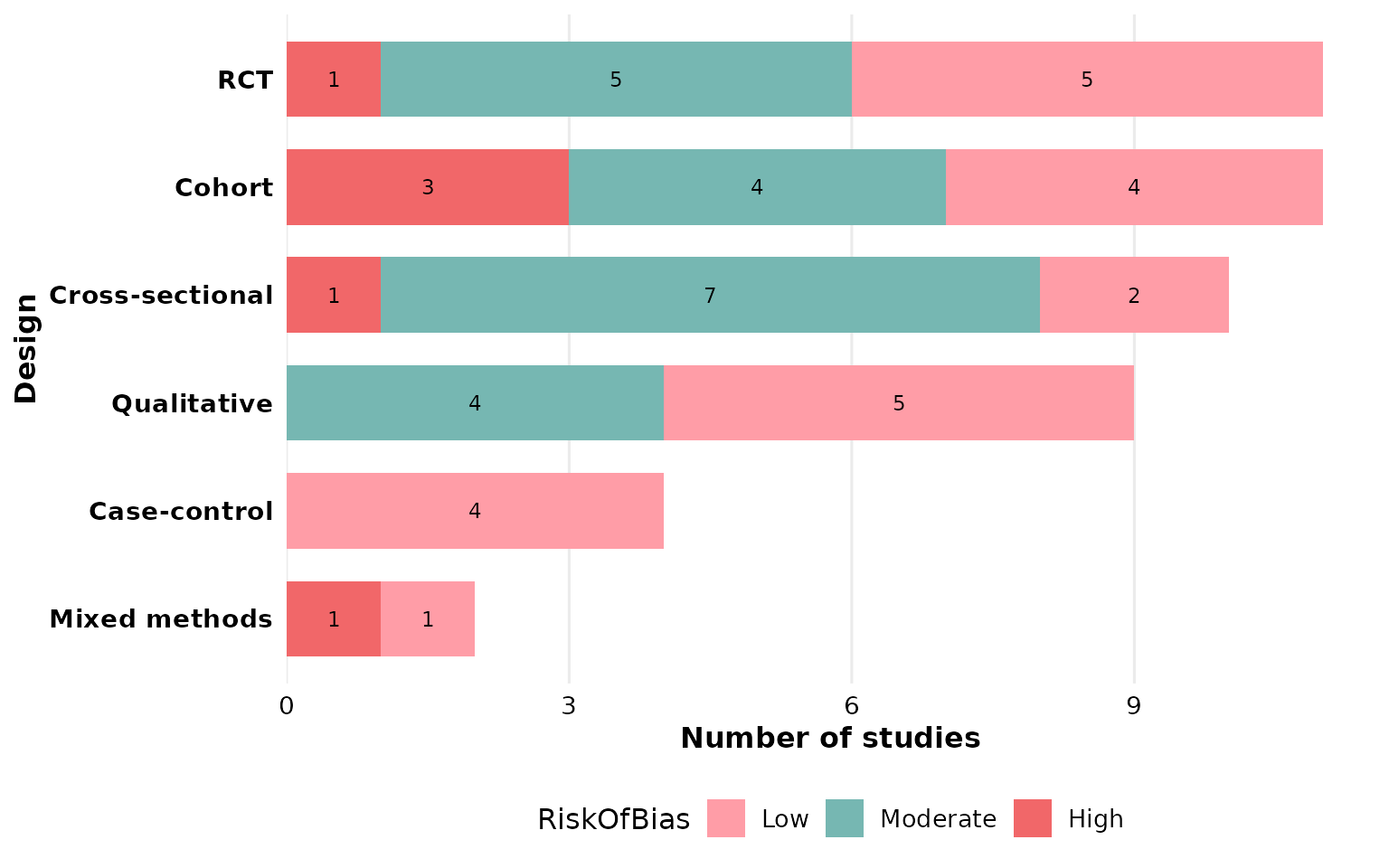
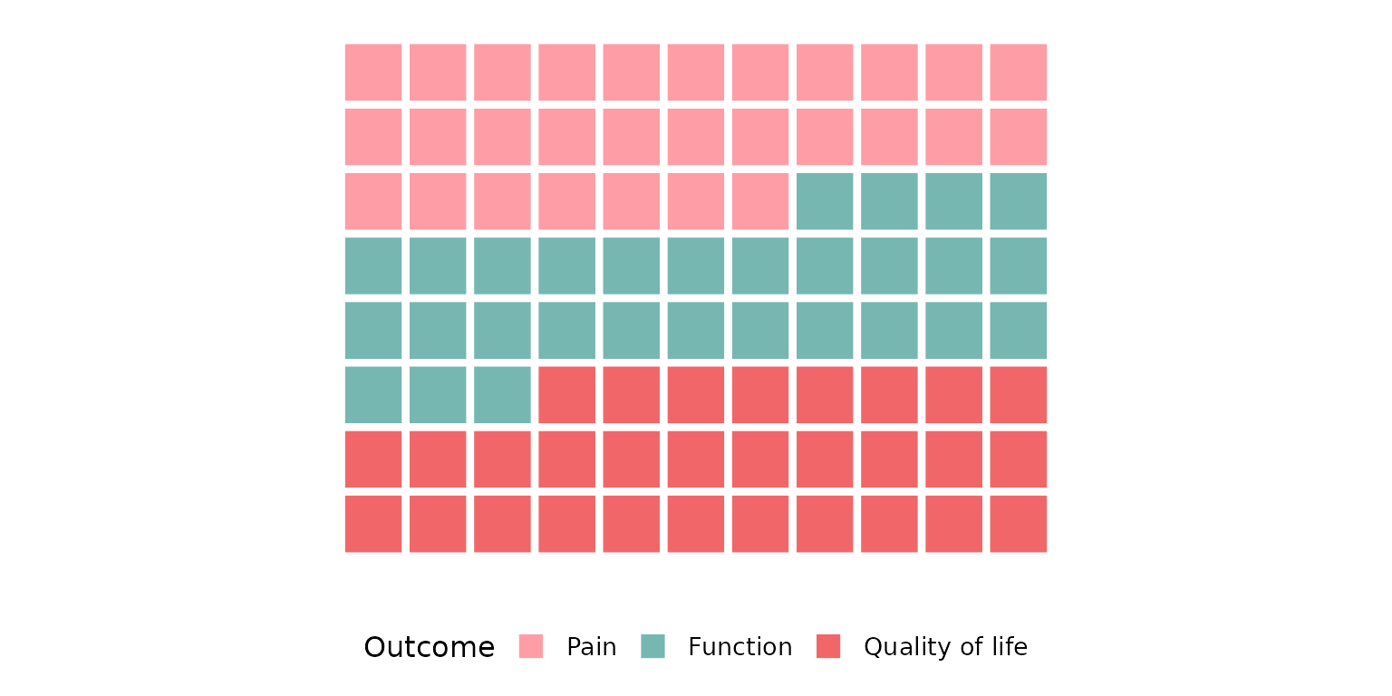
Both col and group may contain multi-value
cells, which are split before counting. Hide the in-segment labels with
labels = FALSE.
Donut / pie chart
reviewPie(studies, Design)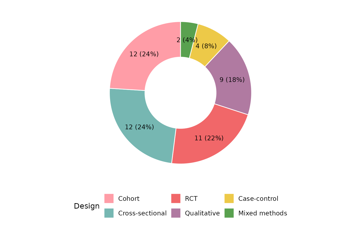
Set donut = FALSE for a classic pie:
reviewPie(studies, Design, donut = FALSE)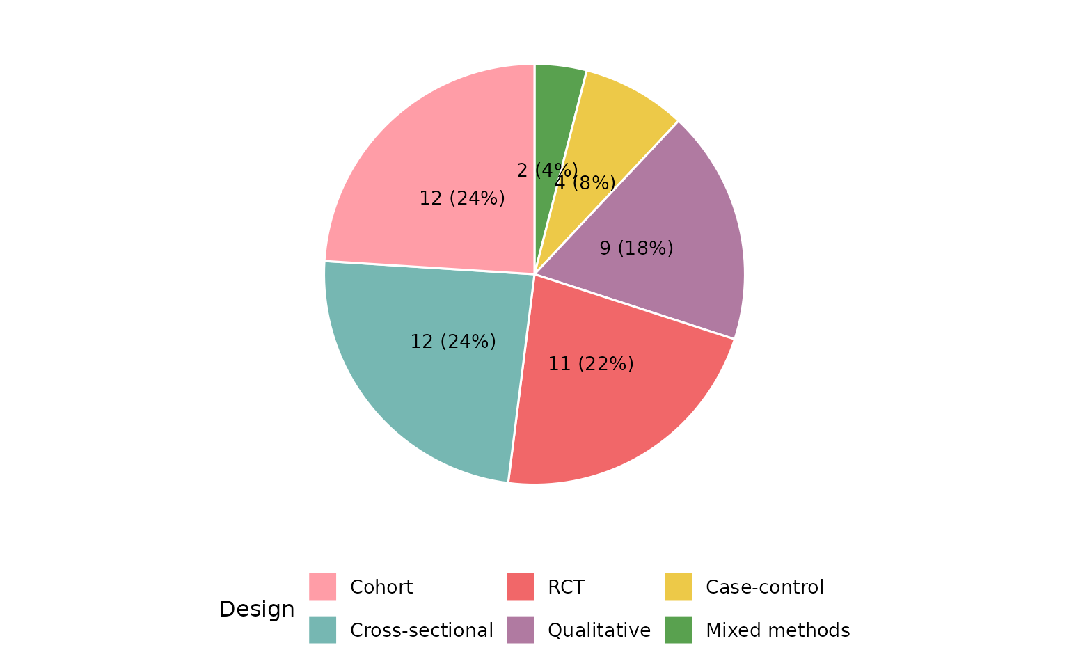
Co-occurrence heatmap
reviewOverlap() shows how two columns co-occur across
studies:
reviewOverlap(studies, Design, Outcome, fill = PALETTE[3])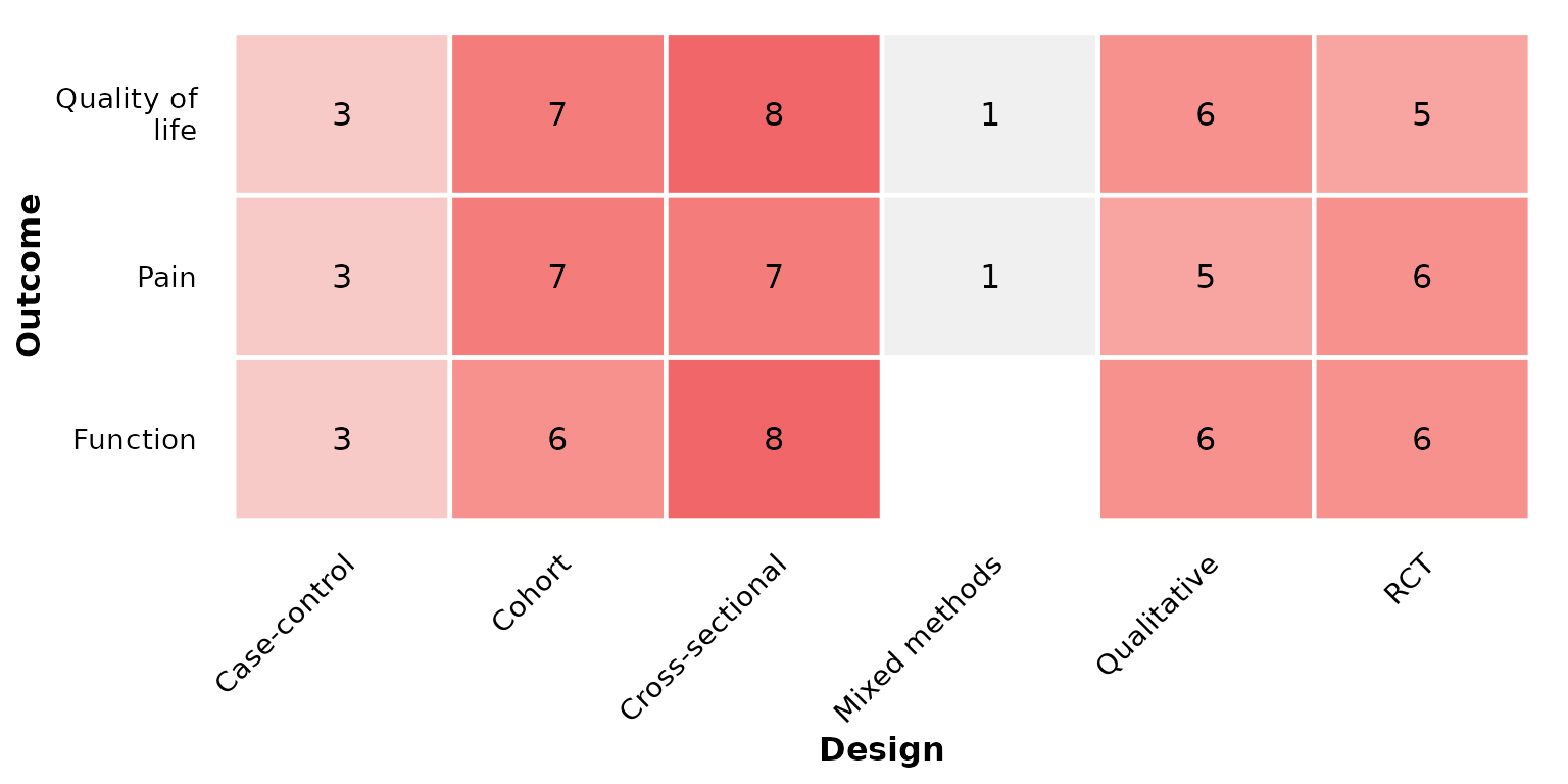
UpSet plot
reviewUpset() visualizes how the values of a multi-value
column co-occur across studies. Each study contributes the set of
distinct values it reports, and each bar counts the studies sharing that
exact combination — a scalable alternative to the pairwise heatmap when
three or more values can co-occur. Requires the ggupset
package.
reviewUpset(studies, Outcome)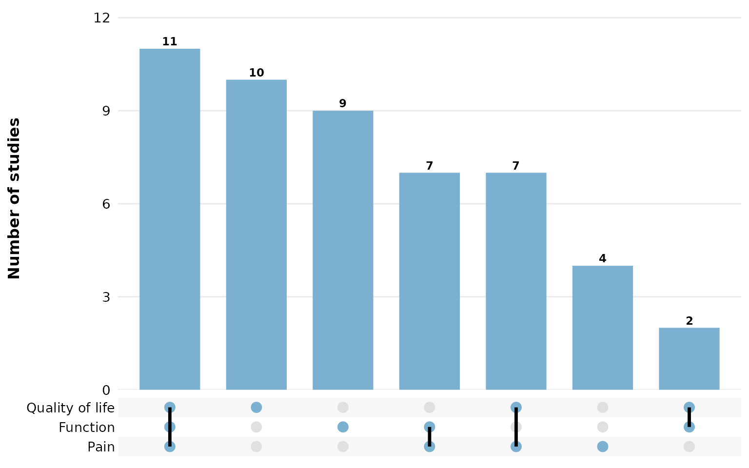
Sort combinations by set size ("degree") instead of
frequency, and cap how many are shown with
n_intersections:
reviewUpset(studies, Intervention, sort_by = "degree", n_intersections = 10)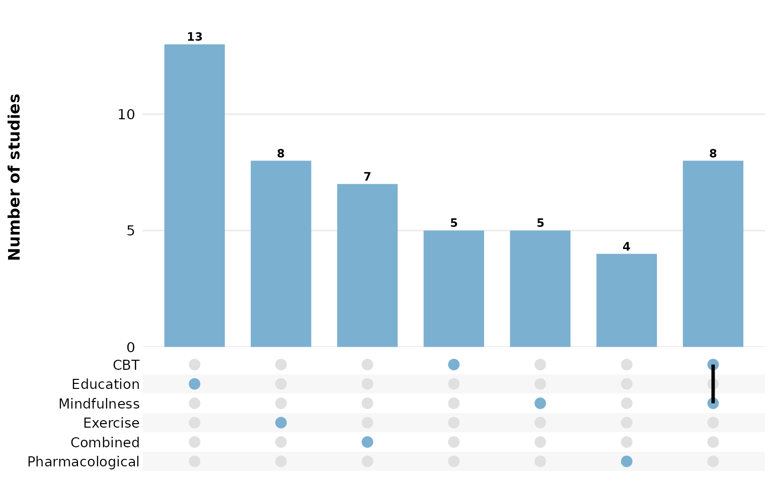
Alluvial plot
reviewAlluvial() shows co-occurrence and flow between
categories across multiple columns. Each study traces a path through the
strata. Requires the ggalluvial package.
reviewAlluvial(studies, c("Design", "Outcome"))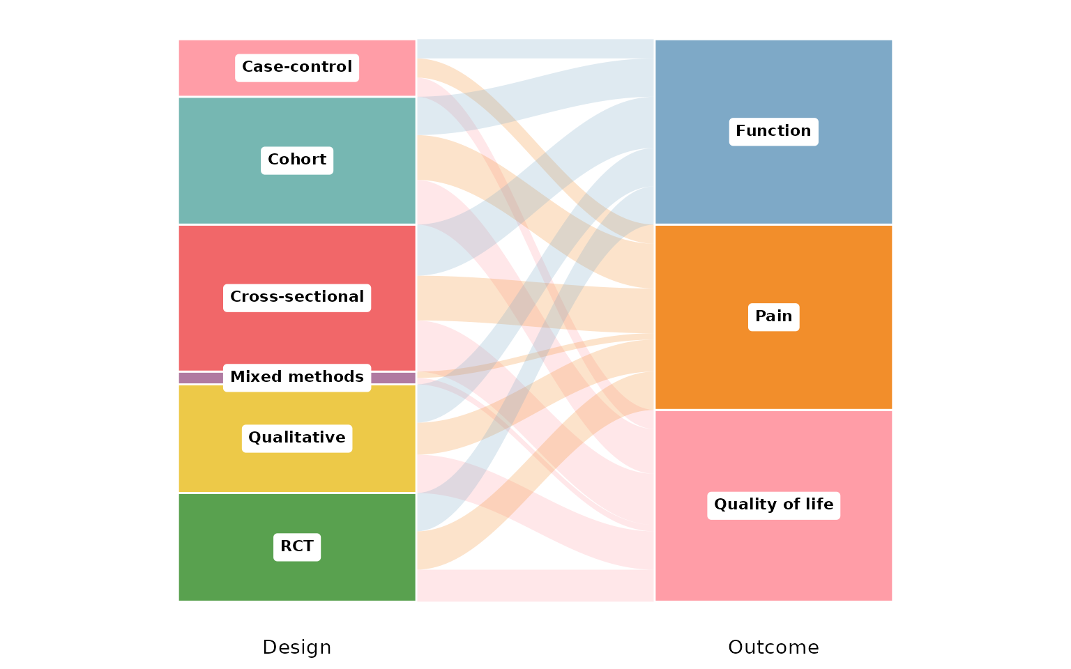
Add proportion or count labels on each stratum:
reviewAlluvial(studies, c("Design", "Outcome"), labels = "prop")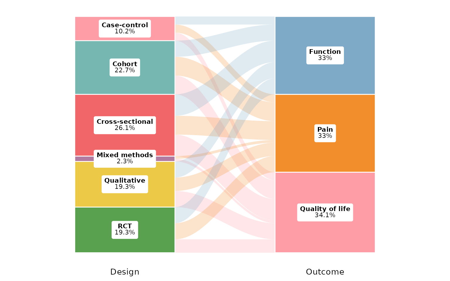
Show flow counts between strata:
reviewAlluvial(studies, c("Design", "Outcome"), labels = "none",
               flow_labels = TRUE)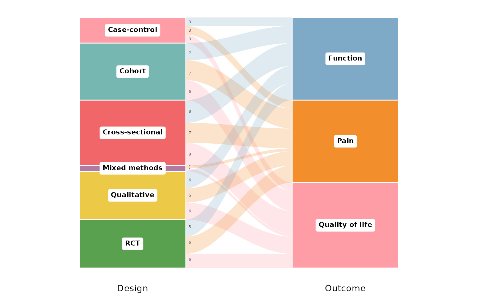
Custom axis labels:
reviewAlluvial(studies, c("Design", "Outcome","AgeGroup"),
               axis_labels = c("Study Design", "Reported Outcome", "Age group"))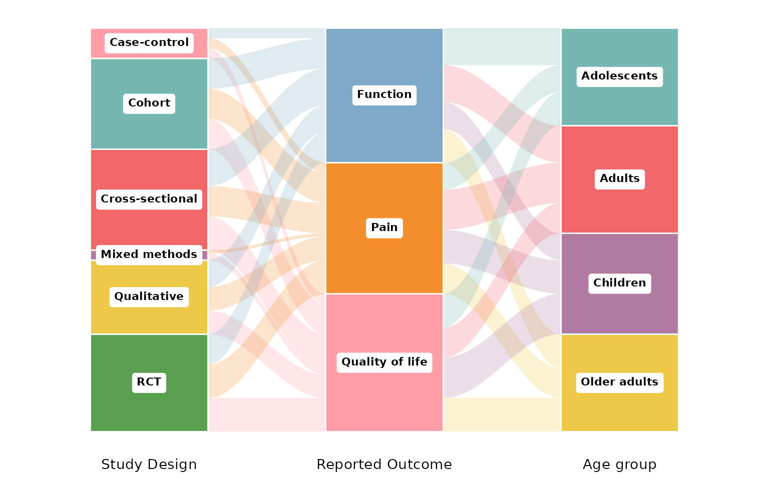
Treemap
reviewTreemap() displays category frequencies as nested
rectangles whose area is proportional to the count. Requires the
treemapify package.
reviewTreemap(studies, Design)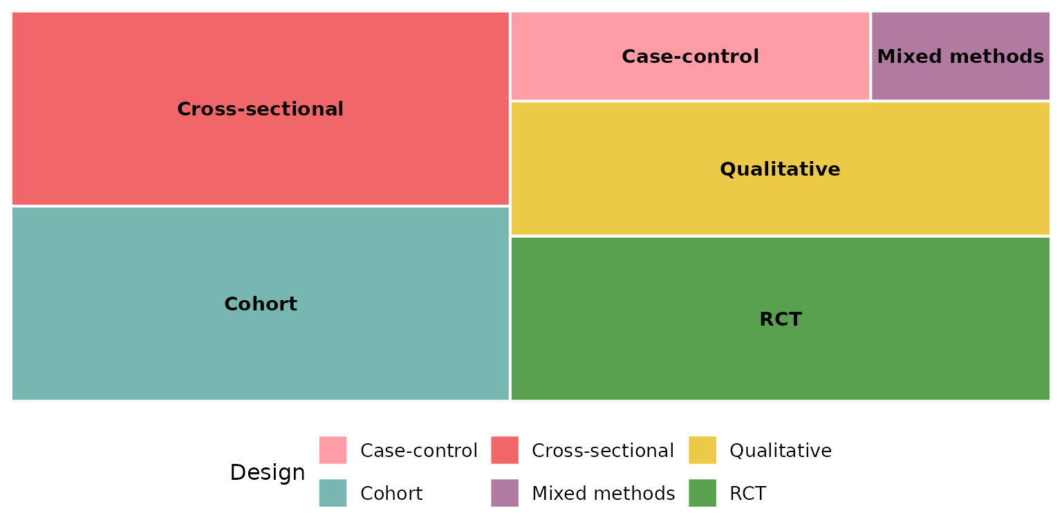
Use color_by to add a hierarchical grouping. Here we
show interventions colored by their higher-order type:
reviewTreemap(studies, Intervention, color_by = InterventionType)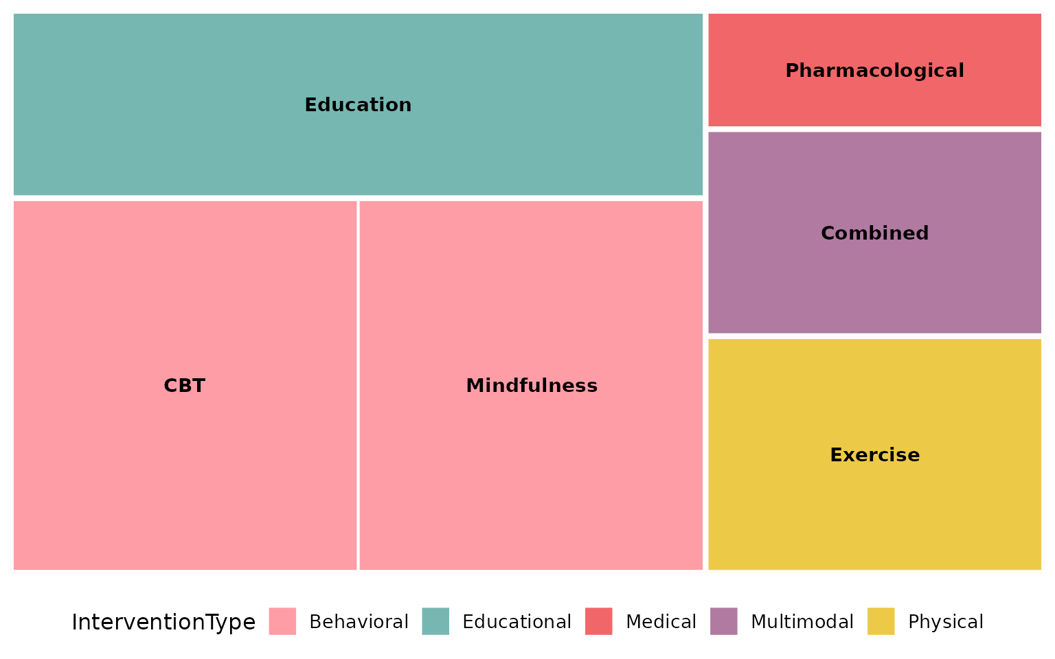
Show study IDs inside each rectangle:
reviewTreemap(studies, Design, studlabs = TRUE)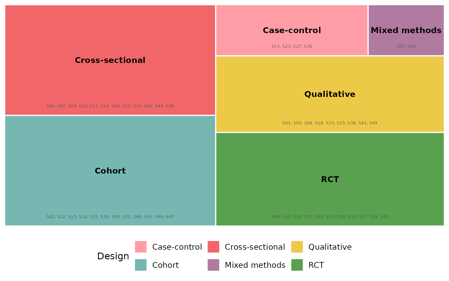
Year trend
reviewTrend() shows how categories distribute across
publication years:
reviewTrend(studies, Design)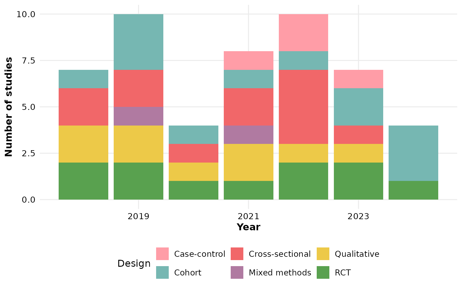
Add counts, within-year percentages, or both on each segment:
reviewTrend(studies, Design, labels = "count")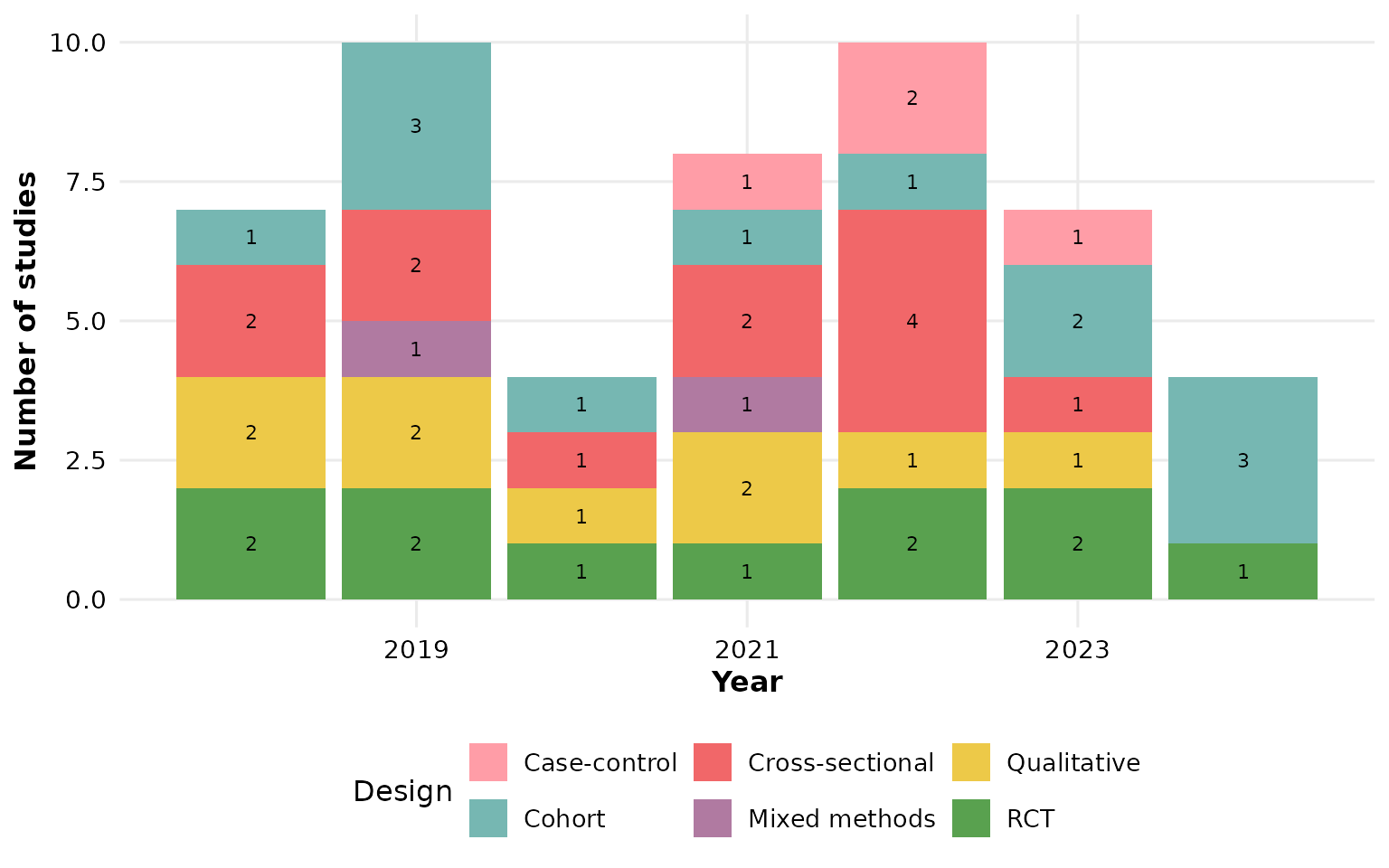
reviewTrend(studies, Design, labels = "percent")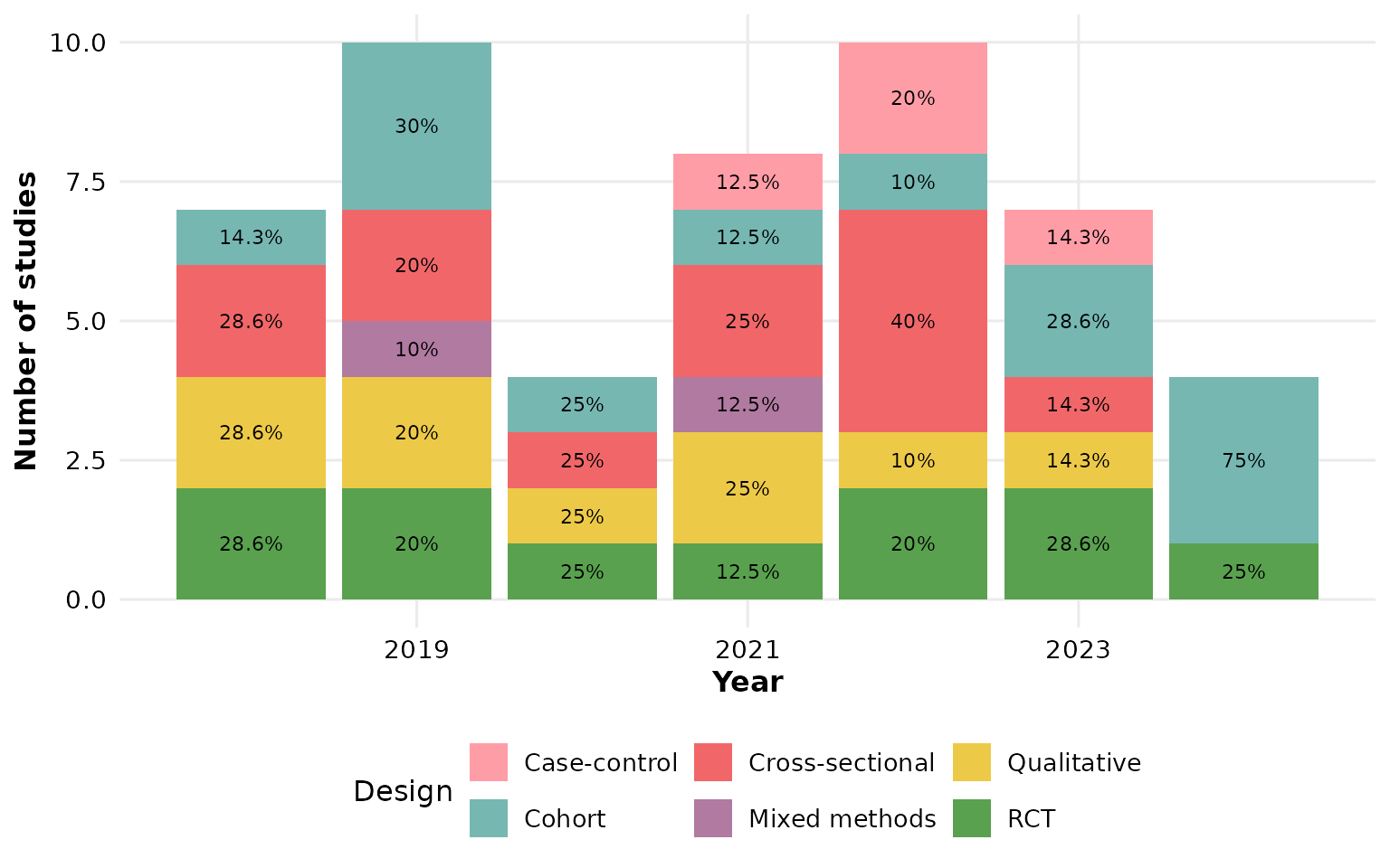
reviewTrend(studies, Design, labels = "both")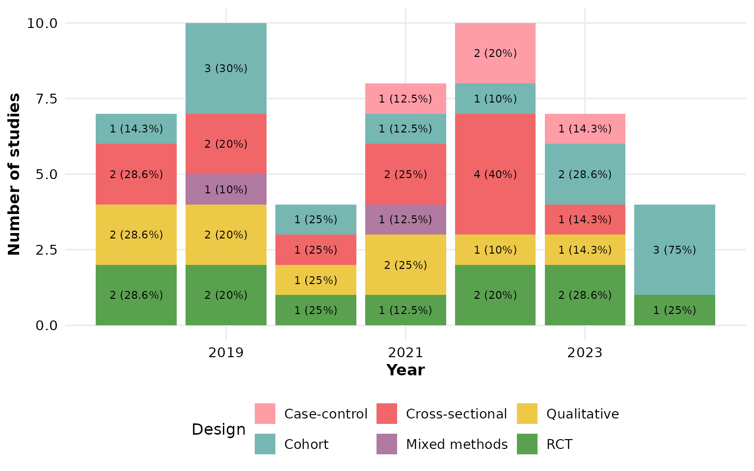
Or overlay study IDs:
reviewTrend(studies, Design, labels = "studies")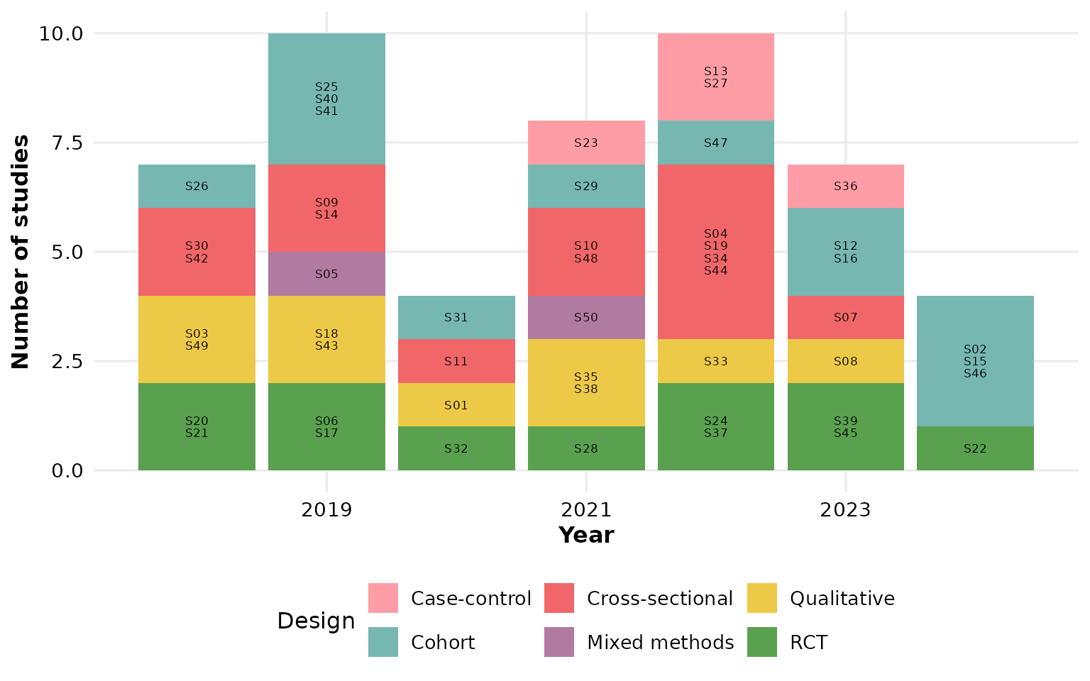
World map
reviewMap() shades countries by the number of studies.
Common aliases like “United States” or “United Kingdom” are resolved
automatically. Requires the maps package
(install.packages("maps")):
reviewMap(studies)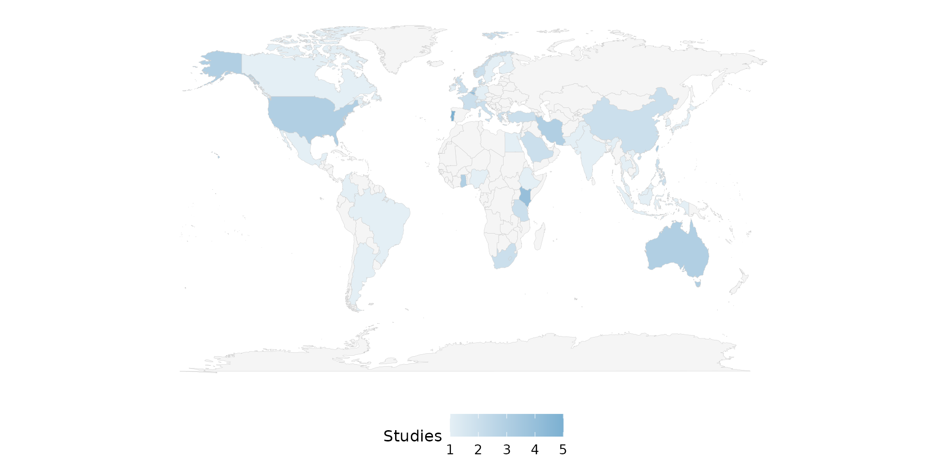
Summary table
reviewTable() returns a formatted gt
table:
reviewTable(studies, Design)| Design | Studies | Frequency | Percent |
|---|---|---|---|
| RCT | S06, S17, S20, S21, S22, S24, S28, S32, S37, S39, S45 | 11 | 22% |
| Qualitative | S01, S03, S08, S18, S33, S35, S38, S43, S49 | 9 | 18% |
| Mixed methods | S05, S50 | 2 | 4% |
| Cross-sectional | S04, S07, S09, S10, S11, S14, S19, S30, S34, S42, S44, S48 | 12 | 24% |
| Cohort | S02, S12, S15, S16, S25, S26, S29, S31, S40, S41, S46, S47 | 12 | 24% |
| Case-control | S13, S23, S27, S36 | 4 | 8% |
Handling missing data
Literature review datasets often have missing values. All functions
accept na.rm, na_label, and
na_in_percent to control how NAs are handled.
Let’s create example data with some missing values:
df_na <- data.frame(
  StudyID = paste0("S", 1:10),
  Design  = c("RCT", "Cohort", NA, "RCT", "Case-control",
              NA, "RCT", "Cohort", NA, "RCT"),
  stringsAsFactors = FALSE
)
Drop NAs, percentages of total (default)
NAs are dropped, but the denominator is all 10 studies. Percentages reflect the share of the full sample, so they do not sum to 100%:
summarize_data(df_na, Design)
#> # A tibble: 3 × 4
#>   Design       Studies         Frequency Percent
#>   <chr>        <chr>               <int>   <dbl>
#> 1 Case-control S5                      1      10
#> 2 Cohort       S2, S8                  2      20
#> 3 RCT          S1, S4, S7, S10         4      40
Drop NAs, percentages of reported only
Set na_in_percent = FALSE so that the denominator only
counts the 7 studies that reported a design. Percentages sum to
100%:
summarize_data(df_na, Design, na_in_percent = FALSE)
#> # A tibble: 3 × 4
#>   Design       Studies         Frequency Percent
#>   <chr>        <chr>               <int>   <dbl>
#> 1 Case-control S5                      1    14.3
#> 2 Cohort       S2, S8                  2    28.6
#> 3 RCT          S1, S4, S7, S10         4    57.1
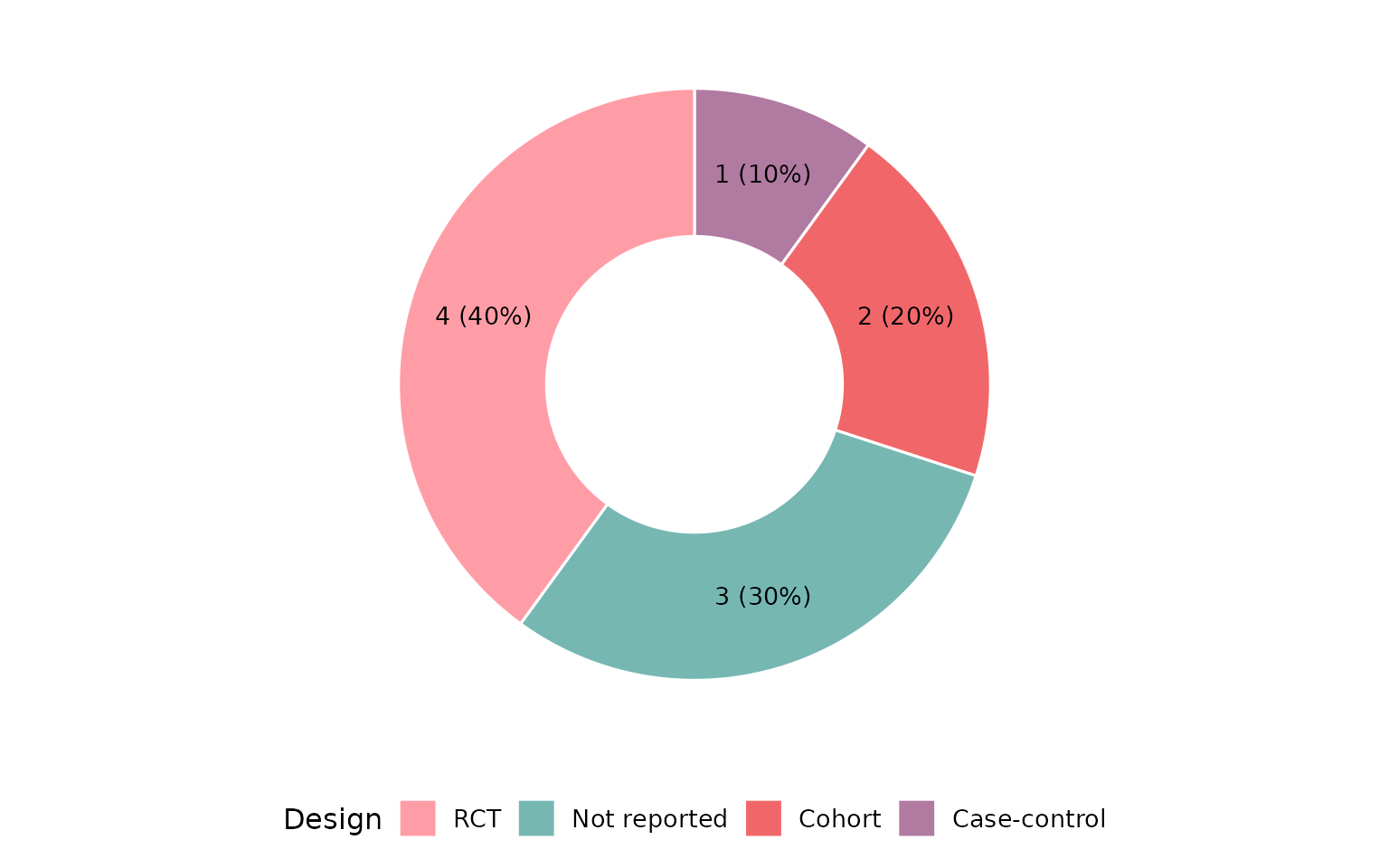
Keep NAs, percentages of total
Set na.rm = FALSE to include a “Not reported” category.
All percentages sum to 100%:
summarize_data(df_na, Design, na.rm = FALSE)
#> # A tibble: 4 × 4
#>   Design       Studies         Frequency Percent
#>   <chr>        <chr>               <int>   <dbl>
#> 1 Case-control S5                      1      10
#> 2 Cohort       S2, S8                  2      20
#> 3 Not reported S3, S6, S9              3      30
#> 4 RCT          S1, S4, S7, S10         4      40
Keep NAs with a custom label, percentages of reported
Combine all three parameters. Here “Missing” replaces
NA, and the denominator excludes missing rows:
summarize_data(df_na, Design, na.rm = FALSE, na_label = "Missing",
               na_in_percent = FALSE)
#> # A tibble: 4 × 4
#>   Design       Studies         Frequency Percent
#>   <chr>        <chr>               <int>   <dbl>
#> 1 Case-control S5                      1    14.3
#> 2 Cohort       S2, S8                  2    28.6
#> 3 Missing      S3, S6, S9              3    42.9
#> 4 RCT          S1, S4, S7, S10         4    57.1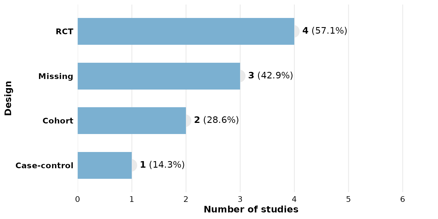
Custom study ID column
All functions default to study_id = StudyID. If your
data uses a different column, pass it:
df <- data.frame(
  ID = paste0("A", 1:5),
  Type = c("X", "Y", "X", "Z", "X"),
  stringsAsFactors = FALSE
)
reviewBar(df, Type, study_id = ID)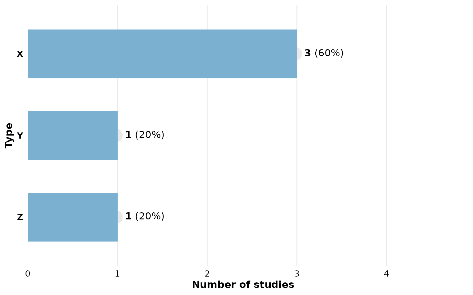
Using summarize_data() directly
If you need the raw summary data frame (e.g. for further processing),
use summarize_data(). Note that Percent is
numeric:
summarize_data(studies, Design)
#> # A tibble: 6 × 4
#>   Design          Studies                                      Frequency Percent
#>   <chr>           <chr>                                            <int>   <dbl>
#> 1 Mixed methods   S05, S50                                             2       4
#> 2 Case-control    S13, S23, S27, S36                                   4       8
#> 3 Qualitative     S01, S03, S08, S18, S33, S35, S38, S43, S49          9      18
#> 4 RCT             S06, S17, S20, S21, S22, S24, S28, S32, S37…        11      22
#> 5 Cross-sectional S04, S07, S09, S10, S11, S14, S19, S30, S34…        12      24
#> 6 Cohort          S02, S12, S15, S16, S25, S26, S29, S31, S40…        12      24