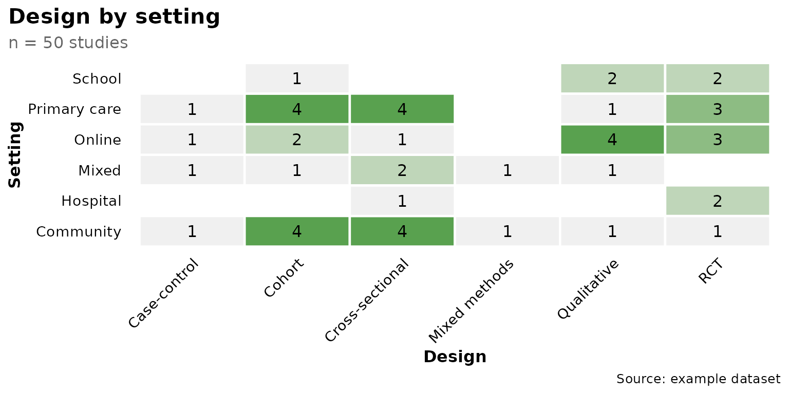
reviewOverlap() cross-tabulates two columns and draws
the result as a tile heatmap: each tile counts how many studies share
that particular combination of col1 (x-axis) and
col2 (y-axis). Tile color runs from light grey (few
studies) to fill (many). This article walks through
every argument of
reviewOverlap(data, col1, col2, sep = "\r\n", fill = "#7BB0D1",
              base_size = 12, na.rm = TRUE, na_label = "Not reported",
              studlabs = FALSE, study_id = StudyID)
Default
Pass the data frame and two columns. Column names may be bare or quoted. Every combination that occurs at least once gets a tile, annotated with its count.
reviewOverlap(studies, Design, Setting)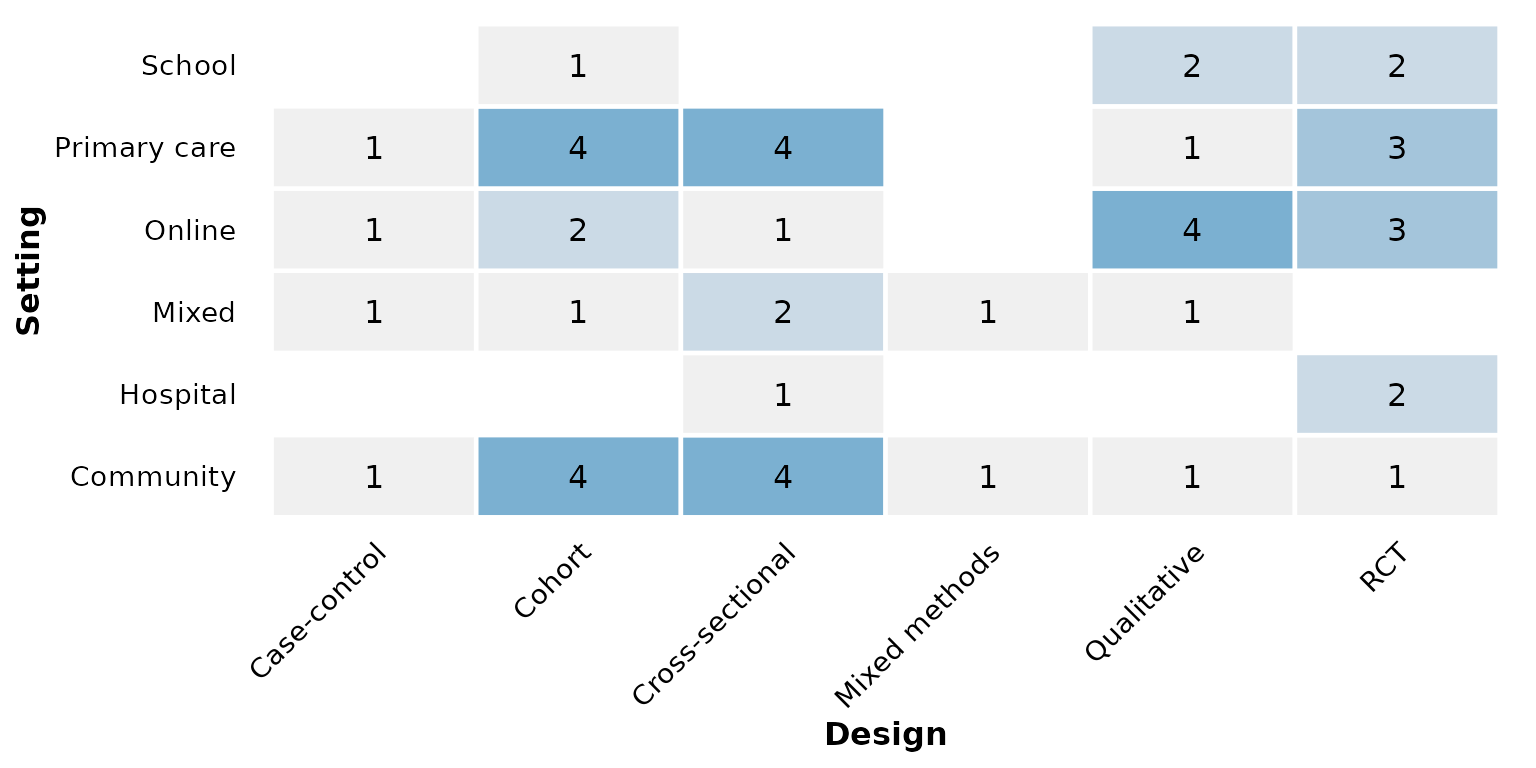
col1: the x-axis column
col1 is mapped to the horizontal axis. Prefer columns
with a handful of categories for a readable grid. Here
RiskOfBias (three levels) sits on x:
reviewOverlap(studies, RiskOfBias, Setting)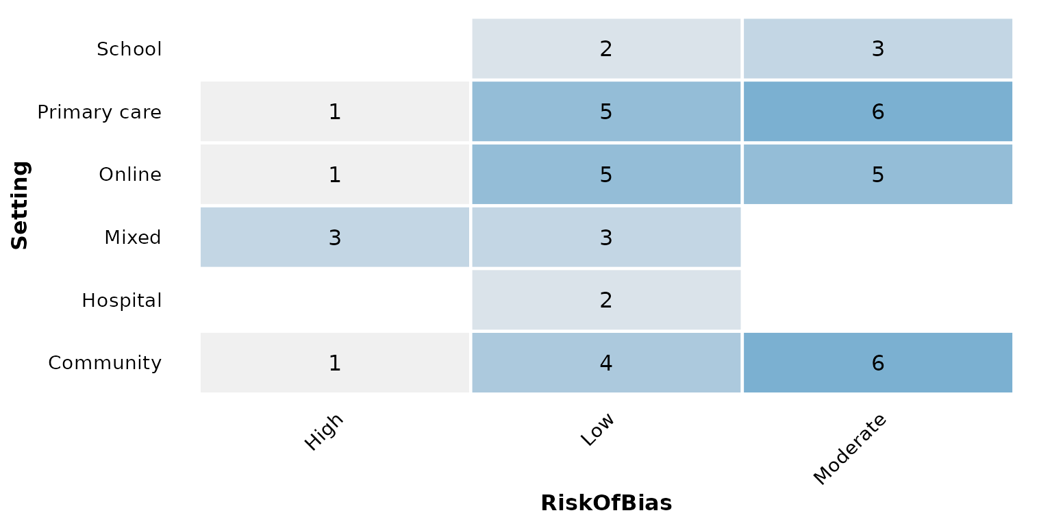
col2: the y-axis column
col2 is mapped to the vertical axis. Either column may
be multi-value — a cell holding several values split by
sep. In studies, AgeGroup lists
one or more age bands per study, so each band is counted
independently:
reviewOverlap(studies, Design, AgeGroup)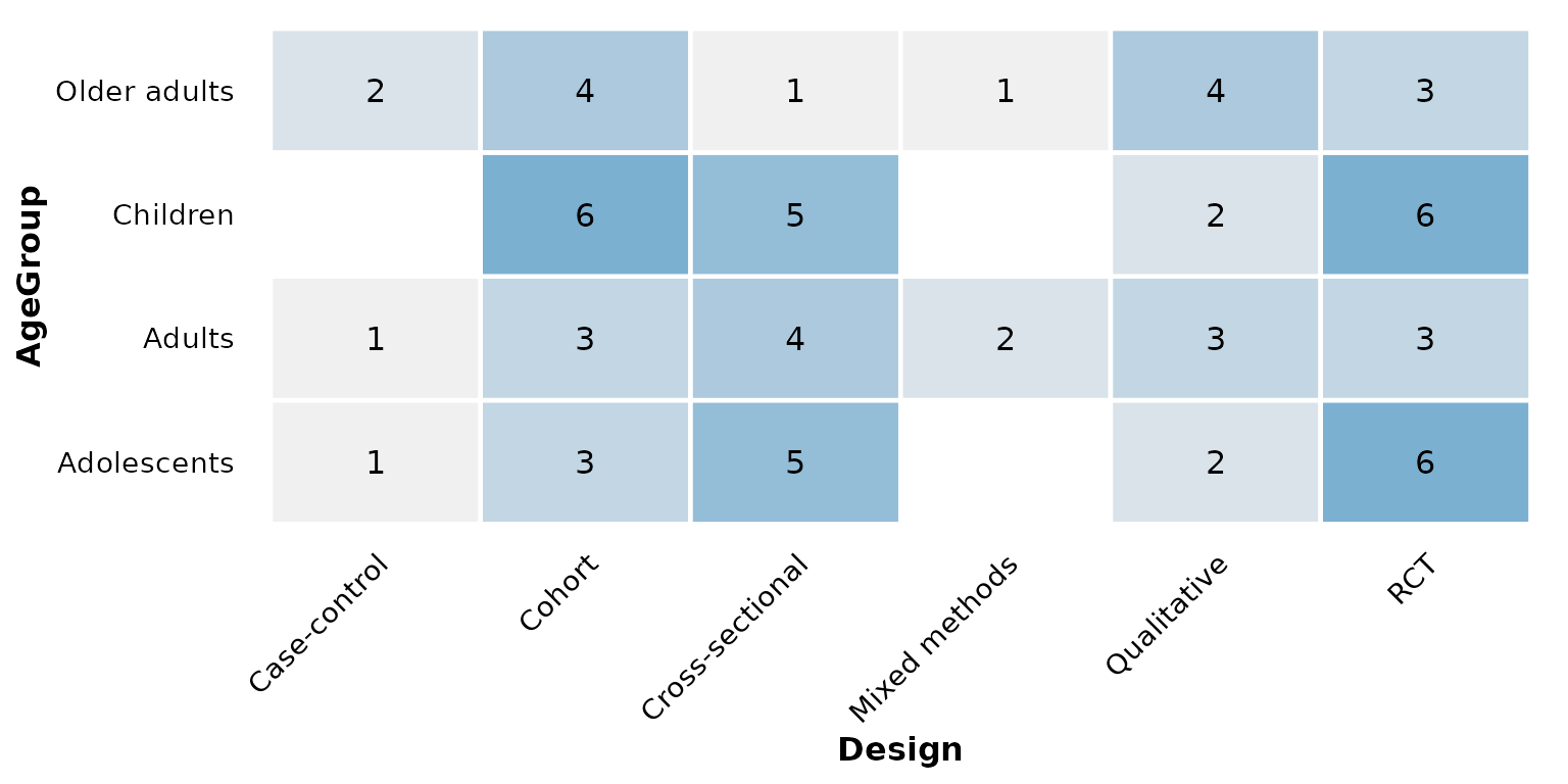
When both columns have several categories the grid grows; the pairing below crosses intervention type with age group:
reviewOverlap(studies, InterventionType, AgeGroup)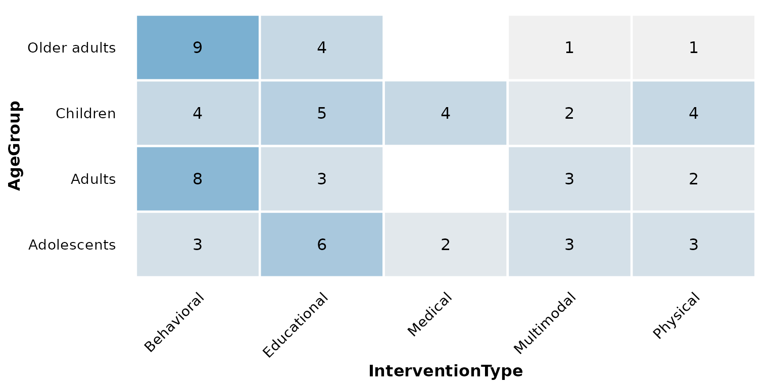
sep: multi-value separator
Multi-value cells are split on sep (default
"\r\n") before counting. AgeGroup uses the
default, so no extra argument is needed above. If your data uses a
different delimiter, set sep. Here we rebuild a
semicolon-separated column to demonstrate:
studies_semi <- studies
studies_semi$AgeGroup <- gsub("\r?\n", "; ", studies_semi$AgeGroup)
reviewOverlap(studies_semi, Design, AgeGroup, sep = "; ")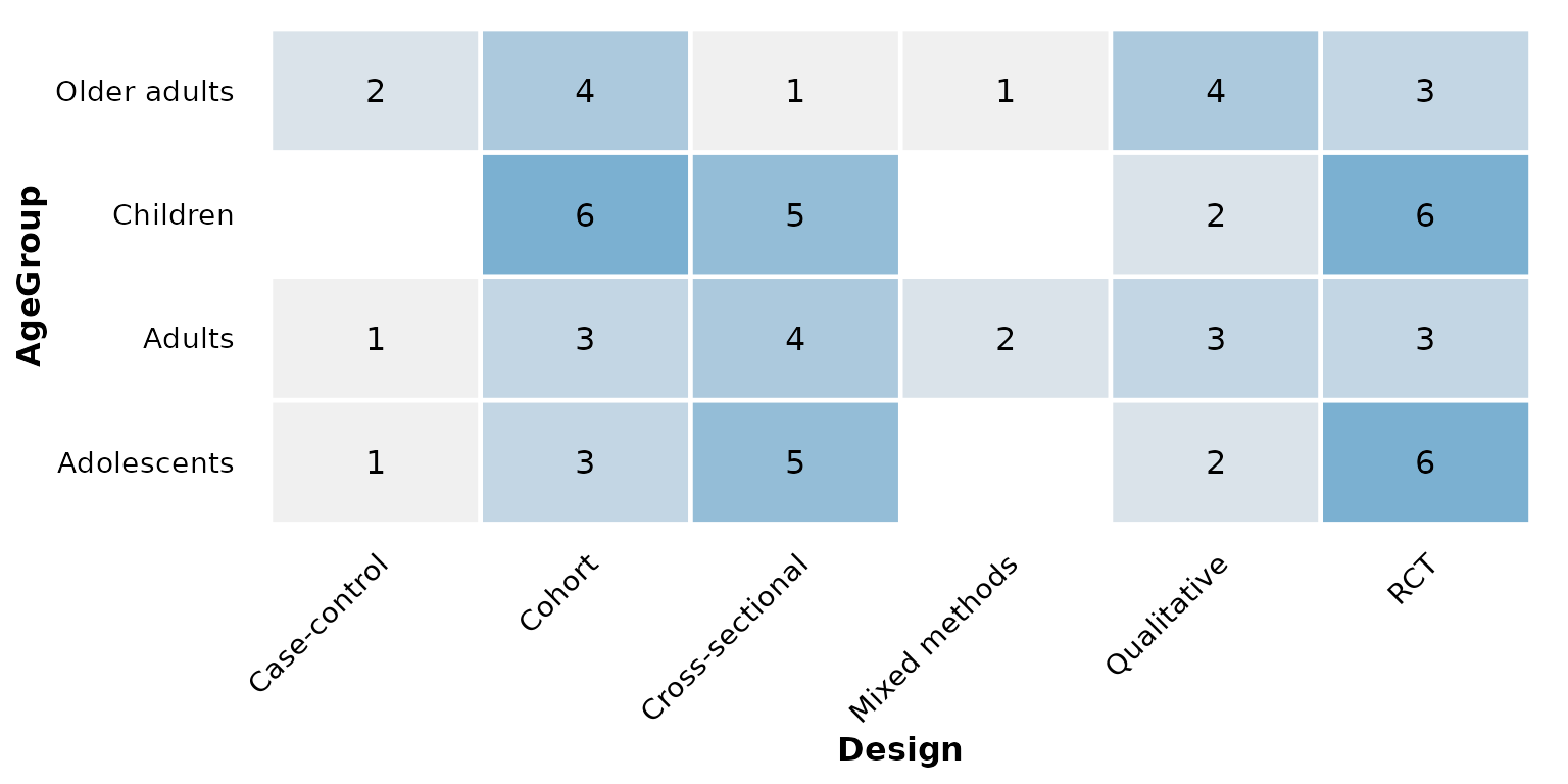
fill: high-end gradient color
The count gradient runs from a fixed light grey (low counts) up to
fill (high counts). A single hex color sets that high
end:
reviewOverlap(studies, Design, Setting, fill = "#59a14f")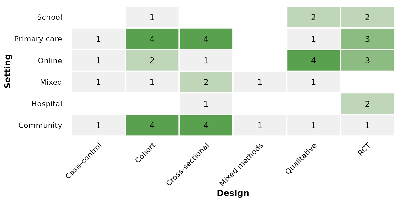
Use one of the package PALETTE colors — a
green high end:
reviewOverlap(studies, Design, Setting, fill = PALETTE[3])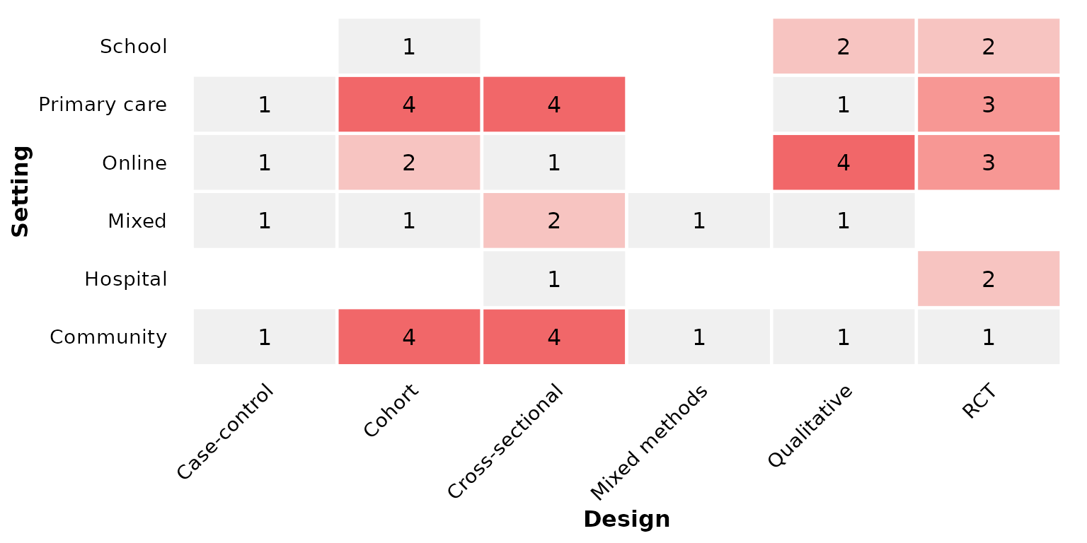
Or a warm orange high end:
reviewOverlap(studies, Design, Setting, fill = PALETTE[7])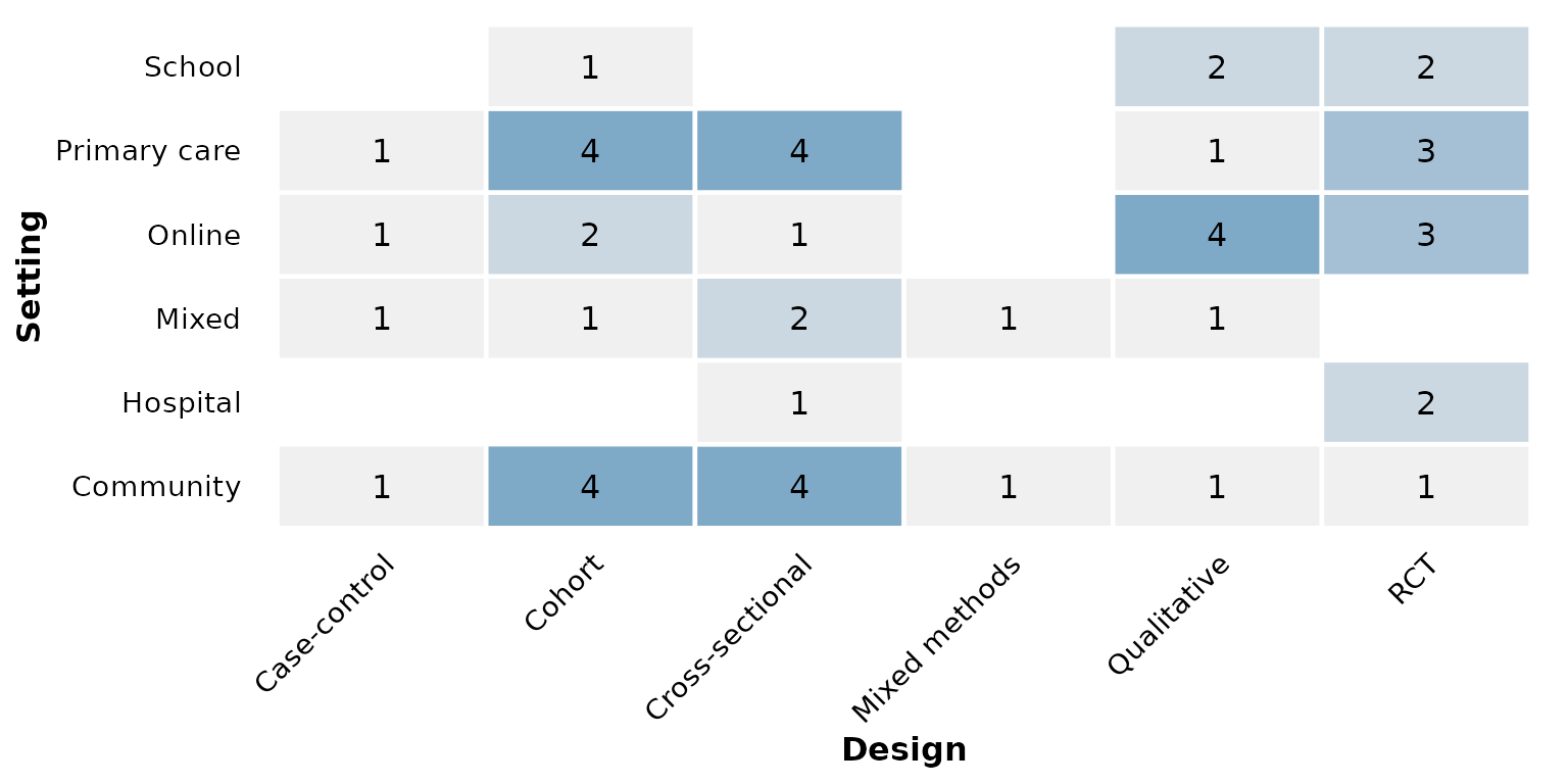
base_size: overall text and element scaling
A single knob scales all text, tile borders, and spacing proportionally. Smaller, for multi-panel figures:
reviewOverlap(studies, Design, Setting, base_size = 9)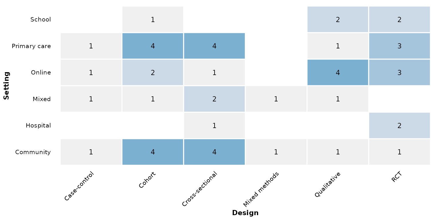
Larger, for slides or posters:
reviewOverlap(studies, Design, Setting, base_size = 18)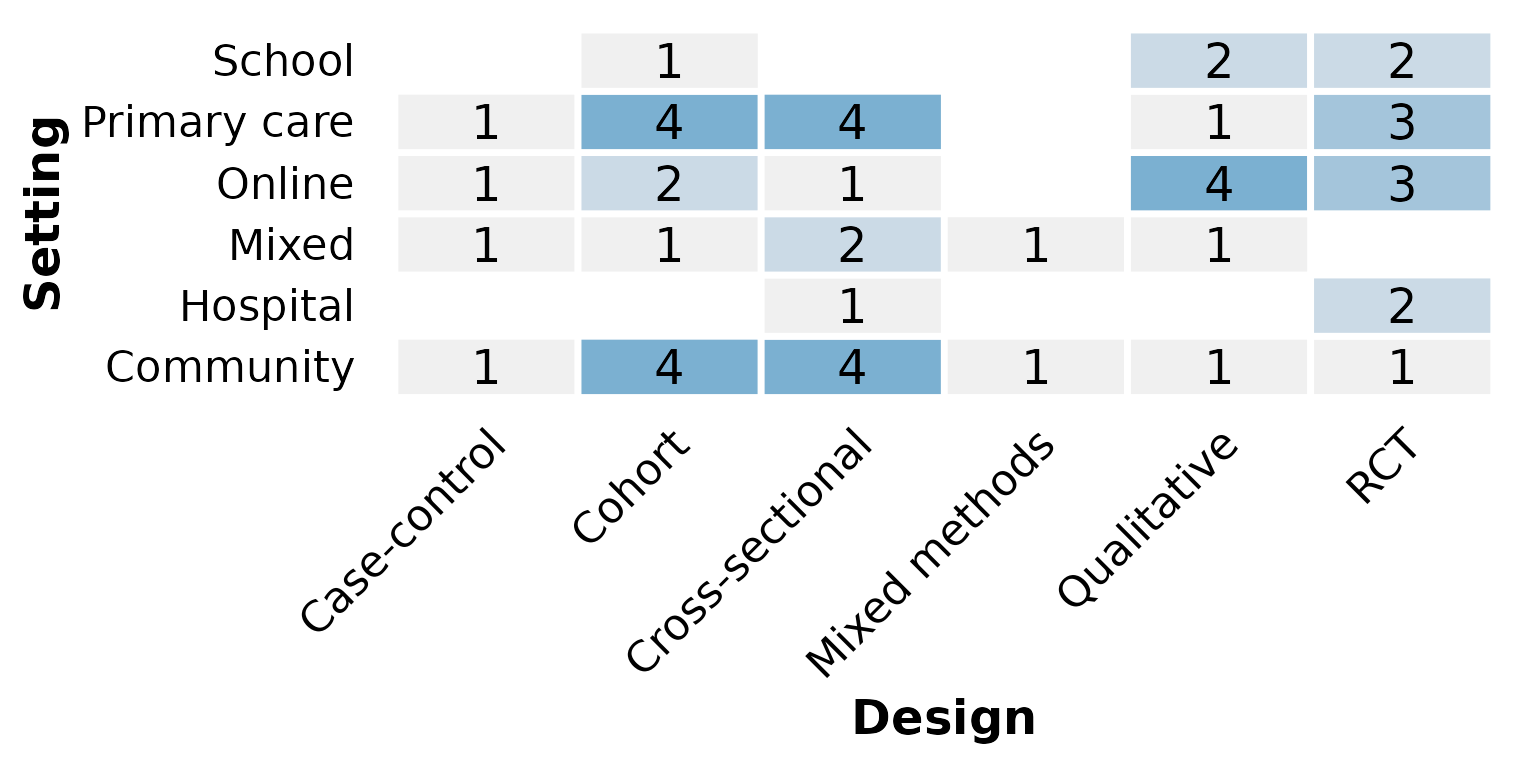
Missing data: na.rm and na_label
These two arguments control how NA (and empty) cells are
treated. We use a column that actually has missing values —
RiskOfBias has a few unreported studies.
By default na.rm = TRUE drops rows missing either
column, so no tile represents them:
reviewOverlap(studies, RiskOfBias, Setting)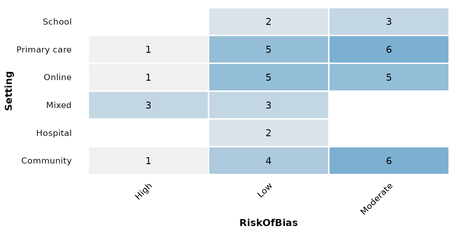
Keep the missing values as their own row/column with
na.rm = FALSE; na_label names the resulting
category:
reviewOverlap(studies, RiskOfBias, Setting, na.rm = FALSE)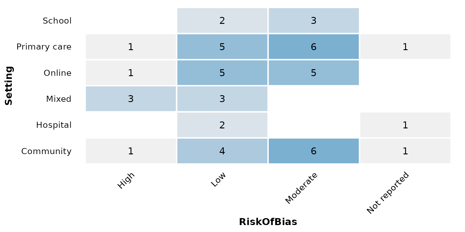
na_label sets a custom label for those cells:
reviewOverlap(studies, RiskOfBias, Setting,
              na.rm = FALSE, na_label = "Unclear")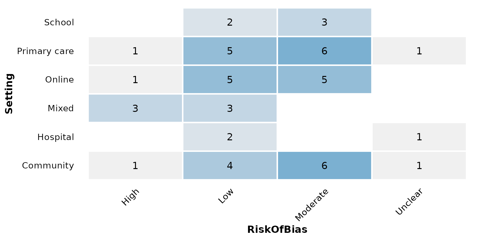
studlabs and study_id: label tiles with
study IDs
Set studlabs = TRUE to write the contributing study
identifiers inside each tile, beneath the count:
reviewOverlap(studies, Design, RiskOfBias, studlabs = TRUE)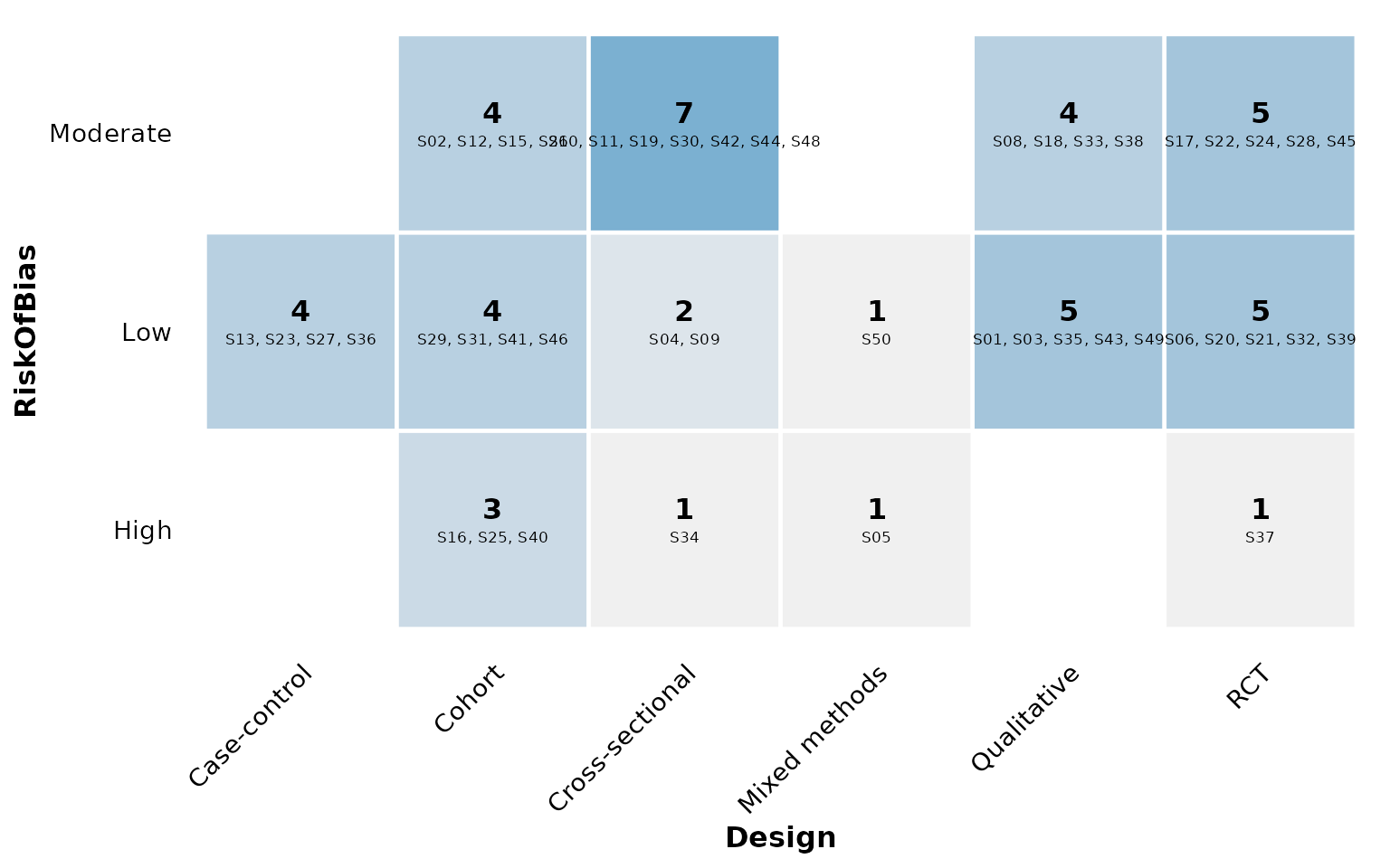
study_id selects which column supplies those identifiers
(default StudyID). Here we label with the author
instead:
reviewOverlap(studies, Design, RiskOfBias,
              studlabs = TRUE, study_id = Author)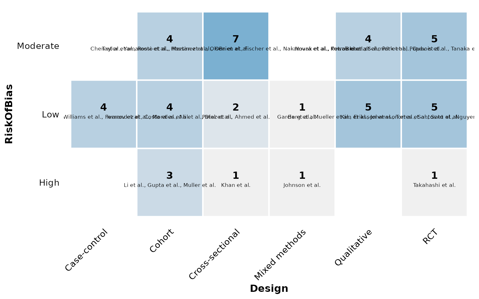
label_wrap: wrap long axis labels
Category names on the axes are wrapped onto multiple lines once they
exceed label_wrap characters (default 15), so
long labels stay readable instead of running off the plot. Lower the
width to wrap more aggressively:
reviewOverlap(studies, AnalysisApproach, Setting, label_wrap = 10)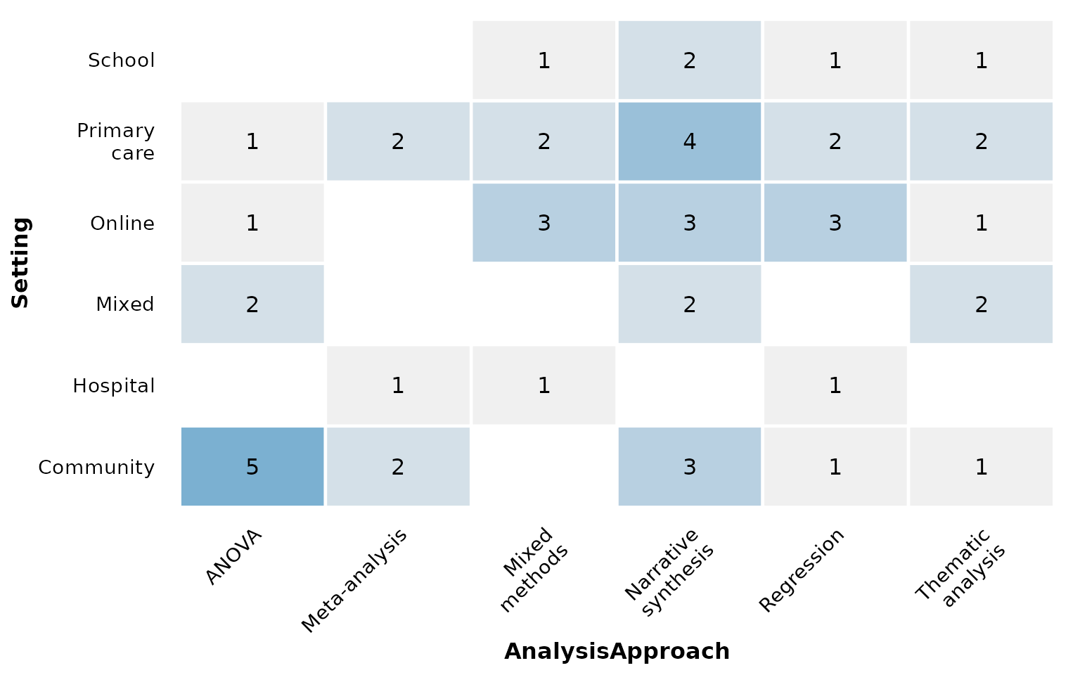
Set label_wrap = NULL (or Inf) to disable
wrapping and keep every label on a single line:
reviewOverlap(studies, AnalysisApproach, Setting, label_wrap = NULL)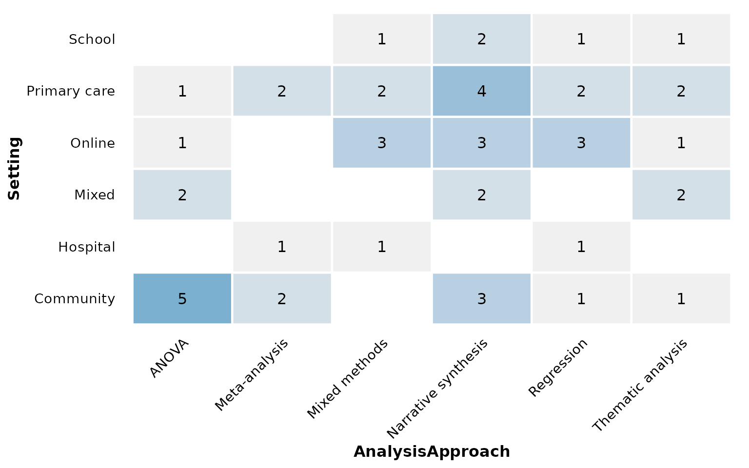
Composing with ggplot2
Every review*() function returns a plain ggplot, so you
can keep adding layers, scales, and labels with +:
reviewOverlap(studies, Design, Setting, fill = "#59a14f") +
  labs(title = "Design by setting", subtitle = "n = 50 studies",
       caption = "Source: example dataset") +
  theme(plot.title.position = "plot")