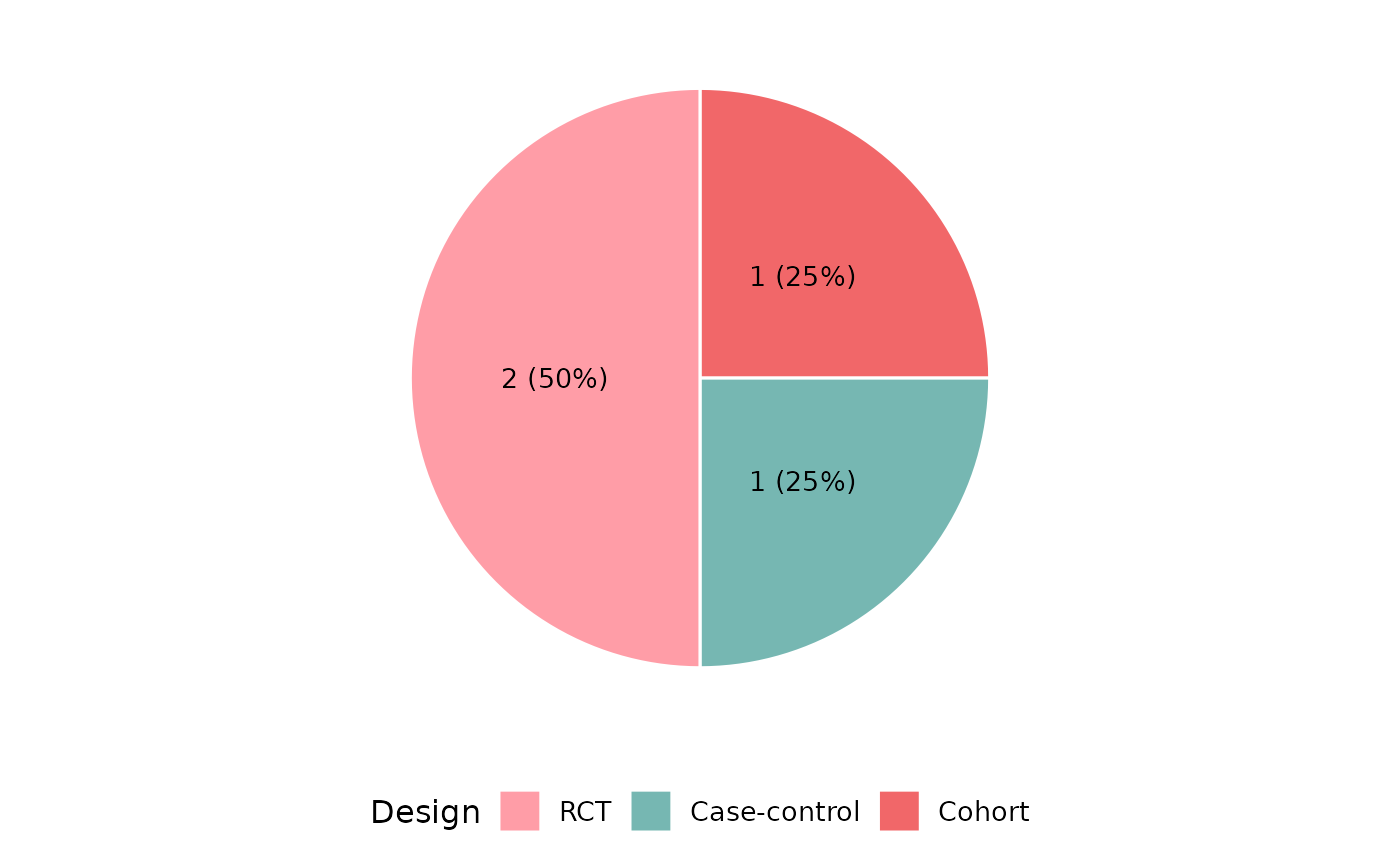
Summarizes a column and displays frequencies as a donut (default) or pie chart with count and percentage labels. Returns a ggplot2::ggplot object.
Usage
reviewPie(
  data,
  col,
  sep = "\r\n",
  colors = PALETTE,
  donut = TRUE,
  study_id = StudyID,
  base_size = 12,
  na.rm = TRUE,
  na_label = "Not reported",
  na_in_percent = TRUE,
  na_last = FALSE
)
Arguments
- data
A data frame with at least a study ID column and the column named by
col.- col
Column to visualize (quoted or unquoted).
- sep
Character. Separator for multi-value cells. Defaults to
"\r\n".- colors
Character vector. Fill colors cycled across categories. Defaults to PALETTE.
- donut
Logical. If
TRUE(default), renders a donut chart. IfFALSE, renders a filled pie chart.- study_id
Column containing study identifiers (quoted or unquoted). Defaults to
StudyID.- base_size
Numeric. Base font size in points. Defaults to
12.- na.rm
Logical. Drop missing values? Defaults to
TRUE.- na_label
Character. Label for missing values when
na.rm = FALSE. Defaults to"Not reported".- na_in_percent
Logical. Include missing rows in the percentage denominator? Defaults to
TRUE.- na_last
Logical. If
TRUE, place the missing-value category last regardless of its frequency. Defaults toFALSE.
Value
A ggplot2::ggplot object.
Examples
df <- data.frame(
StudyID = c("S1", "S2", "S3", "S4"),
Design = c("RCT", "Cohort", "RCT", "Case-control"),
stringsAsFactors = FALSE
)
reviewPie(df, Design)
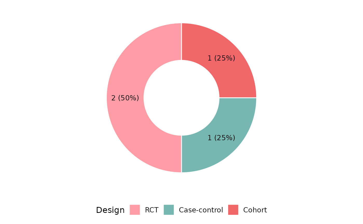 reviewPie(df, Design, donut = FALSE)